What Customer Retention Is, How the Rate Is Calculated, and What Moves It
Keeping the customers you already have, measured honestly. The formula, the three decisions behind it, and where a retention budget pays off.


/ On this page10 sections
Customer retention is the work of keeping the customers you already have, and the rate that measures it is the number a marketing, lifecycle or product owner gets asked to report on.
The rate is one division. What makes it honest is the three decisions you settle before you run it: the window, the unit, and whether you are following one cohort or your whole base.
Then the harder question, which is where the retention money goes. Not to the customers most likely to leave, which is where a churn model would send it.
Retention, Loyalty and Satisfaction Are Three Different Measurements
Customer retention is keeping the customers you already have buying, measured as the share of a starting group still active at the end of a period, with anyone acquired inside that period excluded from the count.
That last clause is doing the work. Without it you are measuring growth, because new signups would paper over everyone who left.
Loyalty and satisfaction are different objects. Satisfaction is what a customer says when you ask, loyalty is what they prefer, and retention is what they did.
Only the third is already in your records. That matters when someone asks you to prove a program worked, because a survey score moves for reasons a purchase record does not.
Say a customer tells you in March that they are delighted and never orders again. Satisfaction was high, loyalty was not, and retention is the one of the three that would have told you.
There is a tighter version for the rate itself. Each period's rate is the people still with you at the end of it, over the people you had at the end of the one before.
The Three Rs, and Where They Came From
The three Rs are retention, related sales and referrals.
They name the three ways a kept customer pays you. They keep buying, they buy adjacent things over time, and they bring other people in.
The phrase belongs to the loyalty literature and not to any standards body, so treat it as a memory aid and not a model.
The third R is the one most reporting never counts. A customer who brought two others is worth more than the rate shows, and nothing in the formula below will tell you that happened.
The Arithmetic of a Customer Who Stays
A kept customer is worth more than a new one because the money to find them has already been spent. That is the whole of the arithmetic, and everything else is a multiplier on it.
The multipliers get quoted as if they were one finding. They are four different measurements of four different things.
Acquiring a customer can cost between five and 25 times more than keeping one, a Harvard Business Review finding that Zendesk's guide repeats.
The same gap is six to seven times, and a company is four times more likely to close a sale with an existing customer than with a new prospect, in a 2014 Postal Service inspector general audit.
Bain's figure sits in the same pile: a 5% improvement in retention that can improve revenue by 25% to 95%, as Zendesk's guide reports it.
And replacing the business value of one lost customer takes three new ones, on a McKinsey figure from August 2023 that IBM's guide passes on.
Use numbers like these to justify the direction of the spend, never to forecast a result.
Open the Footnote Before You Quote the Number
A claim that has traveled through three retellings has usually lost the conditions it was true under. So before a multiplier goes into a deck, read the footnote under it.
That audit is the useful example, because it says where it got its number. The footnote credits the six-to-seven-times figure to a marketing blog post from June 2011 rather than to a study.
Which does not make the direction wrong. It does mean the figure is a marketer's estimate with a government report wrapped around it, and a number in that condition cannot carry a forecast.
Before the Formula Works, You Have to Settle Three Things
The formula is one division, and it gives a different answer depending on three decisions you make before you run it.
Settle them first, and write them down where whoever reads the number can see them.
- The window. A month, a quarter and a year on the same business give three different rates, and the shorter the window the higher the number looks.
- Customers or revenue. Counting logos treats your largest account and your smallest one the same. Counting revenue tells you whether the money stayed.
- A cohort or the whole base. A cohort is one group that arrived together and is followed forward. The whole base mixes people who joined last week with people who joined years ago, and that mix moves every month.
Then the arithmetic. Count everyone you have at the end of the period, subtract the ones you acquired during it, and divide by the number you started with.
On a quarter it looks like this. A business starts with 1,000 customers, gains 200 and ends with 1,150, so subtracting the 200 new arrivals and dividing by 1,000 gives a retention rate of 95%, in Salesforce's worked example.
The Six Metrics That Sit Beside the Rate
The rate on its own answers one question. These six sit beside it, and each answers something the rate cannot.
| Metric | The formula | The question it answers |
|---|---|---|
| Churn rate | Customers lost in the period, divided by the customers you started with | How fast the base is draining |
| Repeat purchase rate | Customers who bought more than once, divided by all customers | Whether a first purchase leads to a second |
| Purchase frequency | Total purchases, divided by the number of unique customers | How often the people who stayed come back |
| Customer lifetime value | Average purchase value, times purchase frequency, times how long a customer stays | What one relationship is worth before you decide what to spend on it |
| Average order value | Total revenue, divided by the number of orders | Whether the people who stayed are spending more |
| Retention cost | What you spent on keeping customers, divided by the number you kept | Whether the program is cheaper than acquisition |
Two more are worth naming if you sell a subscription. Net revenue retention is the same measurement run on revenue, so an account that stayed and upgraded can carry one that stayed and downgraded.
Involuntary churn is the other. Some of what looks like a decision is an expired card, and no amount of relationship work fixes a failed payment.
Why a Cohort's Retention Rate Rises Even When Nothing Improves
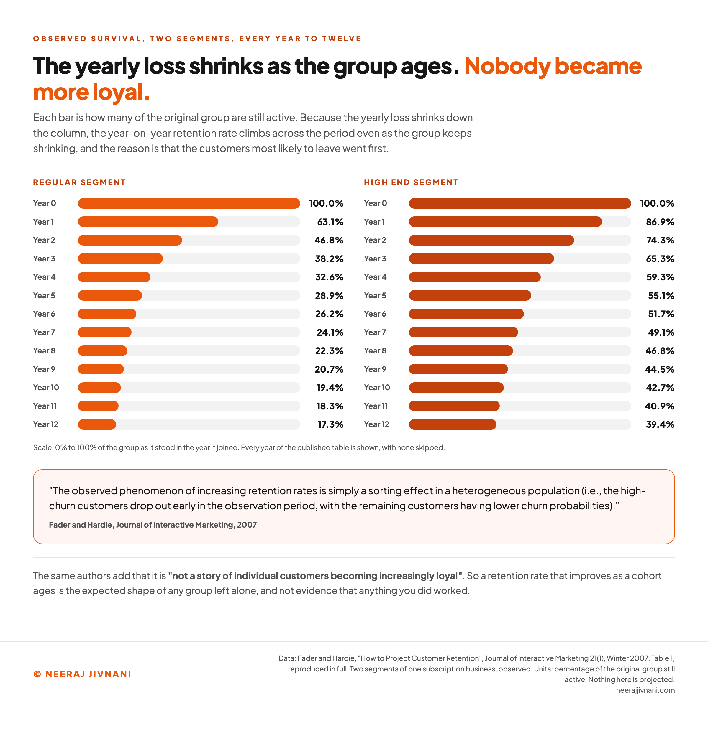
A cohort's retention rate goes up as the cohort ages, and it does so without a single customer becoming more loyal.
The cause is selection, not loyalty. The customers with the highest chance of leaving go first, so the group left behind is made of the people who were always going to stay.
Fader and Hardie named it in the Journal of Interactive Marketing in 2007: the rise is "a sorting effect in a heterogeneous population", where "the high-churn customers drop out early in the observation period, with the remaining customers having lower churn probabilities".
Their published survival data shows how big the effect is. Two segments of one subscription business, followed from the year they joined:
| Years since joining | Regular segment still active | High End segment still active |
|---|---|---|
| 0 | 100.0% | 100.0% |
| 1 | 63.1% | 86.9% |
| 2 | 46.8% | 74.3% |
| 3 | 38.2% | 65.3% |
| 4 | 32.6% | 59.3% |
| 5 | 28.9% | 55.1% |
| 6 | 26.2% | 51.7% |
| 7 | 24.1% | 49.1% |
| 8 | 22.3% | 46.8% |
| 9 | 20.7% | 44.5% |
| 10 | 19.4% | 42.7% |
| 11 | 18.3% | 40.9% |
| 12 | 17.3% | 39.4% |
Read down either column and the yearly loss shrinks, steeply at first and then barely at all. The Regular segment falls from 100% to 63.1% in the first year, and from 18.3% to 17.3% between the eleventh and the twelfth.
The falling column is the share of the original group. The rate that rises is a different division, each year's survivors over the year before, and it climbs as those losses shrink.
So a rising rate is not evidence that anything you did worked. It is the expected shape of any cohort left alone.
That is also the honest answer to what a good retention rate is. It depends on the window and on how old the cohort is, and a published industry average with no edition on it cannot tell you.
One cohort, period by period
Put in how many of one group that arrived together were still active at the end of each period. It does the division the section above leaves to you: the survivors this period over the survivors last period, and the same group against the size it started at.
| years since joining | Still active | Retention rate for the year | Share of the original group |
|---|---|---|---|
| 1 | 63.1% | 63.1% | |
| 2 | 74.2% | 46.8% | |
| 3 | 81.6% | 38.2% | |
| 4 | 85.3% | 32.6% | |
| 5 | 88.7% | 28.9% | |
| 6 | 90.7% | 26.2% |
The rate per year went from 63.1% to 90.7%, while the group fell to 26.2% of what it was. Two lines moving in opposite directions is the sorting effect, not a cohort becoming more loyal. The customers with the highest chance of leaving went first.
A rising rate is not evidence that anything you did worked. The question worth asking is whether this cohort is above the one before it at the same age.
Seeded with the Regular segment of Fader and Hardie, Journal of Interactive Marketing, 2007, as printed above. Every figure here is one division on the numbers in the boxes, and nothing is projected forward.
What Happens If You Project the Curve Forward
Project that curve forward with a regression, which is what a data-mining textbook of the period did, and it breaks in both directions.
Fitted on the first seven years of the High End segment, a linear model underestimates year twelve survival by 81%, and a quadratic one overestimates it by 92%, in the same 2007 paper.
Use this chart — embed code and citation
<a href="https://neerajjivnani.com/blog/customer-retention/"><img src="https://neerajjivnani.com/infographics/customer-retention/sorting-effect.png" alt="Two columns of horizontal bars reproducing every year of Fader and Hardie's 2007 survival table, the Regular segment falling from 100.0% to 63.1% after one year and on to 17.3% by year twelve, beside the High End segment falling from 100.0% to 86.9% and on to 39.4%, with no year skipped so the shrinking yearly loss is visible down the column, and a quoted panel naming the cause as a sorting effect rather than growing loyalty." width="1200"></a>
<p>Chart: <a href="https://neerajjivnani.com/blog/customer-retention/">Neeraj Jivnani</a></p>Neeraj Jivnani, "What Customer Retention Is, How the Rate Is Calculated, and What Moves It", neerajjivnani.com, https://neerajjivnani.com/blog/customer-retention/Free to republish with a link back to this page.
Why Customers Say They Leave, When Somebody Asks Them
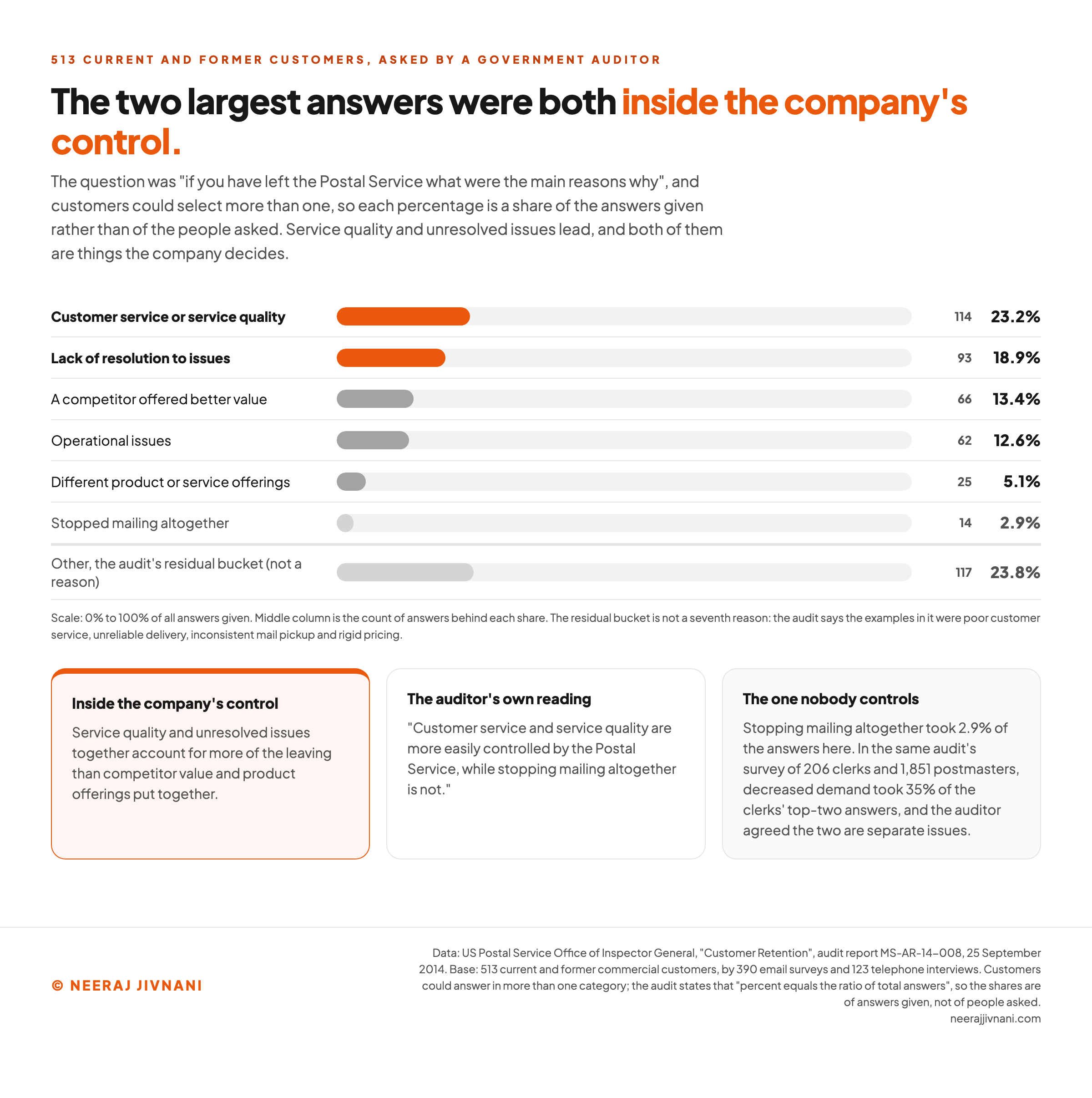
When somebody asks departing customers why they went, the top two answers tend to be things the company could have fixed.
The fullest public count comes from a 2014 Postal Service inspector general audit of 513 current and former customers. It sent 6,632 surveys to the commercial customers whose revenue was falling fastest, received 390 back, and added 123 telephone interviews.
Customers could name more than one reason, so the percentages below are shares of the answers given rather than of the people asked.
These are the counts as the audit published them.
| Reason given for leaving | Respondents | Share of answers |
|---|---|---|
| Customer service or service quality | 114 | 23.2% |
| Lack of resolution to issues | 93 | 18.9% |
| A competitor offered better value | 66 | 13.4% |
| Operational issues | 62 | 12.6% |
| Different product or service offerings | 25 | 5.1% |
| Stopped mailing altogether | 14 | 2.9% |
| Other reasons given | 117 | 23.8% |
The last row of that table is not a seventh reason. It is a residual bucket.
The seven things the audit puts in it are poor customer service, unreliable delivery, inconsistent mail pickup, rigid pricing, easier shipping with a competitor, poor scanning and a difficult claims process.
The Half You Can Do Something About
Two things in that table are worth sitting with. The first is that service quality and unresolved issues together account for more of the leaving than competitor value and product offerings put together.
The second is the stopped-mailing row. Only 2.9% of the answers named stopping mailing altogether, which is the one reason on the list a mail service could do nothing about.
The auditor read it the same way, noting that customer service and service quality "are more easily controlled by the Postal Service, while stopping mailing altogether is not".
That is the useful way to read a churn list. Sort the reasons into the ones you can act on and the ones you cannot, because in this count the actionable half was the bigger one.
The Employees Answered a Different Way
The same audit put the question to the people who deal with those customers, and got a different order back.
It surveyed 206 bulk mail entry unit clerks and 1,851 postmasters and Consumer and Industry Contact managers on why customers had left in the past two years.
Of the answers the clerks ranked first or second, 35% were decreased demand for mailing and shipping services and 25% were better service quality from a competitor. For the postmasters the order flipped, with competitor service quality at 27% and decreased demand at 21%.
That gap is worth knowing before you build anything on either list. When management objected that stopping mailing and decreased demand were being treated as one thing, the auditor agreed in writing that they are two separate issues.
So the customer survey settles what departing customers say, and it does not settle how much of the leaving is demand rather than service. Two surveys in one document, and they do not agree.
Use this chart — embed code and citation
<a href="https://neerajjivnani.com/blog/customer-retention/"><img src="https://neerajjivnani.com/infographics/customer-retention/why-they-left.png" alt="Horizontal bars of the six reasons 513 current and former Postal Service customers gave in the 2014 inspector general audit, each percentage a share of the answers given, with customer service at 23.2% and lack of resolution at 18.9% picked out in orange as inside the company's control, competitor value at 13.4%, operational issues at 12.6% and product offerings at 5.1% below them, stopping mailing altogether at 2.9%, and the audit's 23.8% residual bucket set apart underneath as not a reason of its own." width="1200"></a>
<p>Chart: <a href="https://neerajjivnani.com/blog/customer-retention/">Neeraj Jivnani</a></p>Neeraj Jivnani, "What Customer Retention Is, How the Rate Is Calculated, and What Moves It", neerajjivnani.com, https://neerajjivnani.com/blog/customer-retention/Free to republish with a link back to this page.
The Retention Campaign That Talks People Into Leaving
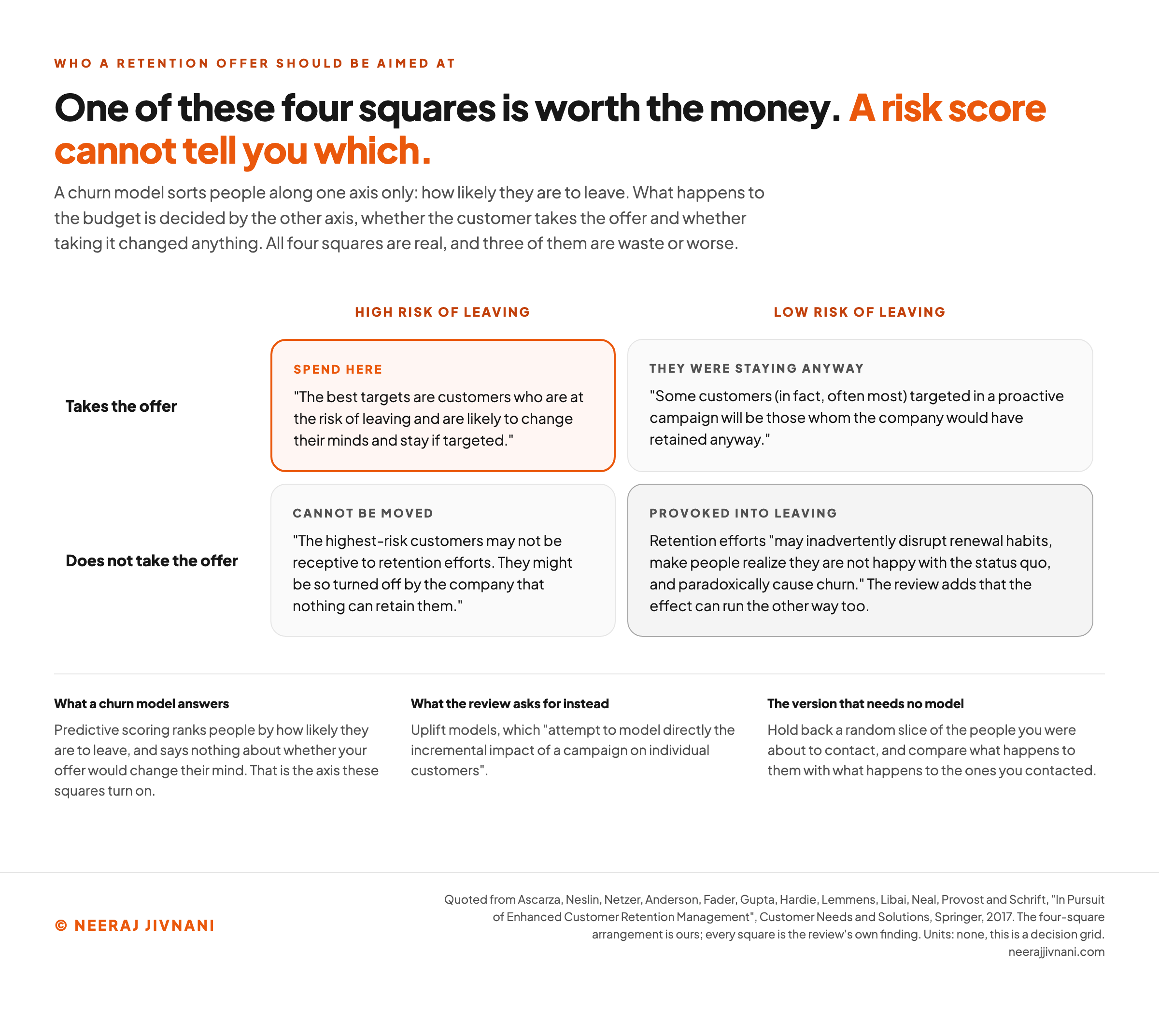
A retention campaign can produce churn it would not otherwise have had, and the people it is usually pointed at are the ones least able to respond to it.
Take the targeting first. A churn model ranks people by how close they are to going, and someone who has already decided to go is not persuaded by a discount.
So the budget lands where it cannot move anything.
At the far end of the ranking is the customer a 2017 review in Customer Needs and Solutions says might be "so turned off by the company that nothing can retain them".
That is the wasted half. The half that costs money is the opposite case, where an offer pushes out a customer who would otherwise have stayed.
The mechanism is habit. A renewal running on autopilot gets interrupted, and retention offers may "disrupt renewal habits, make people realize they are not happy with the status quo, and paradoxically cause churn", in the review's words.
The provocation is the half that was measured, in a 2016 field experiment in the Journal of Marketing Research that tested proactive churn prevention by recommending customers a different plan.
The same passage allows that the effect can run the other way, with a delighted non-churner ending up more loyal, and says the field has not yet unpacked which way it goes.
Who Is Worth the Offer, and Who Is Better Left Alone
Target on effect, not on risk level. The customer worth an offer is the one who is at risk and would change their mind, which is a different question from the one a churn model answers.
Predictive scoring ranks people by how likely they are to leave. It says nothing about whether your offer would move them, which is why a score is a different object from a behavioral segment: one tells you who to spend on, the other tells you what to say.
Uplift models are the ones built for that second question: they "attempt to model directly the incremental impact of a campaign on individual customers", as the review puts it, which is what you need before you spend.
Run a campaign on the risk score alone and the budget goes to people who were leaving anyway and people who were staying anyway.
The second group is usually the bigger one: "some customers (in fact, often most) targeted in a proactive campaign will be those whom the company would have retained anyway", the review reports.
The cheap version of this needs no model at all. Hold back a random slice of the people you were about to contact, and compare what happens to them with what happens to the ones you contacted.
Without that holdout you cannot tell a campaign that saved accounts from a campaign that talked to accounts nobody was going to lose.
Use this chart — embed code and citation
<a href="https://neerajjivnani.com/blog/customer-retention/"><img src="https://neerajjivnani.com/infographics/customer-retention/target-on-effect.png" alt="A two-by-two grid of churn risk against whether the customer takes the retention offer, with the high-risk taker marked as the only square worth spending on, the low-risk taker marked as a customer the company would have retained anyway, the high-risk refuser marked as someone no offer can move, and the low-risk refuser marked as a habitual renewer the offer can provoke into churning." width="1200"></a>
<p>Chart: <a href="https://neerajjivnani.com/blog/customer-retention/">Neeraj Jivnani</a></p>Neeraj Jivnani, "What Customer Retention Is, How the Rate Is Calculated, and What Moves It", neerajjivnani.com, https://neerajjivnani.com/blog/customer-retention/Free to republish with a link back to this page.
The Tactic List, and Which Parts Hold Up
The tactics themselves are not in dispute. What decides whether the money works is which one you start with.
Only the first here rests on a named sample. The rest are convention, ordered by how much of the leaving they act on:
- Fix service and resolution first. The two reasons the audited group cited most often were service quality and unresolved issues, and both sit inside the company's control.
- Close the loop on feedback so the customer sees it. Collecting a score changes nothing on its own. What people leave over is the issue nobody resolved, and resolution is the thing to measure.
- Onboarding and customer education. Someone who never reached the point where the product becomes useful has nothing to be retained by. This acts on the first period, which is where the survival table above shows the biggest loss.
- Dedicated account management, for the accounts that carry it. A single point of contact removes the reason to go looking elsewhere when something breaks. It is expensive per account, so it belongs to the accounts whose value pays for it.
- Self-service, live support and flexible billing. These are the three places a small friction turns into a cancellation, and the failed payment behind involuntary churn is the version nobody counts.
- Loyalty and reward schemes. Widely used and the hardest of these to evaluate, because the people who join one tend to be the people who were already staying.
- Community and personalization. Both work on the reasons people stay rather than the reasons they leave, which makes them slow to show up in a number.
- The tooling underneath. A customer relationship management system or an analytics platform holds the record that makes any of this measurable. It decides nothing about where the money goes, which is the decision every item above turns on.
The Five Factors Question
There is no canonical set of five factors. The lists that circulate are each a different company's five, and none of them cites a standard.
If you want the five, they are service quality and how fast an issue gets resolved, onboarding, feedback the customer can see a result from, loyalty schemes and personalization. Service leads because it is the one departing customers named for themselves.
Getting a Former Customer Back Is a Different Job
Getting a former customer back is a different program from keeping one, with its own list, its own offer and its own rate.
The first thing to check is whether anybody owns it at all.
The 2014 Postal Service audit found that agency's retention strategy "does not include a process to contact former customers", and that 94% of the customers surveyed said nobody contacted them when they reduced or stopped their business.
The economics are better than they look. A company is twice as likely to win a former customer back as to win a new one, on research that same audit cites.
Offboarding belongs here too. What happens in the cancellation flow decides whether a customer leaves as someone who might return or as someone who will not.
There is a reporting consequence as well. A returning customer is not in the cohort you were tracking, so a win-back program can work without moving the rate you report.
The list to build is short. Everyone who left in the last twelve months, why they left where you know it, and what has changed since.
Retention Programs That Left a Public Record
Most of what gets published as a retention case study is a company's own account of its own success, which tells you what it wants to be known for and not whether the program worked.
The ones worth studying are the ones an outsider wrote down, and the fullest public record here belongs to the United States Postal Service.
In fiscal 2012 the Postal Service began laying the foundation for a retention program on the standard pattern. The Sales group reorganized around retention, and a Business Customer Intelligence team built a model to predict which customers it risked losing.
In fiscal 2013 a pilot fed that model's output to seven of the 67 district offices and two specialized call centers. Those made proactive contact with a prioritized list of at-risk customers each month.
The plan was to take it to the remaining 60 districts in fiscal 2014.
That is a risk-targeted campaign built exactly as the intuition says, and it is the shape the 2017 review questions.
The audit did not find that the model was wrong. It found that departments were not sharing what they knew about customers at risk, and that nobody was contacting the ones who had already gone.
Chewy's Refund and Starbucks Rewards
Two examples are worth pulling apart, because what stands behind them is not the same.
Chewy is the first. A customer asked to return dog food after her dog died, and the company told her to keep it and donate it to a shelter, refunded her in full and sent flowers, in a 2022 Today report that Zoom's guide relays.
Starbucks Rewards is the other, and the number there is the company's own: it attributes as much as 40% of total sales to the scheme, on 2019 figures relayed by Zoom's guide.
The part worth copying there is not the discount. The scheme runs through an app that also takes payment and lets people order ahead, so the reward and the convenience arrive together and cannot be separated in that number.
Measure It Honestly, Then Spend Where It Moves Something
Retention is measured before it can be managed, and the measurement has to be honest about what it cannot tell you.
Fix the window, the unit and the cohort, and publish all three next to the number. A rate with no window on it is not something anyone can act on.
Expect the rate to rise as a cohort ages, and do not book that as a win. The question worth asking is whether this cohort is above the one before it at the same age.
Spend the budget where it changes an outcome rather than where the risk score is highest. The cheapest way to find out which is which is a holdout.
And start from the reasons people give. Service quality and unresolved issues were the two largest answers in that audit of 513 current and former customers, and both were things the company could have changed.
Retention work goes wrong in two places, and neither of them is the tactic list. The number gets read without its window, and the money gets aimed at the risk score instead of at the people it could move.