What Scannability Is, and How Short a Paragraph Has to Be
Your reader is hunting, not reading. See which change makes your page faster to search, and the paragraph sizes three organizations publish.

/ On this page9 sections
Somebody landed on your page looking for one thing. They are hunting for it rather than reading toward it, and most of what you wrote is in their way.
Scannability is how fast they find it. Raising it is mostly a matter of taking things away, and the sizes that decide when a paragraph is short enough are published in three places.
Cut, then front-load, then format, and the sequence is the part that gets skipped.
Scannability Is a Search, Not a Read
Scannability is how quickly somebody can find one specific thing on your page without reading the rest of it.
That measures the page, not the writing. A page can be clear, well argued and a pleasure to read, and still be slow to search.
Think of what the reader is doing as a query. They arrived with a question, and your page is the index they have to run it against.
Three words get used as though they mean the same thing, and keeping them apart is worth two minutes.
- Legibility is whether the letters resolve. Contrast, type size, line length. A reader either can make out the words or cannot.
- Readability is whether a sentence carries once they have started it. Vocabulary, sentence shape, how much they have to hold in their head.
- Scannability is whether they can find the sentence at all without reading the ones around it.
They come apart in practice. A page of short, plain, beautifully written prose with no headings in it is readable and close to unsearchable.
The reverse happens more often. A page chopped into headings and bullets, each one saying almost nothing, is fast to scan and empty when you get there.
Skimmability is the closest thing to a synonym, and the two get used interchangeably. If there is a shade between them, scanning is looking for something specific and skimming is looking for the gist.
Why Reading Stopped Being the Default
Reading stopped being the default because your reader arrived with a question rather than with an hour.
The behavior has been measured since the web was young. Nielsen Norman Group's 1997 study of how people read online found that 79 percent of its test users always scanned any new page they came across, and 16 percent read word by word.
Two things about that figure are worth holding onto.
It is old, and it has not aged the way you might expect. Screens got better and pages got longer, and neither change gives anybody more time.
And it was never a complaint about readers. Scanning is the correct behavior for somebody who has ten tabs open and one question, and a page that punishes it is arguing with its own audience.
What follows from that is less obvious than "use bullet points".
If the reader is running a search, the page is competing with the back button rather than with boredom.
They are not deciding whether your writing is good. They are deciding whether their answer is in here, and leaving costs them nothing.
Holding attention is the wrong target. The target is a page where somebody who has not agreed to look hard can still land on their answer.
What a Reader Is Doing While They Scan
A scan is not one behavior, and which one you get is set by the job the reader came to do.
Three Jobs, Not One Behavior
There are three jobs, and they want different things from the same page.
- Finding a known thing. They already know what they are looking for, a price, a date, a command, a name. They are pattern-matching against a shape, and they will ignore everything that is not it.
- Judging whether the page is worth it. They do not know what is here yet. They are sampling, mostly near the top and mostly down the left, to decide whether to invest.
- Reading properly. They have decided, and they are reading in order like the page assumed all along.
Why You Do Not Get to Choose
Each of those jobs has a name in the field, and the names describe what the reader is doing rather than how your page is laid out.
Judging a page produces the F-shape, heavy along the first lines and then down the left edge. Reading it properly is the commitment pattern.
Finding a known thing splits into two, which is the part worth having. Hunting for a value produces the spotted pattern, where the eye crosses the page looking for the thing itself.
Hunting for a section is the layer-cake, hopping from heading to heading and dipping in once one matches.
You do not choose which of these happens. The reader's job chooses it, and the same person will run several of them on one page inside a minute.
That has one practical consequence. A page built for the F-shape alone serves the reader who is deciding and abandons both kinds of hunter, because one of them hunts on headings and the other hunts on the shape of the thing.
Build for all three and you are back to the same short list: things the eye can land on, an answer under each one, and nothing in between that has to be read.
Cutting Beats Formatting
The formatting techniques do not all help the same amount.
There is an order, and the first move is not a formatting move at all. Deleting outranks anything you can do with bold.
Cut What They Did Not Come For
Deleting is the strongest single thing you can do to a page. It is also the move that feels like losing work, which is why it goes undone.
The arithmetic is simple. Every word between the reader and their answer is a word they have to skip, so removing one beats making it easier to skip.
The same Nielsen Norman Group work that produced the 79 percent figure rewrote one promotional site four ways and scored each rewrite against it.
The version that was cut shorter measured 58 percent more usable than the promotional original. The version marked up for scanning measured 47 percent more usable.
Marking up the page helped. Writing less helped more.
So start by asking what the reader did not come for. The history of the category, the paragraph explaining why the topic matters, the throat-clearing sentence announcing what the next section covers.
None of that survives contact with somebody who arrived with a question.
The test is blunt. Delete a sentence and read the paragraph again.
If nothing was lost, it was never doing anything, and formatting it would have been decoration on top of a passenger.
Put the Answer in Front of the Explanation
Second move, and it costs nothing but a rewrite: lead every section with its answer, then explain.
A scanner reads the first few words of a block and decides from them. Put the conclusion at the end and they will never reach it, because the sentence that would have earned their attention is behind the one that did not.
The rule goes further down the page than it first looks. Headings answer rather than label, so "How to Authenticate" beats "Authentication".
The first words of a paragraph carry the point, and the first words of a bullet do too, because a bulleted list is scanned down its left edge like everything else.
News writing settled on this a century ago for a reason a web page inherits directly. It is the only structure that degrades well, because a reader who stops after one line still got something.
Then Mark the Page
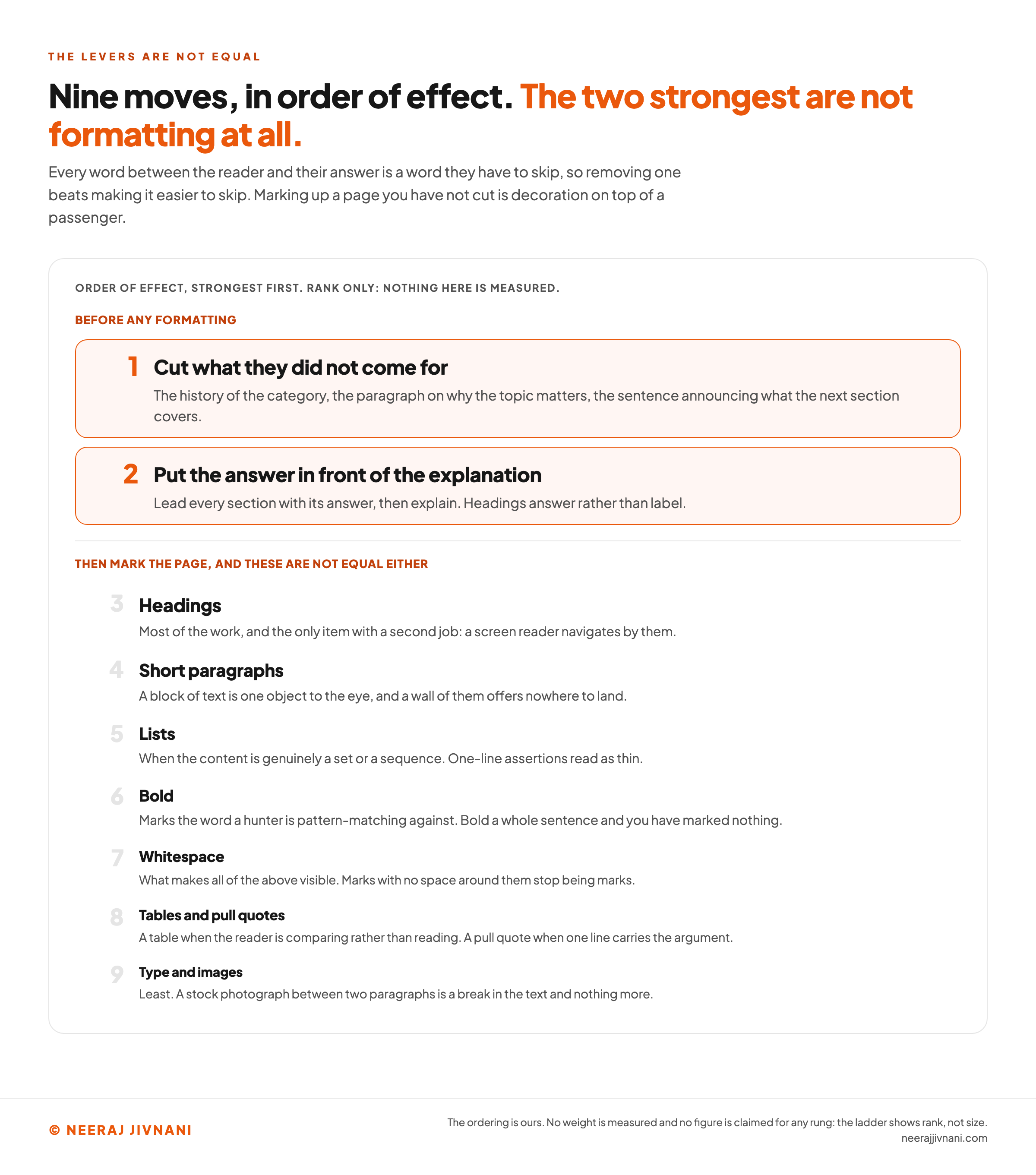
Now format, and in this order, because they are not equal either.
- Headings do most of the work, and they are the only item here with a second job. A screen reader navigates a page by its headings, so good ones serve a sighted scanner and a reader who cannot see the page at all.
- Short paragraphs come next. A block of text is a single object to the eye, and a wall of them offers nowhere to land.
- Lists work when the content is genuinely a set or a sequence. A list of one-line assertions reads as thin, because a bullet that carries no claim has nothing under it to find.
- Bold marks the word a hunter is pattern-matching against. Bold a whole sentence and you have marked nothing.
- Whitespace is what makes all of the above visible. Marks with no space around them stop being marks.
- Tables are worth reaching for when the reader is comparing rather than reading, and a pull quote is worth it when one line carries the argument.
- Type and images matter least. A heading in a different weight helps. A stock photograph between two paragraphs is a break in the text and nothing more.
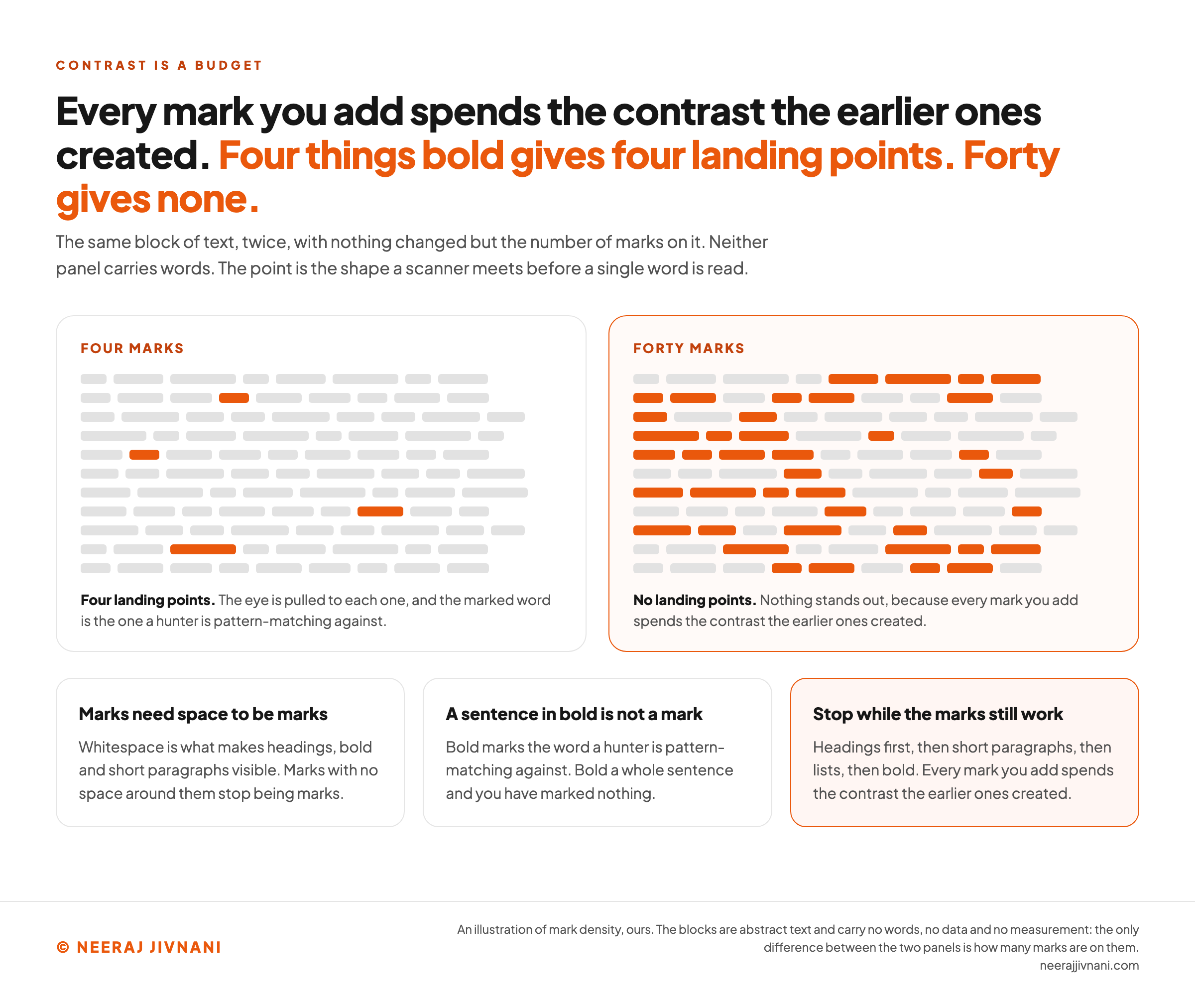
One caution about the last few. Every mark you add spends the contrast the earlier ones created.
A page where four things are bold has four landing points. A page where forty things are bold has none.
Use this chart — embed code and citation
<a href="https://neerajjivnani.com/blog/scannability/"><img src="https://neerajjivnani.com/infographics/scannability/the-first-two-moves-are-not-formatting.png" alt="A ranked ladder of nine moves under an axis reading order of effect, strongest first, rank only, nothing here is measured. The top two rungs sit in orange boxes under the band before any formatting: cut what they did not come for, which names the history of the category, the paragraph on why the topic matters and the sentence announcing what the next section covers, and put the answer in front of the explanation, which says to lead every section with its answer and to make headings answer rather than label. Below a dividing rule, a band reading then mark the page, and these are not equal either carries seven more rungs drawn in descending type size: headings, short paragraphs, lists, bold, whitespace, tables and pull quotes, and type and images, each with one line saying what it does and where it stops working." width="1200"></a>
<p>Chart: <a href="https://neerajjivnani.com/blog/scannability/">Neeraj Jivnani</a></p>Neeraj Jivnani, "What Scannability Is, and How Short a Paragraph Has to Be", neerajjivnani.com, https://neerajjivnani.com/blog/scannability/Free to republish with a link back to this page.
Use this chart — embed code and citation
<a href="https://neerajjivnani.com/blog/scannability/"><img src="https://neerajjivnani.com/infographics/scannability/every-mark-spends-the-contrast.png" alt="Two panels showing the same abstract block of text, drawn as eleven rows of small grey bars standing in for words, with nothing different between them but the number of bars colored orange. The left panel, labeled four marks, has four orange bars sitting far apart, and reads four landing points, because the eye is pulled to each one and the marked word is the one a hunter is pattern-matching against. The right panel, labeled forty marks, has orange bars scattered through every row, and reads no landing points, because every mark you add spends the contrast the earlier ones created. Three cards underneath say that marks need space around them or they stop being marks, that bold marks the word a hunter is pattern-matching against so bolding a whole sentence marks nothing, and that the order runs headings, short paragraphs, lists, then bold." width="1200"></a>
<p>Chart: <a href="https://neerajjivnani.com/blog/scannability/">Neeraj Jivnani</a></p>Neeraj Jivnani, "What Scannability Is, and How Short a Paragraph Has to Be", neerajjivnani.com, https://neerajjivnani.com/blog/scannability/Free to republish with a link back to this page.
How Short Is Short
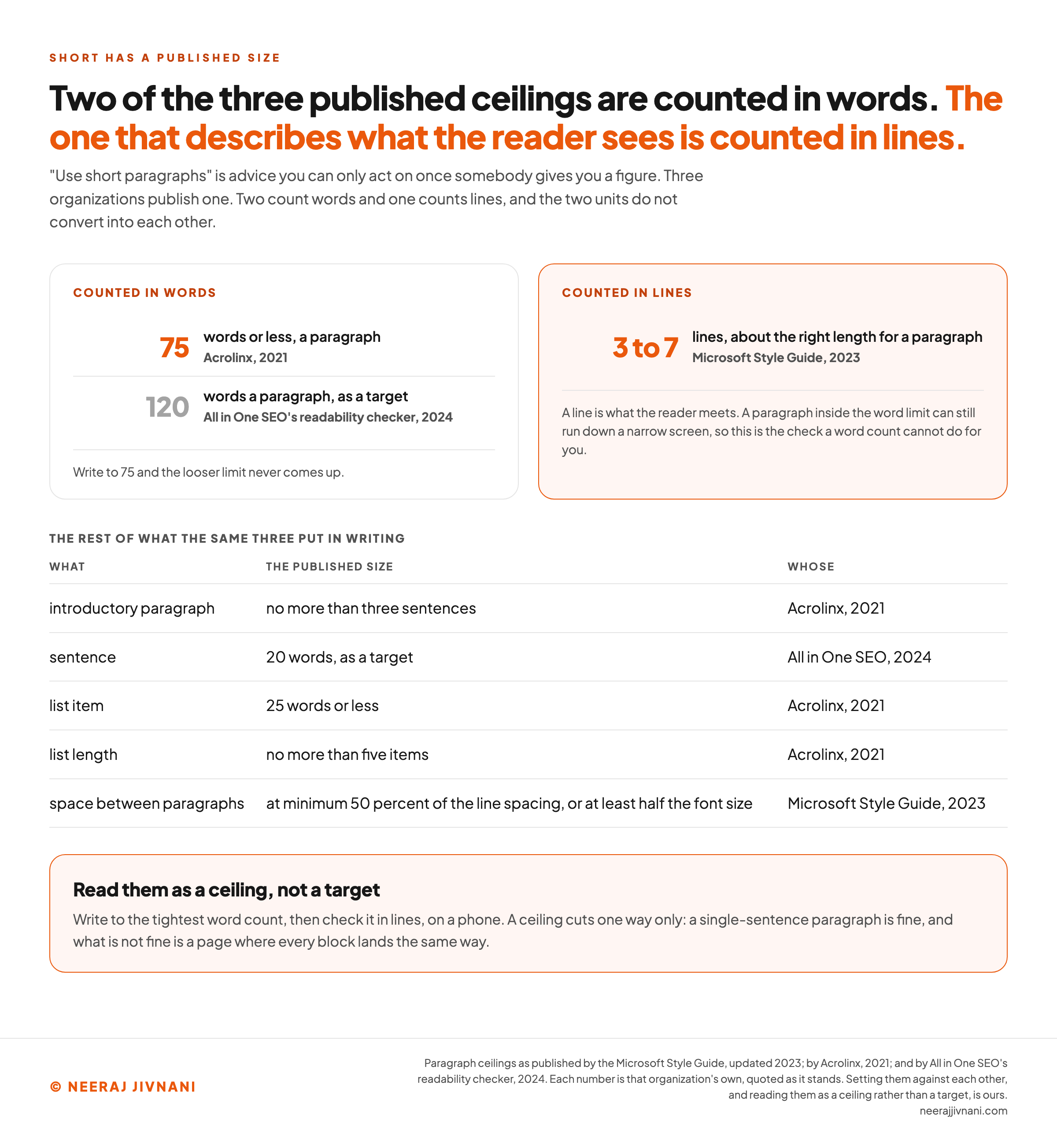
Short enough is 75 words a paragraph, or three to seven lines, and neither number is ours.
"Use short paragraphs" is advice you can only act on once somebody gives you a figure. Three organizations publish one, and sooner or later one of them is the standard you get held to.
The Three Published Sizes
Here is what each of them puts in writing.
| what | the published size | whose |
|---|---|---|
| paragraph | three to seven lines | Microsoft Style Guide, 2023 |
| paragraph | 75 words or less | Acrolinx, 2021 |
| paragraph | no more than 120 words | All in One SEO, 2024 |
| introductory paragraph | no more than three sentences | Acrolinx, 2021 |
| sentence | 20 words, as a target | All in One SEO, 2024 |
| list item | 25 words or less | Acrolinx, 2021 |
| list length | no more than five items | Acrolinx, 2021 |
| space between paragraphs | at minimum 50 percent of the line spacing, or at least half the font size | Microsoft Style Guide, 2023 |
The Microsoft Style Guide, the rule its own writers work to, says in its 2023 revision that three to seven lines is about the right length for a paragraph. It adds that it is fine to have a single-line paragraph now and then.
Acrolinx, whose software checks enterprise content against exactly this kind of rule, published tighter ones in 2021.
Paragraphs kept to 75 words or less, introductory paragraphs no longer than three sentences, list items at 25 words or less, and lists of no more than five items.
All in One SEO (AIOSEO), a WordPress plugin, sits at the loose end. Its readability checker, as its guidance stood in 2024, targets no more than 120 words a paragraph, sentences of 20 words, and suggests a subheading for any passage running past 300.
What to Do With Three Different Numbers
Read them as a ceiling rather than as a target, and the spread stops mattering.
Write to the tightest word count. A paragraph under 75 words is inside the strictest of the two word limits, so the looser one never comes up and you never have to find out which standard your reader's employer bought.
Then check it in lines, on a phone. Words and lines are different units, and a paragraph that passes on a word count can still run down a narrow screen. Microsoft's measure catches that, because a line is the unit the reader meets on the page.
Do not skip the spacing number. Half the line spacing between paragraphs, at minimum. Short paragraphs pressed together read as one block, and you have spent the cutting for nothing.
A ceiling cuts one way only. A single-sentence paragraph is fine.
What is not fine is a page where every block lands the same way. A run of identical paragraphs reads as though a machine wrote it, and the fix is always to make one shorter.
Use this chart — embed code and citation
<a href="https://neerajjivnani.com/blog/scannability/"><img src="https://neerajjivnani.com/infographics/scannability/two-units-that-do-not-convert.png" alt="Two panels setting the published paragraph ceilings against each other by unit. The left panel, counted in words, carries 75 words or less from Acrolinx in 2021 and no more than 120 words a paragraph as a target, from All in One SEO's readability checker in 2024, with a note that writing to 75 means the looser limit never comes up. The right panel, counted in lines and outlined in orange, carries three to seven lines from the Microsoft Style Guide as updated in 2023, with a note that a line is what the reader meets and that a paragraph inside the word limit can still run down a narrow screen. A table underneath lists the rest of what the same three put in writing: an introductory paragraph of no more than three sentences, a sentence target of 20 words, list items of 25 words or less, lists of no more than five items, and space between paragraphs of at minimum 50 percent of the line spacing or at least half the font size, each row carrying its publisher and year. A closing panel reads them as a ceiling rather than a target." width="1200"></a>
<p>Chart: <a href="https://neerajjivnani.com/blog/scannability/">Neeraj Jivnani</a></p>Neeraj Jivnani, "What Scannability Is, and How Short a Paragraph Has to Be", neerajjivnani.com, https://neerajjivnani.com/blog/scannability/Free to republish with a link back to this page.
A Test You Can Run on Your Own Page in Five Minutes
The proper way to check this is to watch somebody use the page. That costs recruiting, a script and an afternoon, which is not what one person writing one page has.
You can approximate it alone in about five minutes.
Three Passes Over Your Own Page
The three find different things, so run all of them.
- Read only the headings, top to bottom. If that sequence does not say what the page covers and roughly what it concludes, your headings are labels rather than answers, and a layer-cake reader will never find the section they want.
- Read only the first line of every paragraph. This is close to what an F-shape reader gets. If the argument falls apart, your conclusions are sitting at the ends of blocks where nobody meets them.
- Squint at it. Step back until the words go fuzzy and only shape is left. A page that blurs into one grey rectangle has no way in, and a page that blurs into scattered marks has no hierarchy.
The Question That Decides It
Then one question, and it decides more than the three passes do.
Pick the single thing a reader comes to that page for, and time how long it takes to find. If you cannot get to it in a few seconds on your own page, nobody arriving cold will.
Doing this yourself has one advantage and one catch. You can run it today, on every page you own, and again after every edit.
The catch is that you know where everything is, which is why the squint pass is in there. It is the only one your familiarity cannot fake.
What a scanner gets back
Paste a page you own. Each pass takes something away and hands back what is left. The three find different things, so run all of them.
Nothing leaves your browser. A line starting with # is treated as a heading; everything else is a paragraph.
Nothing pasted yet. The passes run on whatever you put above.
When a Page Should Not Be Scannable
Scannability is not free, and a few kinds of page are made worse by it.
The cost is that everything you do to help a scanner tells the reader it is safe to skip.
Headings say there is a summary here. Bullets say these items do not need connecting.
Short paragraphs say you can leave at any time.
When the reader came to find something, that is a service. When they came to be convinced, moved or taken through an argument, it is you undoing your own work.
Three Pages to Leave Alone
Three cases where the answer is no, or not much.
- Narrative. A story, a piece of reporting, a personal essay. The reader agreed to go in order, and the point usually arrives last, which is the one structure scanning destroys.
- An argument that has to be followed. A case built step on step is not a set of independent claims, and bulleting it is a lie about its shape. Prose is doing the connecting work.
- Anything with legal or safety weight. Making terms easy to skip is not a neutral choice, and there are places where a reader skipping is your problem and not theirs.
A page does not have to be one thing throughout. A long piece can carry a scannable summary at the top and unbroken prose underneath, and serve both readers without either one noticing the seam.
The question to ask is what the reader is here to do.
If they came to find, help them find. If they came to follow, do not keep offering them exits.
The Word Itself
Scannability is a real word, spelled with two n's, and the nearest thing to a synonym is skimmability.
Those are the answers. A good share of the people who search this term are asking about the word itself rather than about the practice, which is fair, because it is an ugly word and it looks invented.
Is It Scannability or Scanability?
Two n's. Scannability.
The rule is the ordinary English one for doubling: a single-syllable word ending in one vowel and one consonant doubles that consonant before a suffix that starts with a vowel. Scan gives scanned, scanning, scannable, scannability.
The single-n spelling turns up often enough that it looks like a variant. It is not one, and the same rule that gives you scanning gives you scannability.
Is Scannability a Word?
Yes, in the sense that matters.
It is built the way readability and reliability are built, from an adjective that was itself built from a verb. Nothing about the construction breaks a rule, and nobody reading it has to be told what it means.
What makes it feel invented is that it is young and narrow. Cambridge's English dictionary carries scannable, the adjective, while the noun lives mostly inside content and design work.
That is the ordinary life of a technical word. People needed it before the dictionaries got there.
What Is Another Word for Scannability?
Skimmability is the nearest, and it is not exact.
Readability and legibility get offered as synonyms and they are different properties, which is the whole reason the awkward word survives. There is no single common English word for how quickly a page can be searched, so a clumsy one filled the gap.
If you need to avoid it in a sentence, say the thing instead. How fast somebody can find the one line they are after.
What Does Scannable Mean?
Scannable means able to be taken in without being read in full.
It carries a second sense outside content work, which is able to be read by a machine. A scannable barcode, a scannable document, a scannable form.
That sense is the one you will meet in a hardware manual or a shipping label, and it is worth keeping apart from this one.
On a page, scannable text is text a person can search with their eyes. Same adjective, different scanner.
Write It Shorter, Then Mark It
If you keep one thing, keep the order.
- Cut what the reader did not come for.
- Move the answer to the front of whatever survives.
- Then mark the page so the eye has somewhere to land, headings first, and stop before the marks cancel each other out.
The sizes are there for when you need a ruling rather than a judgment. Write a paragraph shorter than 75 words, then look at it on a phone and count the lines.
Three to seven is the number, in the unit the reader meets.
None of this is about writing less well. It is about arranging what you wrote for somebody who is looking for one thing, has not agreed to read the rest, and will be gone in seconds if they cannot tell their answer is in here.