What a Waterfall Chart Shows, and How to Read One Without Guessing
A waterfall chart explains the gap between two totals by drawing every contribution to it. See what yours tells a reader, and what it leaves out.


/ On this page8 sections
A waterfall chart explains the gap between two totals. It draws the figure you started with, then one bar for every contribution that pushed it up or pulled it down, then the figure you ended with.
The bars in the middle hang in mid-air, which is where the name comes from and why you cannot read one by looking at the bars.
You read it off the labels. Most of what makes a good one follows from that.
What a Waterfall Chart Shows
A waterfall chart shows a running total as values are added or subtracted along the way, which is how Microsoft's Excel documentation puts it. It answers one question: what happened between this figure and that one?
Three things are on the page. A starting bar and a finishing bar, both anchored to the horizontal axis, and between them one floating bar for every contribution.
Each floating bar begins where the one before it ended, climbing from that point if it is an increase and dropping from it if it is a decrease.
Line up several decreases and the bars step downward like water over a ledge.
The running total is the point of the arrangement. At any bar, the height of its upper or lower edge is the total the sequence had reached by that step, so the chart carries the arithmetic as well as the result.
That is what separates it from a column chart. There, every bar rises from zero and no bar has anything to do with its neighbors.
Here each bar depends on the one before it, so moving a bar moves everything to its right.
The Other Names for the Same Chart
The same chart travels under three names, and they describe the same object.
Bridge chart is the usual name in finance, and Microsoft's Excel page uses it too. It ties the name to the look: the opening and closing columns sit on the axis while everything between them floats, a span held up at both ends.
Cascade chart is the other one you will meet. Some writers treat it as a plain synonym; others keep it for a chart that carries subtotals partway through.
Waterfall is the name that stuck, so if somebody hands you a bridge or a cascade, you are looking at this chart.
Reading One, and Why the Labels Do the Work
Read a waterfall chart left to right, off the labels rather than off the bars.
That is not fussiness, and here is the mechanism. Each floating bar begins where its predecessor stopped, so two bars rarely share a starting height. Two contributions of the same size end up drawn at different altitudes.
So your eye is being asked to compare two lengths that do not share a starting line. People are poor at that, and good at the opposite: comparing bars that all rise from the same baseline.
A waterfall chart takes that baseline away by design.
The consequence is worth stating plainly. Above a handful of bars, a waterfall chart with no data labels is not a chart anybody can use. It is a picture of a shape.
Say a chart runs from an opening total to a closing one through six bars, three of them up and three of them down. Two of those bars look identical and are not, and nothing on the page will tell you which is larger.
The bars with the labels off
Six floating bars between an opening and a closing figure, three of them up and three of them down. The figures are invented and the values are hidden. That is the only thing taken away.
Two bars are marked. Which one is larger?
Each floating bar begins where the one before it ended, so two contributions of the same size end up drawn at different altitudes. Your eye is being asked to compare two lengths that do not share a starting line.
Above a handful of bars, a waterfall chart with no data labels is not a chart anybody can use. It is a picture of a shape. Put the value on every bar.
Once the values are printed, reading it is quick. Take the two anchored ends and note the gap between them, because that gap is the thing the chart was built to explain.
Then find the largest bar. That is the driver the chart exists to point at, and on a well-ordered chart it is the reason somebody drew it.
Then check whether the running total crosses zero anywhere in the middle. A sequence that dips below the axis and climbs back tells a different story from one that never does, and it is easy to miss while you are scanning the shape.
What the Connector Lines Are For
Connector lines join the end of each column to the beginning of the next, which is how Microsoft describes them in its instructions for the feature.
Leave them on.
Each line is a visible statement that the next bar begins from this exact total, and that relationship is the one a reader has to hold in mind to follow the chart at all.
Turn them off only when the bars are packed tightly enough that the lines become a grey wash. That is a judgment about one chart, not a rule.
What People Use It For
Reach for a waterfall chart when somebody has asked why a number moved, and the answer is a list of things rather than a single cause.
The shape of the question is always the same: two totals, and a set of contributions that explain the distance between them.
That covers most of the finance reporting you will see it in:
- A profit and loss walk, from revenue at the left to net income at the right, with each cost category as its own bar.
- Budget against actual, where every bar is the variance on one line rather than the line itself.
- Headcount over a year, opening with the people you had, then hires, transfers and exits, closing with the people you have.
- A price walk, from list price down through discounts, rebates and freight to the net price that reaches you.
Outside finance the same shape turns up wherever a total has to be explained rather than reported: a project budget consumed phase by phase, a pipeline losing volume at each stage, an inventory count that opens, moves and closes.
The common thread is that somebody cares why the number moved. Where nobody is asking that, the running total is doing no work and a simpler chart will do.
The Four Shapes It Turns Up In
Four variants show up often enough to be worth recognizing. Subtotals and stacking change how you build the chart, a variance chart changes the numbers you feed it, and a horizontal layout changes only how it sits on the page.
With subtotals, some bars partway through are anchored to the axis to show the running total at that point, and on a long chart it is the single change that does most for comprehension.
As a variance chart, each bar is a difference rather than a value: budget against actual, forecast against outturn. The chart is identical; the numbers feeding it are not.
Stacked, every bar is divided so you can see which business unit or product line made up that step. It carries more, and it is the variant that most often becomes unreadable.
Horizontal, the bars run left to right instead of bottom to top, a layout decision taken when the category names are too long to sit under vertical columns.
The Order of the Bars Is Yours to Choose
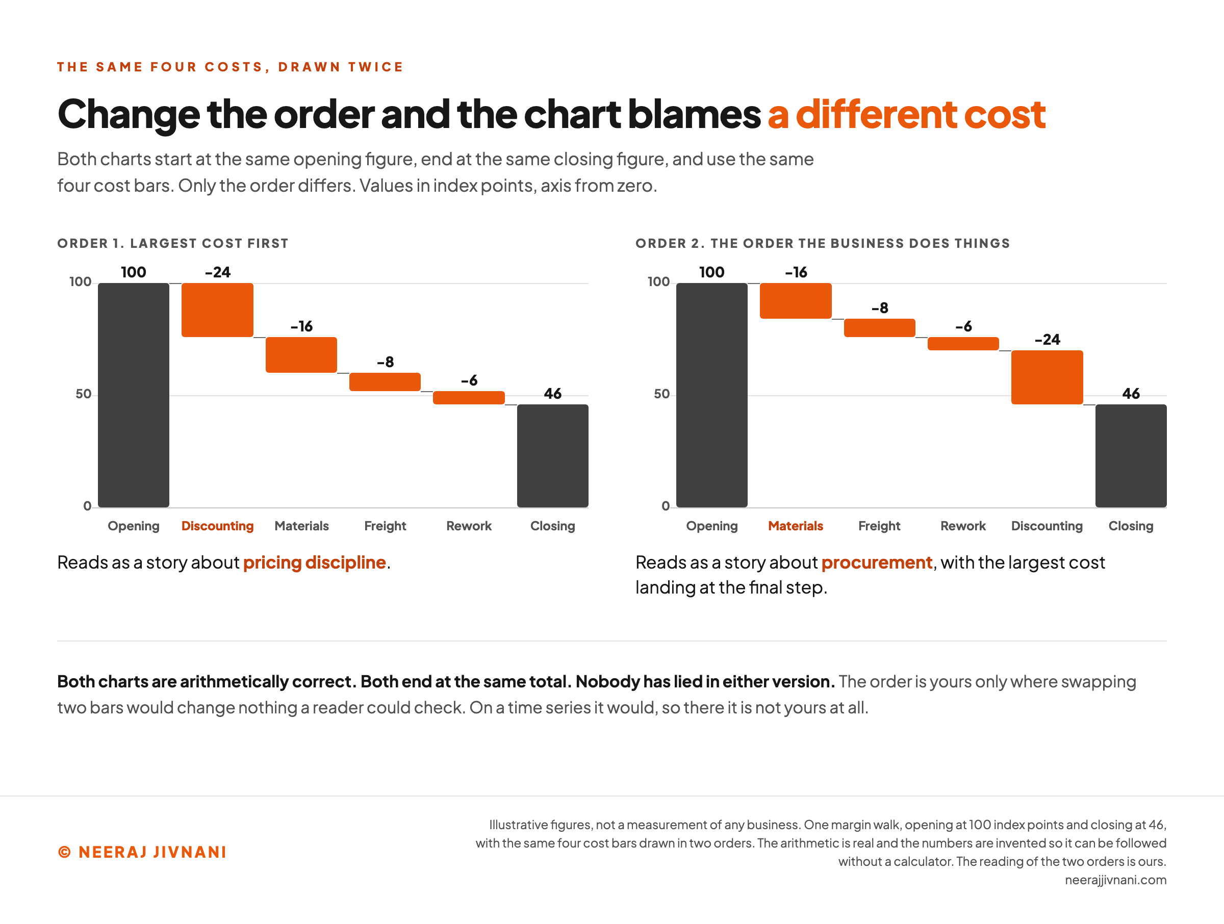
When a waterfall chart breaks one total into its parts, nothing in the data tells you which bar comes first. That decision is yours, and it is the analysis rather than the formatting.
Say a margin walk has four cost bars: freight, discounting, materials and rework. Lead with discounting and the chart is about pricing discipline; lead with materials and the same four bars become a story about procurement.
Both versions are arithmetically correct, both end at the same total, and nobody has lied in either one.
This is why a generic instruction to order your categories logically is not much help. Logical for what? The order should answer the question somebody asked.
Three orderings earn their place, and each answers a different question:
- By size, largest contribution first, when the question is which driver mattered most. This is the default worth reaching for, because it puts the answer where the eye lands first.
- By sign, all increases then all decreases, when the question is whether the gains covered the losses. The turning point becomes visible as a single change of direction.
- By process, in the order the business does things, when the question is where in a sequence the value leaks away.
Whichever you pick, say so on the chart. A subtitle reading "drivers, largest first" costs you nothing and removes the suspicion that the order was chosen to flatter somebody.
When the Order Is Not Yours
A time series settles the order for you.
Re-ordering it is then not a choice, it is a falsehood.
If the bars are quarters, months or stages of a process that genuinely happen in sequence, they go in that sequence. Sorting those by size produces a chart that looks tidier and describes a year that did not happen.
The tell is one question. Ask whether swapping two bars would change anything a reader could check.
On a decomposition the answer is no, so the order is yours to argue with. On a time series the answer is yes, so it is not.
When the order is fixed, the only ordering decision left is where to put the subtotals, and that is worth spending thought on. Subtotals at the end of each quarter turn a long run of bars into four readable chapters.
Use this chart — embed code and citation
<a href="https://neerajjivnani.com/blog/waterfall-chart/"><img src="https://neerajjivnani.com/infographics/waterfall-chart/two-orders-two-culprits.png" alt="Two waterfall charts side by side built from the same four cost bars, both opening at 100 index points and both closing at 46, on an axis running from zero. In the left panel, headed Order 1, largest cost first, the bars fall discounting 24, materials 16, freight 8 and rework 6, and the verdict under it reads that the chart tells a story about pricing discipline. In the right panel, headed Order 2, the order the business does things, the same four bars run materials 16, freight 8, rework 6 and discounting 24, so the largest cost lands at the final step and the verdict reads that the chart tells a story about procurement. The first cost bar in each panel is marked in orange to show which one leads. A line beneath both panels states that the charts are arithmetically correct, end at the same total, and that nobody has lied in either version, and that the order is yours only where swapping two bars would change nothing a reader could check." width="1200"></a>
<p>Chart: <a href="https://neerajjivnani.com/blog/waterfall-chart/">Neeraj Jivnani</a></p>Neeraj Jivnani, "What a Waterfall Chart Shows, and How to Read One Without Guessing", neerajjivnani.com, https://neerajjivnani.com/blog/waterfall-chart/Free to republish with a link back to this page.
Building One in Excel
Excel has the chart built in, and the whole job is four steps.
- Lay out two columns. Category names in the first, values in the second, with decreases entered as negative numbers. Put the opening and closing totals in as their own rows.
- Select both columns, then choose Insert and pick Waterfall from the chart menu.
- Mark the totals. The first chart will draw your opening and closing figures as floating bars, which is wrong. Click once to select the whole series, then again to select the single total bar, then right-click it and pick Set as Total.
- Turn on data labels, and check that every bar carries its value.
Step three is the one people miss, and skipping it leaves the two figures that anchor the chart hanging in mid-air with everything else. Microsoft documents that box as the thing that makes a value start on the horizontal axis at zero instead of floating.
Everything after that is formatting. Color, the connector lines and the axis arrive with a default, the order arrives from your rows, and none of those defaults is a decision.
The Same Chart in Google Sheets
Google Sheets carries the chart type as well, and the data goes in the same shape. Select the cells, click Insert and then Chart, and pick Waterfall under Chart type in the Setup panel.
Google's help page sets out the layout: a label for each row in the first column, which becomes the horizontal axis, numeric data in the other columns, and one row per bar.
Everything you then need sits behind the Customize panel. Connector lines are under Chart style, and subtotals and data labels are together under Series.
One thing Sheets does that a spreadsheet chart often will not: enter two or more columns of numeric data and you can choose to show them sequentially or stack them, which is the stacked variant without any workaround.
What a Waterfall Chart Should Look Like
A good waterfall chart survives being forwarded. Somebody who missed the meeting opens it, reads it in about ten seconds, and needs nothing said out loud. Four things get it there.
Every bar carries its value. This is the one that is not negotiable. Floating bars start at different heights, so any two of similar size cannot be told apart without their labels.
Color carries three meanings and no more. One for increases, one for decreases, one for the anchored totals. A fourth color is a fourth idea the reader has to learn before they can start, and there is rarely a fourth idea worth that.
Subtotals break up anything long. Past eight or ten bars a reader loses track of the running total, and an anchored subtotal gives it back to them.
The category count stays small. If you have twenty contributions, most of them are noise. Group the small ones into a single bar and label it as the group it is, rather than shrinking twenty labels until none of them can be read.
Where the Axis Gets You Into Trouble
Truncating the vertical axis is more dangerous here than on almost any other chart.
On an ordinary bar chart a truncated axis exaggerates differences, and a reader who checks the axis can correct for it.
On a waterfall chart the bars were already hard to compare, so the shape is carrying more than usual. Cutting the axis distorts the one thing a reader takes in at a glance.
The temptation is real: a large opening figure with small changes against it produces bars that are almost invisible. The honest fixes are to leave the opening total off the chart and state it in the subtitle, or to chart the changes on their own.
Both work for the same reason. With no bar being read against zero, the axis no longer has to start there.
If you truncate anyway, label it on the chart in words: a broken axis that announces itself is a compromise, and one that does not is a misleading picture.
When a Waterfall Chart Is the Wrong Chart
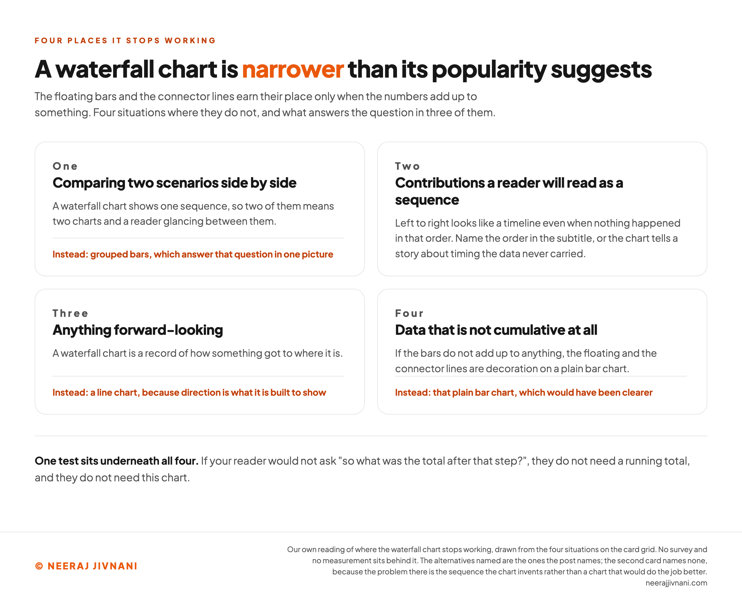
The waterfall chart is narrower than its popularity suggests. Here are four situations to watch for, three where another chart answers the question better and one where a subtitle does.
Comparing two scenarios side by side. A waterfall chart shows one sequence, so two of them means two charts and a reader glancing between them. Grouped bars answer that question in one picture.
Contributions a reader will read as a sequence. Left to right looks like a timeline even when nothing happened in that order. Name the order in the subtitle, or the chart tells a story about timing the data never carried.
Anything forward-looking. A waterfall chart is a record of how something got to where it is. A line chart carries a projection better, because direction is what it is built to show.
Data that is not cumulative at all. If the bars do not add up to anything, the floating and the connector lines are decoration on a plain bar chart, and a plain bar chart would have been clearer.
There is a simpler test underneath all four. If your reader would not ask "so what was the total after that step?", they do not need a running total, and they do not need this chart.
Use this chart — embed code and citation
<a href="https://neerajjivnani.com/blog/waterfall-chart/"><img src="https://neerajjivnani.com/infographics/waterfall-chart/four-jobs-it-cannot-do.png" alt="Four cards in a two by two grid under the heading that a waterfall chart is narrower than its popularity suggests. Card one, comparing two scenarios side by side, notes that a waterfall chart shows one sequence so two of them means two charts and a reader glancing between them, and names grouped bars instead. Card two, contributions a reader will read as a sequence, notes that left to right looks like a timeline even when nothing happened in that order, and says to name the order in the subtitle rather than naming another chart. Card three, anything forward looking, notes that the chart is a record of how something got to where it is, and names a line chart instead. Card four, data that is not cumulative at all, notes that the floating bars and connector lines are decoration on a plain bar chart, and names that plain bar chart instead. A line beneath the grid gives the single test underneath all four: if your reader would not ask what the total was after that step, they do not need a running total." width="1200"></a>
<p>Chart: <a href="https://neerajjivnani.com/blog/waterfall-chart/">Neeraj Jivnani</a></p>Neeraj Jivnani, "What a Waterfall Chart Shows, and How to Read One Without Guessing", neerajjivnani.com, https://neerajjivnani.com/blog/waterfall-chart/Free to republish with a link back to this page.
The Chart Has to Carry the Explanation on Its Own
A waterfall chart is one of the few charts that fails quietly. A pie chart with too many slices looks wrong immediately; a waterfall chart with no labels and an arbitrary order looks professional and says almost nothing.
That is why the two decisions worth spending time on are not formatting decisions at all. Whether the values are legible, and what order the bars are in.
Settle those two and the chart will hold up in a room you are not standing in. Leave them to the defaults and you have drawn a shape that needs you beside it to mean anything.