The Kano Model: How to Run the Survey, and How to Score What Comes Back
Run one yourself without guessing: the two questions to ask, the grid that turns a pair of answers into one result, and what to do when yours split.

/ On this page11 sections
The Kano model turns a feature list into a build order. It does that by asking each customer two questions about every feature: how they would feel if it were there, and how they would feel if it were not.
A grid turns that pair of answers into one result, and for most pairs that result is what the feature is worth to the person who answered.
Almost all of the difficulty sits in that grid, and in what you do when the answers come back split. Get those two right and you have a ranked backlog you can defend in a room.
What the Kano Model Claims
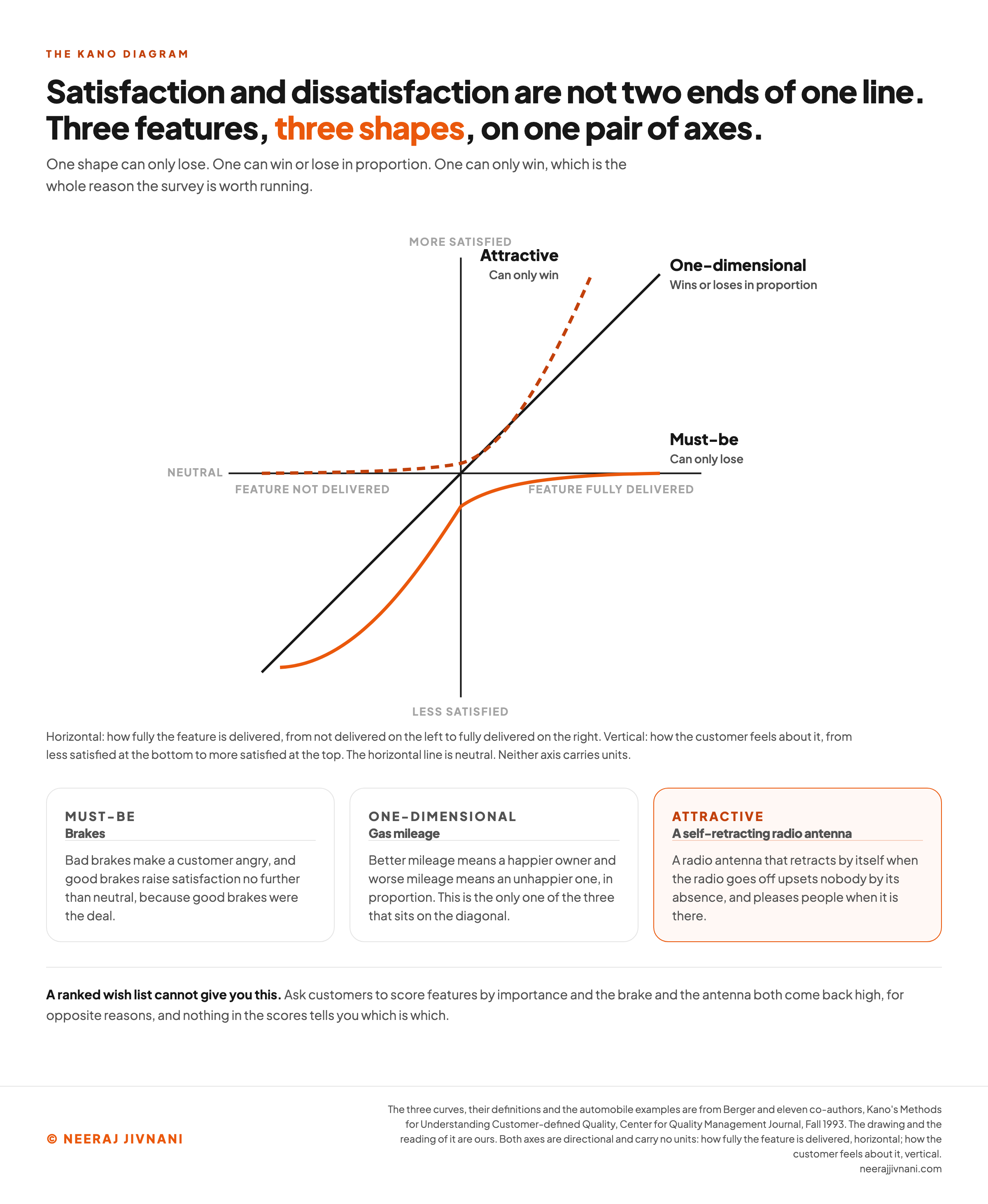
Satisfaction and dissatisfaction are not two ends of one line. That single claim is the whole model, and it is why the method exists at all.
The intuitive view is that the more fully a product delivers something, the happier the customer gets. Plot that and you get a straight line through the origin at 45 degrees.
Some features do behave that way.
Many do not.
A car shows the difference in three parts. The examples come from the 1993 Center for Quality Management paper that formalized the method for English-speaking teams, and they have aged well.
Gas mileage sits on the diagonal. Better mileage means a happier owner and worse mileage means an unhappier one, in proportion.
Brakes do not sit on it at all. Bad brakes make a customer angry, and good brakes raise satisfaction no further than neutral, because good brakes were the deal.
Then there is the feature nobody asked for. A radio antenna that retracts by itself when the radio goes off upsets nobody by its absence, and pleases people when it is there.
Three shapes, then, on the same pair of axes: how fully you deliver the feature, and how the customer feels about it.
One shape can only lose. One can win or lose in proportion. One can only win, which is the whole reason the survey is worth running.
That is what a ranked wish list cannot give you.
Ask customers to score features by importance and the brake and the antenna both come back high, for opposite reasons, and nothing in the scores tells you which is which.
Use this chart — embed code and citation
<a href="https://neerajjivnani.com/blog/kano-model/"><img src="https://neerajjivnani.com/infographics/kano-model/three-shapes.png" alt="Kano diagram plotted on two axes, how fully the feature is delivered on the horizontal and how the customer feels on the vertical, showing three curves: a must-be curve that starts deep in dissatisfaction and flattens at neutral no matter how well the feature is delivered, a one-dimensional line through the origin at 45 degrees that rises and falls in proportion, and an attractive curve that starts at neutral and rises steeply, each labeled with what it can and cannot do, with car brakes, gas mileage and a self-retracting radio antenna as the worked examples." width="1200"></a>
<p>Chart: <a href="https://neerajjivnani.com/blog/kano-model/">Neeraj Jivnani</a></p>Neeraj Jivnani, "The Kano Model: How to Run the Survey, and How to Score What Comes Back", neerajjivnani.com, https://neerajjivnani.com/blog/kano-model/Free to republish with a link back to this page.
The Five Categories a Survey Can Return
Five categories come out of a Kano survey. Three describe how a feature moves satisfaction, and two are results you did not plan for.
Each one travels under several names, which is the main reason the model looks more complicated than it is. The first column carries the name used everywhere below.
| Category | Also called | What it does | If you build it | If you skip it |
|---|---|---|---|---|
| Must-be | basic, threshold, expected, dissatisfier | Sets the price of entry | Nothing visible. Satisfaction reaches neutral and stops | Sharp dissatisfaction, out of proportion to the feature |
| One-dimensional | performance, linear, satisfier | Scales in both directions | Satisfaction rises roughly in proportion to how well you do it | Dissatisfaction rises the same way |
| Attractive | delighter, exciter, excitement | Wins without risk | Satisfaction rises sharply, often more than the effort deserves | Nothing. Nobody misses it |
| Indifferent | neutral, low impact | Nothing, in either direction | Nothing | Nothing |
| Reverse | unwanted | Costs you satisfaction | Dissatisfaction, for this segment at least | Satisfaction |
Read that as a budget instruction rather than a taxonomy. Each row implies a different amount of money and a different stopping point.
Indifferent and Reverse Pay for the Study
The three-category version of the model, must-be plus one-dimensional plus attractive, is the one that leaves money on the table. Indifferent and reverse are where a survey earns back what it cost.
An indifferent result is permission to stop.
Someone on your team is arguing for that feature right now, and the survey has told you customers will not notice it either way. What you save is not the build, it is everything the feature would have needed after it shipped.
Reverse is more interesting and more dangerous. It means the feature costs you satisfaction, and a strong reverse count almost never applies to your whole market.
Usually it marks a segment. Some customers want fewer options and simpler defaults, and a feature aimed at power users reads to them as clutter.
So a reverse result is a signal to split the sample before you act on anything. Removing a feature because one segment dislikes it is how you lose the segment that was paying for it.
What to Settle Before You Write a Question
Three decisions come before any wording, and each one quietly determines what the data can tell you.
Which features. Every feature costs two questions, and a long questionnaire produces careless answers. That is what ruins a Kano study, not any subtlety of analysis.
Keep the list to the features you would fund this quarter. A feature you cannot pay for is a feature you are paying respondents to think about.
How each feature is phrased. One feature per pair, described so the customer can picture it without you in the room.
"Better onboarding" is not testable.
"The app sets up your first project for you from a template" is.
Which customers, and how many. Define the segment before you send anything. The bad result to watch for is a clean survey of two different groups at once.
On sample size, the number matters less than whether the distribution comes back clean.
When two categories tie or come close, more responses are not the answer.
What a tie usually means is that you need more information: you may be looking at two market segments, or at questions that were not specific enough, and that is the 1993 paper's own reading of it.
A small sample from one segment beats a large one drawn from a mixed list.
The Question Pair, and Why the Wording Is the Hard Part
Each feature gets two questions, always in the same order. The first assumes the feature is present and working, the second assumes it is absent.
The two forms have names: functional for the first, dysfunctional for the second. The 1993 paper gives the template plainly: "If [the product] satisfied [requirement x], how would you feel?" and "If [the product] did not satisfy [requirement x], how would you feel?"
Both questions take the same five answers, and those answers are not a satisfaction scale. The respondent picks between liking it that way, it having to be that way, being neutral, being able to live with it, and disliking it, in that order.
The ordering reads as backwards the first time.
"I like it that way" outranks "It must be that way", because the scale runs by how much pleasure the customer takes in the outcome, a hedonic scale, rather than by how strongly they want it.
On a scale of wanting, nobody would rank those two that way. The instrument is measuring delight, and expecting something is the opposite of being delighted by it.
Where the Five Answers Came From
The five English answers above are a translation of Kano's own five, taught to the paper's member companies by Professor Shoji Shiba in 1990.
Those answers confused customers, and teams rewrote them. The paper records both, and prints the wordings they used instead.
One set swaps "It must be that way" for "I expect it" and plainer wording for the middle three.
That is the wording you will meet in survey templates, and the paper credits it to an unnamed participant in a training course rather than to Kano.
One team replaced the pleasure scale with a scale of consequence, running from helpful at one end to "This would be a major problem for me" at the other, because they found "I like it that way" too ambiguous.
Pick one wording, use it for every question in the survey, and never mix two sets, because the grid below assumes all five answers keep their order.
The Lookup Table
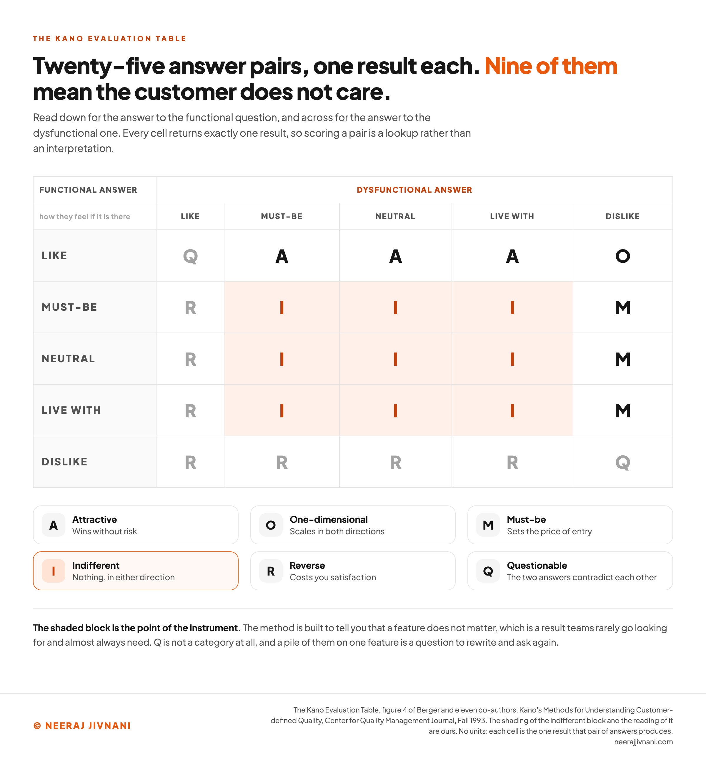
Two answers per feature, twenty-five possible combinations, and each one returns exactly one result. The grid below is a lookup rather than an interpretation, and it is figure 4 of the 1993 paper.
Read down for the answer to the functional question, and across for the answer to the dysfunctional one. The five short labels are the paper's own, one per answer, in the order given above.
| Functional answer | Dysfunctional: like | must-be | neutral | live with | dislike |
|---|---|---|---|---|---|
| like | Q | A | A | A | O |
| must-be | R | I | I | I | M |
| neutral | R | I | I | I | M |
| live with | R | I | I | I | M |
| dislike | R | R | R | R | Q |
A is attractive, O is one-dimensional, M is must-be, I is indifferent, R is reverse and Q is questionable.
Nine of the twenty-five cells return indifferent. The method is built to tell you that a feature does not matter, which is a result teams rarely go looking for and almost always need.
What Q and R Are Telling You
Q is not a category. It means the two answers contradict each other, and the paper puts it down mostly to a misread question or a badly written pair.
A stray Q here and there is normal.
A feature with a pile of them is a question to rewrite and ask again.
R has a similar diagnostic use.
It means your assumption about which direction counts as functional was backwards for that customer. Before you treat reverse as a finding, check the question was not written the wrong way round.
Look up one answer pair
One respondent, one feature, two answers. The grid returns one of six letters, and the letter is an instruction about what to do next. Two of the six are not findings at all.
Leave it blank and the template shows as the paper writes it. Fill it in and read both questions back: if you cannot picture the feature from the sentence, neither can the customer.
Question one, the functional form
If [the product] satisfied [requirement x], how would you feel?
Question two, the dysfunctional form
If [the product] did not satisfy [requirement x], how would you feel?
Both questions take the same five answers, in the same order, and those answers are not a satisfaction scale. The five short labels are the paper's own, one per answer.
Answer both questions and the category appears here, with what it means for the build order.
Use this chart — embed code and citation
<a href="https://neerajjivnani.com/blog/kano-model/"><img src="https://neerajjivnani.com/infographics/kano-model/the-lookup-grid.png" alt="The Kano evaluation table drawn as a five by five grid, the customer's answer to the functional question down the side and the answer to the dysfunctional question across the top, each of the twenty-five cells filled with the one result that pair produces: attractive, one-dimensional, must-be, indifferent, reverse or questionable, with the nine indifferent cells shaded together to show that more than a third of all answer pairs mean the customer does not care." width="1200"></a>
<p>Chart: <a href="https://neerajjivnani.com/blog/kano-model/">Neeraj Jivnani</a></p>Neeraj Jivnani, "The Kano Model: How to Run the Survey, and How to Score What Comes Back", neerajjivnani.com, https://neerajjivnani.com/blog/kano-model/Free to republish with a link back to this page.
When the Answers Split
Two answers become one result by lookup, and then you tally the results for each feature. The simplest reading is the mode, which is the one that came back most often.
A requirement voted must-be by 43% of respondents and attractive by 38% is read as a must-be, which is the 1993 paper's own example.
Sometimes the decision cannot wait for more information, and you have to force a single winner out of a split that close.
Take must-be first, then one-dimensional, then attractive, then indifferent, on the grounds of which has the greatest impact on the product. That ordering is the 1993 paper's.
A mode on its own is not enough.
A feature split 90 to 10 between attractive and indifferent and one split 60 to 40 both come out attractive, and only one is a safe bet. The mode hides that difference completely.
Mike Timko, then at Analog Devices, put that objection into the same paper, and he was right.
Better and Worse, on Real Numbers
Timko's fix reduces each feature to two numbers, computed from the four main category counts and ignoring reverse and questionable responses.
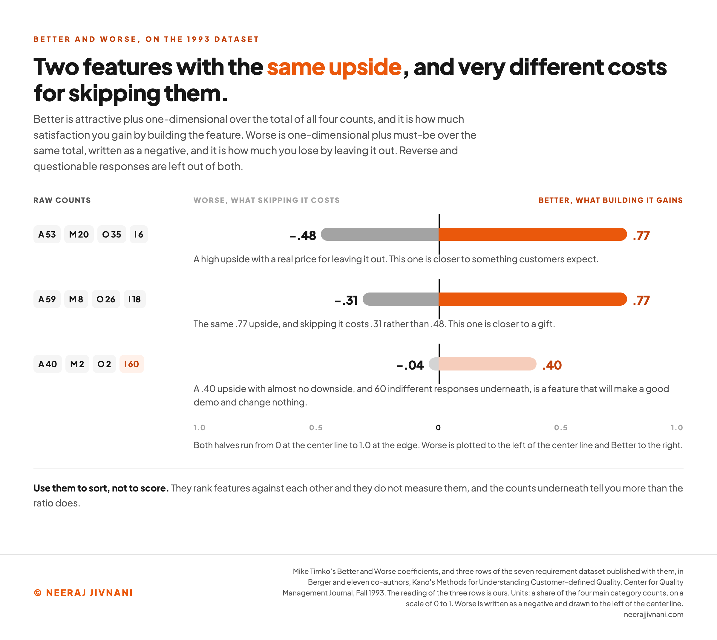
Better is attractive plus one-dimensional, divided by the total of all four. It is how much satisfaction you gain by building the feature.
Worse is one-dimensional plus must-be over the same total, written as a negative. It is how much satisfaction you lose by leaving it out.
Both numbers are needed, and the dataset published with the formulas in 1993 shows why. Here are three of its seven requirements, with the raw counts for attractive, must-be, one-dimensional and indifferent.
| Counts (A / M / O / I) | Better | Worse |
|---|---|---|
| 53 / 20 / 35 / 6 | .77 | -.48 |
| 59 / 8 / 26 / 18 | .77 | -.31 |
| 40 / 2 / 2 / 60 | .40 | -.04 |
The first two features look identical on the upside. Both score .77, so both buy the same amount of goodwill when you ship them.
They are not the same decision.
The first costs you .48 if you skip it and the second costs you .31, so the first is closer to something customers expect and the second is closer to a gift. Skipping the first has a price, and skipping the second mostly does not.
The third row is the one to read carefully. A .40 upside with almost no downside, and 60 indifferent responses underneath, is a feature that will make a good demo and change nothing.
Use them to sort, not to score.
They rank features against each other. They do not measure them, and the counts underneath tell you more than the ratio does.
Their own author would have wanted that caveat attached. The paper introduces the two coefficients as a trial he was hesitant to publish, and they became the standard scoring method afterwards rather than by design.
Use this chart — embed code and citation
<a href="https://neerajjivnani.com/blog/kano-model/"><img src="https://neerajjivnani.com/infographics/kano-model/same-better-different-worse.png" alt="Paired horizontal bars for three customer requirements from the 1993 dataset, each showing its Better score to the right of a center line and its Worse score to the left, with the raw attractive, must-be, one-dimensional and indifferent counts printed beside each row: 53, 20, 35 and 6 giving Better .77 and Worse -.48; 59, 8, 26 and 18 giving Better .77 and Worse -.31; and 40, 2, 2 and 60 giving Better .40 and Worse -.04, showing two features with an identical upside and very different costs for skipping them." width="1200"></a>
<p>Chart: <a href="https://neerajjivnani.com/blog/kano-model/">Neeraj Jivnani</a></p>Neeraj Jivnani, "The Kano Model: How to Run the Survey, and How to Score What Comes Back", neerajjivnani.com, https://neerajjivnani.com/blog/kano-model/Free to republish with a link back to this page.
Turning the Output Into a Build Order
The build order is must-be first, then one-dimensional, then one or two attractive. The categories are not a priority list on their own, though, because each needs a different rule and the rules are not interchangeable.
Must-be features come first, and they stop at good enough. Get every one of them to a level nobody complains about, then leave them alone.
The 1993 paper says it directly: improving a must-be that already performs acceptably "is not productive" next to improving a one-dimensional or attractive one.
Teams break that rule constantly, usually because must-be failures generate support tickets and support tickets are visible.
One-dimensional features are where budget scales. More effort buys more satisfaction here in rough proportion, so this is the right place for sustained investment and the right place to compare against cost.
Attractive features are chosen, not accumulated. Pick one or two per release and finish them properly.
A half-built delighter delights nobody, and a release carrying six of them reads as unfocused rather than generous.
Indifferent features are a stop order. Cut them from the roadmap and put the argument to rest with the numbers.
Reverse features get a segment check first. Split the sample, and if the reverse result belongs to one group, the answer is usually a setting rather than a deletion.
Delight Decays, So Date Your Results
A Kano result describes one moment. Features move between categories over time.
They move in one direction. Attractive becomes one-dimensional, and one-dimensional becomes must-be.
Almost nothing travels back up.
Michael Lieberman put that direction plainly in Quirk's Marketing Research Review in 2008: attributes migrate between Kano categories "almost always in a downward direction".
His example was the car again. Electronic door locks and cup holders "were at one time an exciting feature, then became a good plus, and now customers expect them and would be annoyed if they weren't standard".
Three consequences follow, and the first is the one people skip.
Put the date on the result. A category is a measurement, not a property of the feature, and a two-year-old Kano chart presented as current is worse than no chart at all.
Re-survey the attractive features first. They move fastest, they are the ones your competitors are copying, and a delighter that has quietly become an expectation is a gap you are not defending.
Treat must-be features as permanent. Once something crosses into the expected column it stays there, so the maintenance cost never goes away.
The Limits of the Instrument
Kano is a narrow instrument, and knowing where it stops keeps you from over-reading a result. Four limits are worth having in mind before you run one, and none of them is a flaw.
The 1993 paper says as much itself: the responses "should be seen only as a guide" and "do not provide exact answers as to which features must be included in the product".
It knows nothing about cost. Every category is measured on the customer side only, so a delighter that takes two engineers a year and a delighter that takes an afternoon score the same. Your own estimates are the missing half of every decision.
It cannot ask about what nobody can picture. A genuinely new feature described in one sentence tends to come back indifferent, because respondents cannot imagine using it.
That is a limit of the instrument rather than a verdict on the idea.
The scale is ordinal. The five answers are ordered, but the gaps between them are not equal, so averages of the raw answers mean little and the category counts are the honest output.
One survey cannot see two audiences. Mixed segments produce ties, and a tie looks like ambiguity when it is two clear answers canceling out.
When You Need a Trade-off Study Instead
Kano compares features.
It does not compare levels of a feature, or combinations of features at a price.
If the real question is how much of something to build, or which bundle to sell at which price, that is a trade-off study and Kano is not it.
The two are a sequence rather than a competition. Run Kano first, to decide what the trade-off study is allowed to be about.
Lieberman read them the same way in that 2008 article: Kano is a precursor to a choice exercise like conjoint, and it "is far more simple to administer and can be used to winnow out insignificant attributes".
Credited to Kano, Borrowed From Herzberg
The model is credited to Noriaki Kano, working with Nobuhiko Seraku, Fumio Takahashi and Shinichi Tsuji.
Their paper was presented at a Japanese Society for Quality Control annual meeting in October 1982, then published in the society's own periodical, Quality, volume 14, number 2, in 1984.
The idea reaches back further than that. Kano studied Frederick Herzberg's motivation-hygiene theory of job satisfaction, and the earlier paper he wrote with Takahashi in October 1979 took its name from it.
What he borrowed was the asymmetry. Herzberg had already split the two at work: fixing what employees complain about stops them being unhappy, and it does not make them satisfied.
The borrowing stops short of the whole model. One-dimensional quality, the class that moves both ways at once, appears to have no direct analog in Herzberg's theory, and the 1993 paper says so.
Three Groups, Three Budgets
The Kano model does one thing well, and it is not prioritization in general. It tells you which of your features can only lose, which scale with effort, and which can only win, and those three groups need three different budgets.
Everything else in the method serves that answer.
Run it on features you could fund, on one segment at a time, and write the date on the result.
Then use it for what it is: a map of where satisfaction comes from, drawn by the people who feel it.