The Customer Journey Map, and How to Build One Your Team Will Use
What to put on the map, what to leave off, and where the evidence comes from, so the map you draw is one your team actually uses.


/ On this page11 sections
A customer journey map is a picture of what one kind of customer does, thinks and feels while trying to get something done with you, laid out in the order it happens.
Most of them are too big. The rows that earn their place are few, the evidence behind them is thinner than the grid admits, and the version on the wall often describes the company rather than a customer.
Here is which rows earn their place, where the content of those rows comes from, and what has to happen after the workshop for the day to have been worth spending.
What a Customer Journey Map Is
A customer journey map is a visual record of the steps one type of customer takes to reach a goal with your business, showing at each step what they did, where they met you, and how it went.
The form is almost always the same. Stages run left to right in the order the person experiences them, and rows run top to bottom, each row holding one kind of information about that stage.
What it is for is less obvious than what it looks like.
Any business of more than a few people splits the experience between teams. Marketing owns the first contact, the website or a salesperson owns the middle, somebody else owns delivery, and support meets the person at their worst moment.
Each of those teams can be doing well by its own measures while the whole thing is unpleasant to sit through.
Take a bank.
Its acquisition team can be hitting every target on new current accounts while the people opening those accounts are waiting more than a week on an identity check nobody has ever timed.
Nothing in either team's reporting contains that fact.
A map is where it turns up, because a map is the one artifact that puts the pieces in one order, on one surface, in front of everybody at once.
That is the value. It is also why a map made alone at a desk is worth much less than a mediocre one made in a room.
The Map and the Mapping Are Two Things
"Customer journey map" and "customer journey mapping" are treated as one term. They name two different things, and the one people budget for is the less valuable half.
The mapping is the work: deciding whose journey, pulling together what you already know, and arguing about what happens in what order. The map is what is left on the wall when that is over.
Almost all the value sits in the first.
Reach for a template and you get the artifact without the argument, which is the half that was doing the work.
Scope It Before You Draw It
One customer, one journey, one question. Settle those three before anyone opens a template and the rest of the work has an edge to it.
Scope is not the boring administrative part of journey mapping. It is the decision that makes every later decision easy or impossible, and it is over in the first few minutes of the meeting.
Get it wrong and the workshop produces a wall of sticky notes that nobody can turn into anything. Get it right and the rest is mostly transcription.
One Customer, One Journey, One Question
One customer means a single persona, not an average of everyone who buys. Two segments that behave differently produce a map where every row is a compromise, and a compromised row cannot be acted on.
One journey means a specific thing the person is trying to get done, with a beginning and an end you could name out loud. Getting a first appointment is a journey. Being a customer is not.
One question is the part most often skipped. You are drawing this because something is wrong or something is being decided, and the map exists to settle that.
Write the question down before the workshop.
If nobody in the room can say what the map is for, you will get a description of the business, and a description of the business is what everybody already has.
Say a veterinary practice with two clinics is losing people after a first visit and cannot work out why.
That is a scope. One owner with a sick animal, from the moment something looks wrong to the follow-up a week later, to find out where trust is lost.
Who Has to Be in the Room
Three kinds of person, and teams reliably bring the first two and forget the third.
- Somebody who talks to customers every day. Support and front-desk staff know the questions people ask, and they know them in the customer's own words rather than the company's.
- Somebody who owns the service being described. Without them the room invents how things work internally, and half the map turns out to be wrong.
- Somebody who can authorize a change. A map produced for an absent decision-maker becomes a presentation, and presentations get thanked rather than acted on.
Anyone whose work is not touched by that journey is a spectator, and spectators lengthen a workshop without improving it.
What Goes On the Map
A first map should carry four rows, and there are eight worth knowing about.
Which four you pick, and where you get their contents, is what the rest of this section is about.
The columns come first, though, because what you call a stage decides what anybody writes in the cells beneath it.
The Stages Across the Top
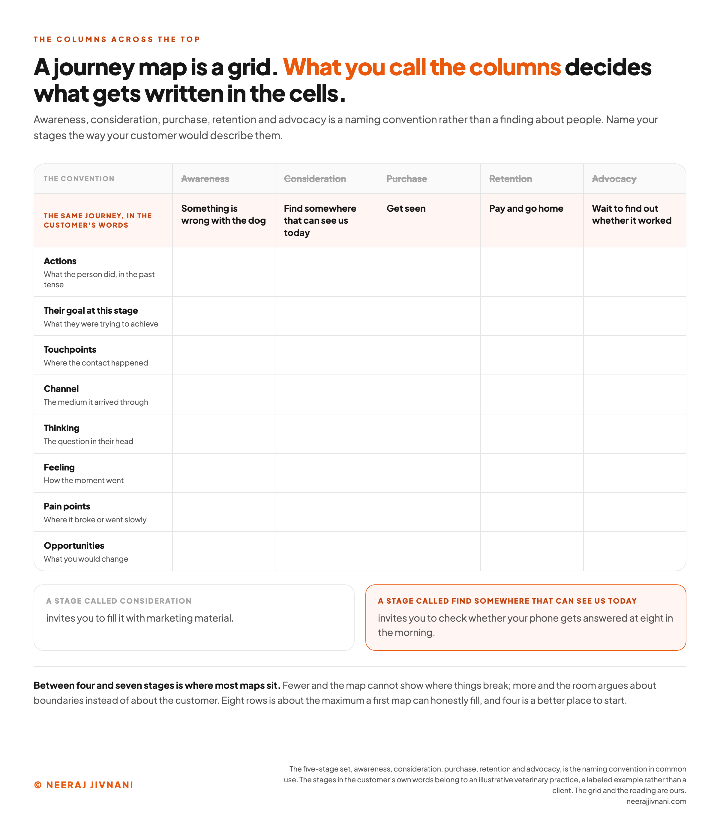
Awareness, consideration, purchase, retention and advocacy is the five-stage set you will meet everywhere.
Those five are a naming convention rather than a finding about people. They are useful as a starting shape and they are the wrong labels for most real maps.
Name your stages the way your customer would describe them.
The veterinary practice above does not have an awareness stage. It has "something is wrong with the dog", "find somewhere that can see us today", "get seen", "pay and go home", and "wait to find out whether it worked".
Those are harder to write and they change the map completely.
A stage called "consideration" invites you to fill it with marketing material. A stage called "find somewhere that can see us today" invites you to check whether your phone gets answered at eight in the morning.
Between four and seven stages is where most maps sit. Fewer and the map cannot show where things break; more and the room spends its time arguing about boundaries instead of about the customer.
The Rows Down the Side
Each row answers a different question about the same moment. These are the ones worth having, and the order is roughly the order a room fills them in.
- Actions. What the person did, in the past tense, observable from outside. This row anchors everything else, so it goes first.
- Their goal at this stage. What they were trying to achieve, which is frequently not what you were trying to achieve at the same moment.
- Touchpoints. Where the contact happened: a search result, a phone call, a receptionist, a text message, a friend.
- Channel. The medium the touchpoint arrived through. The two words are used interchangeably and they name different things: the reminder is the touchpoint, and text messaging is the channel it arrived on.
- Thinking. The question in the person's head at that moment, ideally in a form somebody has heard a real customer say.
- Feeling. How the moment went. Worth a row only if you have something behind it, and worth nothing at all when it is invented in the room.
- Pain points. Where it broke, went slowly, or asked for something the person did not have to hand.
- Opportunities. What you would change, which is the only row that produces work.
Eight rows is about the maximum a first map can honestly fill. Four is a better place to start.
Start with actions, touchpoints, pain points and opportunities: what they did, where it happened, where it broke, and what you would change.
A row you cannot fill with evidence gets filled with a guess, and a guess in a grid looks exactly like a finding.
The Touchpoint List Is Usually Wrong
The touchpoint row is the one most maps get wrong, and they get it wrong in the same direction: too many entries, all weighted as though they mattered equally.
A 2017 paper in Business Horizons by Mark Rosenbaum, Mauricio Losada Otalora and German Contreras Ramirez tested that at a large indoor shopping mall.
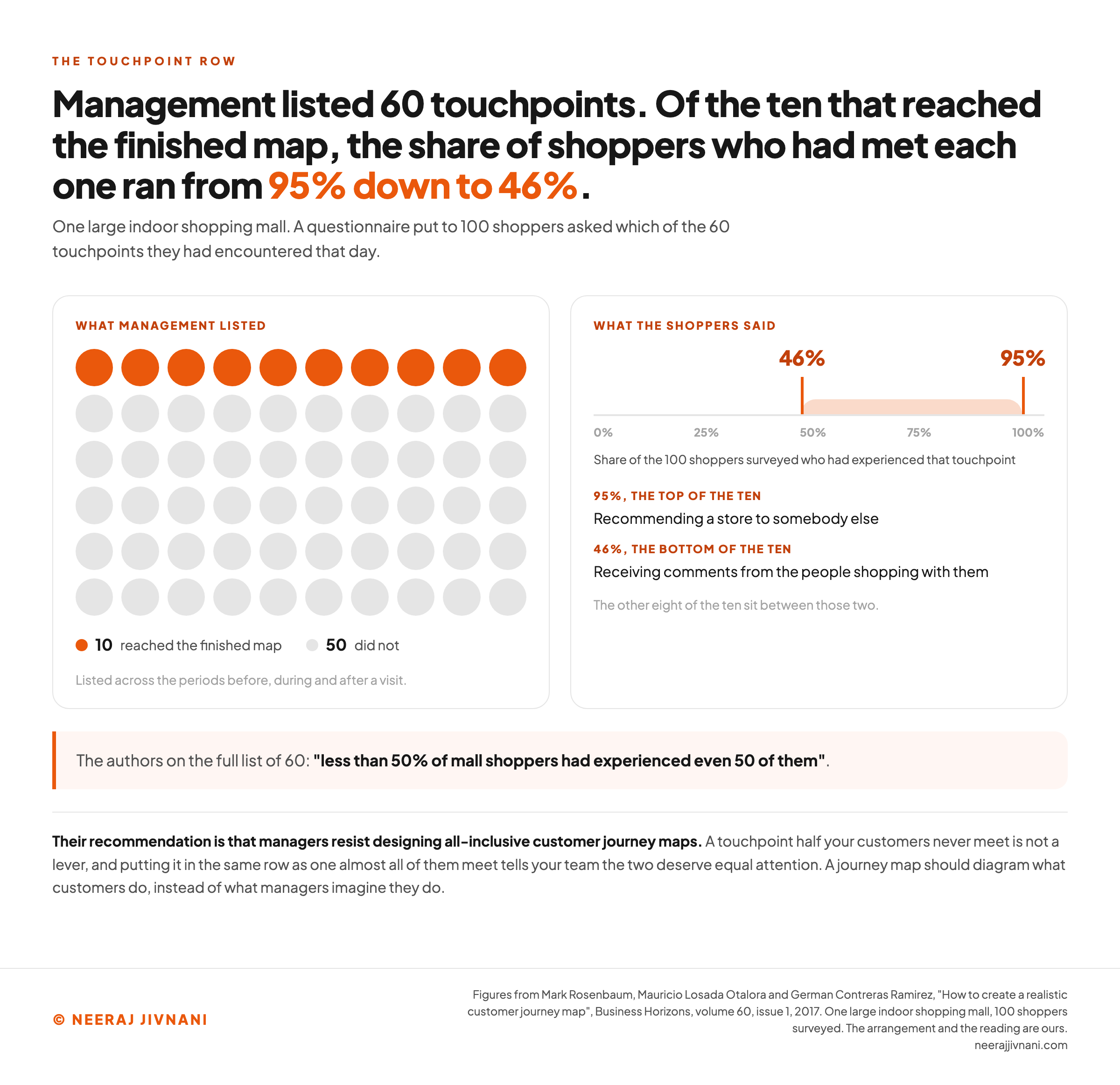
Working with the mall's management, the authors listed 60 customer touchpoints across the periods before, during and after a visit. Then they put a questionnaire to 100 shoppers asking which of the 60 they had encountered that day.
Of the ten that made it onto the finished map, the share of shoppers who had experienced each one ran from 95% at the top, recommending a store to somebody else, down to 46% at the bottom, receiving comments from the people shopping with them.
Their note on the full list of 60 is blunter: "less than 50% of mall shoppers had experienced even 50 of them".
A shorter touchpoint row follows from that.
A touchpoint half your customers never meet is not a lever. Putting it in the same row as one almost all of them meet tells your team the two deserve equal attention, and a map that says that has undone its own job.
So keep the row short, and keep it to what customers met rather than to everything the business can list. The paper's own recommendation is that managers "resist designing all-inclusive customer journey maps".
Split the Row Into What You Control and What You Do Not
There is a second cut worth making. Split the touchpoint row into the ones your business controls and the ones somebody else owns.
Your own store, your website, your email list and your social accounts sit on the controlled side. The retailers who stock you, the search results, other people's blogs and word of mouth sit on the other.
That is the line the University of Tennessee Extension's 2024 journey mapping guide for small farm and food producers draws down the middle of its own touchpoint table.
Most maps only fill the first column, because that is the column somebody in the room is responsible for. The second column is where the surprises are.
Use this chart — embed code and citation
<a href="https://neerajjivnani.com/blog/customer-journey-map/"><img src="https://neerajjivnani.com/infographics/customer-journey-map/the-columns-decide-the-map.png" alt="A blank journey map grid with two header strips above it. The first, grayed and struck through and labeled the convention, reads awareness, consideration, purchase, retention and advocacy. The second, live, reads the same journey in the customer's words: something is wrong with the dog, find somewhere that can see us today, get seen, pay and go home, and wait to find out whether it worked. Eight empty rows run down the side, labeled actions, their goal at this stage, touchpoints, channel, thinking, feeling, pain points and opportunities. Two cards underneath say that a stage called consideration invites you to fill it with marketing material, while a stage called find somewhere that can see us today invites you to check whether your phone gets answered at eight in the morning." width="1200"></a>
<p>Chart: <a href="https://neerajjivnani.com/blog/customer-journey-map/">Neeraj Jivnani</a></p>Neeraj Jivnani, "The Customer Journey Map, and How to Build One Your Team Will Use", neerajjivnani.com, https://neerajjivnani.com/blog/customer-journey-map/Free to republish with a link back to this page.
Use this chart — embed code and citation
<a href="https://neerajjivnani.com/blog/customer-journey-map/"><img src="https://neerajjivnani.com/infographics/customer-journey-map/what-shoppers-actually-met.png" alt="Two panels. On the left, sixty dots stand for the sixty touchpoints management listed, ten of them filled orange for the ten that reached the finished map and fifty gray for the ones that did not. On the right, a scale running from zero to one hundred percent marks the top of the ten at 95 percent, recommending a store to somebody else, and the bottom of the ten at 46 percent, receiving comments from the people shopping with them, with a note that the other eight sit between those two. A band beneath quotes the authors on the full list of sixty: less than 50% of mall shoppers had experienced even 50 of them." width="1200"></a>
<p>Chart: <a href="https://neerajjivnani.com/blog/customer-journey-map/">Neeraj Jivnani</a></p>Neeraj Jivnani, "The Customer Journey Map, and How to Build One Your Team Will Use", neerajjivnani.com, https://neerajjivnani.com/blog/customer-journey-map/Free to republish with a link back to this page.
Where the Evidence Comes From
A map needs something no report in your business contains: the order things happened in, for one person, including the parts that happened somewhere you were not looking.
That is why the usual dashboards are so little help here. They count populations, and a population has no sequence.
Read Ten Customers End to End
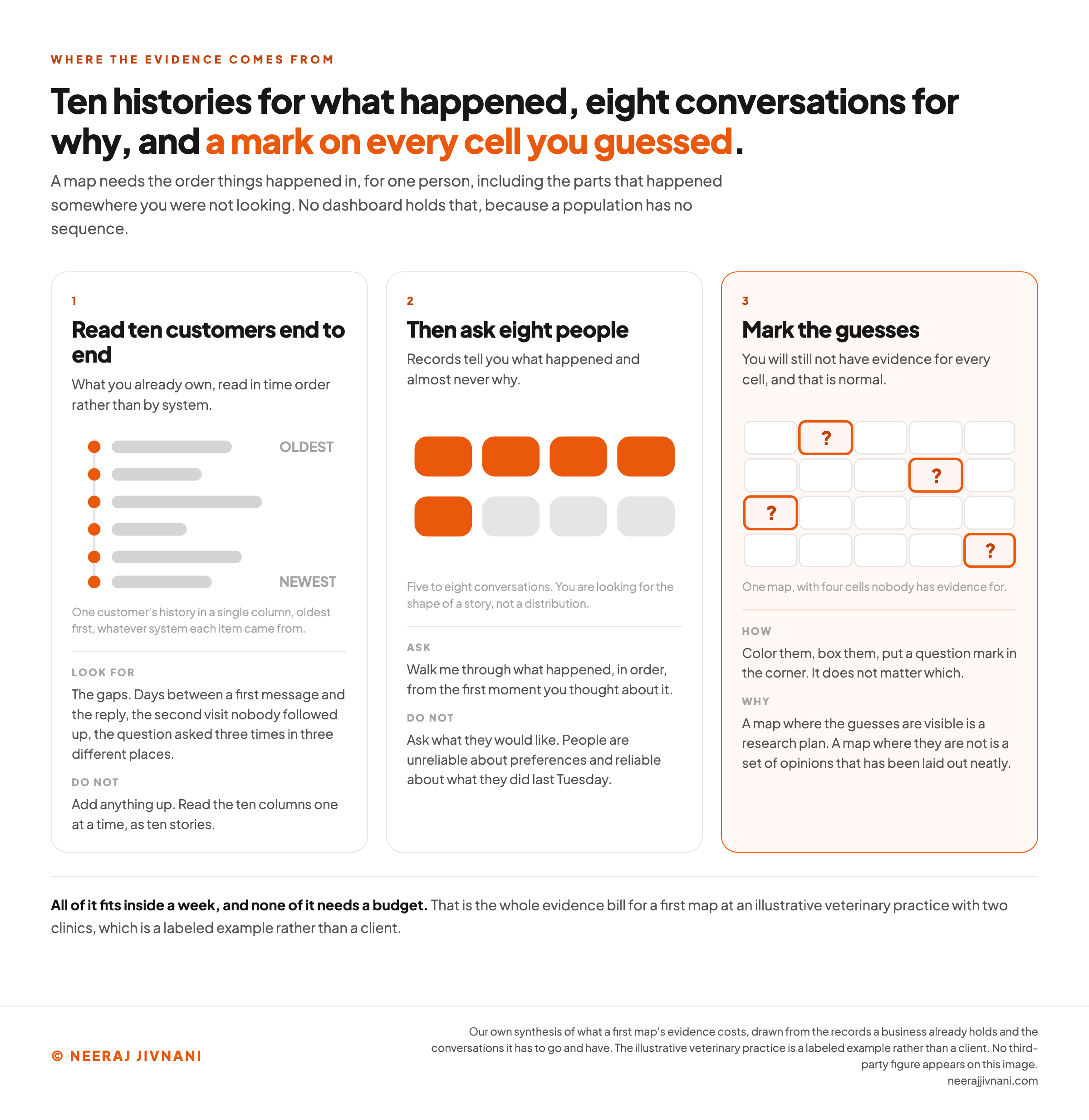
The cheapest strong evidence for a first map is a small number of individual histories, read in time order rather than by system.
Pick ten customers who recently completed the journey you are mapping. For each one, put everything you hold with a date on it into a single column, oldest first, whatever system it came from.
That column holds the first session, the form, the call and whatever the person taking it wrote down, the order, the tickets afterwards, and the review if there is one.
Read those ten columns one at a time, as ten stories. Nothing here gets added up.
What you are looking for is not the common case. It is the gaps: the days that went by between a first message and the reply, the second visit nobody followed up, the question asked three times in three different places.
None of that survives being averaged, which is the reason it has never appeared in a report.
Then Go and Ask
Records tell you what happened and almost never why. Interviews are for the why, and a small number of them go a long way.
Five to eight conversations with people who recently did the thing will change more cells than a large survey would. You are looking for the shape of a story, not a distribution.
Ask them to walk through what happened, in order, from the first moment they thought about it.
Do not ask what they would like. People are unreliable about preferences and reliable about what they did last Tuesday.
The veterinary practice can finish all of this inside a week, and none of it needs a budget.
Mark the Guesses
You will still not have evidence for every cell. That is normal and it is not a problem, as long as the map says so.
Mark the guesses. Color them, box them, put a question mark in the corner, it does not matter which.
A map where the guesses are visible is a research plan. A map where they are not is a set of opinions that has been laid out neatly.
Use this chart — embed code and citation
<a href="https://neerajjivnani.com/blog/customer-journey-map/"><img src="https://neerajjivnani.com/infographics/customer-journey-map/ten-histories-eight-conversations.png" alt="Three numbered panels. The first, read ten customers end to end, draws one customer's history as a single column of dated items running oldest to newest, and says to look for the gaps and not to add anything up. The second, then ask eight people, draws eight conversation shapes with five of them filled in, and says to ask people to walk through what happened in order rather than to ask what they would like. The third, mark the guesses, draws a blank journey grid with four cells outlined in orange and carrying a question mark, and says that a map where the guesses are visible is a research plan while a map where they are not is a set of opinions laid out neatly." width="1200"></a>
<p>Chart: <a href="https://neerajjivnani.com/blog/customer-journey-map/">Neeraj Jivnani</a></p>Neeraj Jivnani, "The Customer Journey Map, and How to Build One Your Team Will Use", neerajjivnani.com, https://neerajjivnani.com/blog/customer-journey-map/Free to republish with a link back to this page.
The Kinds of Map, and When Each One Earns the Time
Four kinds turn up in practice. They are not competing formats, and the current state map is the one that comes first.
| The map | What it shows | When it earns the time |
|---|---|---|
| Current state | What happens today, including the parts nobody is proud of | Always, and first |
| Future state | What you intend the experience to be after the changes | After a current state map, as the record of what you decided |
| Day in the life | The customer's whole day or week, with your product as a small part of it | When you suspect you are solving the wrong problem |
| Service blueprint | The same journey with the internal systems, teams and handoffs drawn underneath it | When the breakages are operational rather than about messaging |
Draw the current state first, every time. A future state map made before a current state map is a wish list with a grid around it, and it will not survive its first contact with somebody who works on the front desk.
The service blueprint is the one to reach for when your pain points keep resolving to the same answer: a person did not have the information they needed, or two systems did not agree.
That is a back-stage problem, and a customer-facing map cannot show you where it lives.
Four Things It Gets Confused With
Four artifacts get confused with a customer journey map, and the differences are worth two minutes because they change who should be in the room.
An experience map is drawn wider than your business and a funnel is drawn as a population rather than a person, so each answers a question a customer journey map cannot. Picking the wrong one wastes a workshop before it starts.
The Experience Map
An experience map describes a general human activity without a particular company in it: what it is like to move house, or to manage a long-term condition.
It is broader than a journey map and it is what you draw before you know where your business fits, or when you want to see the parts of the experience you have nothing to do with.
User Journey and Buyer Journey
A user journey covers the same ground inside a digital product, from the first screen to the last. It is the version a product or design team usually means.
A buyer journey stops at the purchase. It covers awareness, consideration and the decision, and it is the version a sales team usually means because it maps onto their pipeline.
A customer journey covers both and keeps going. The distinction matters most in the part after the sale, which is where the buyer journey stops and where most of the money in a repeat business is made.
The Marketing Funnel
A funnel and a journey map look similar and answer different questions.
A funnel counts a population moving toward a purchase, so its unit is a number and its output is a stage where that number has fallen.
A journey map describes one kind of person doing one specific thing, so its unit is a sentence and its output is a reason.
Neither one answers the other's question. A business running on the funnel alone knows the middle is leaking and not why; a business running on the map alone has a rich account of an experience and no idea how many people are living through it.
How to Create a Customer Journey Map
Six steps. Nothing here needs software, and the first three are the ones that decide whether the rest is any good.
- Write the question down. One sentence naming the thing this map has to answer, agreed before the meeting rather than discovered halfway through it.
- Pick one customer and one journey. Name one person, name the customers this map is deliberately not about, and say the start and end moments out loud.
- Pull what you already know. An hour in the support queue, the reviews and the analytics gives the room something to argue with rather than about.
- Lay out the stages, in your customer's words. Get the columns settled before anybody fills a cell. A grid whose columns are still being argued over does not fill at all.
- Fill the rows, marking every guess as you go. Do actions first, because everything else hangs off what the person did.
- Mark where it breaks, and say who is responsible at each crossing between teams. A break sitting between two departments belongs to neither of them until somebody says otherwise.
Then stop. The temptation at the end of a good workshop is to keep adding rows, and the map gets worse from that point on.
Reading the Finished Map
The most useful thing on a finished map is almost always a break that belongs to nobody.
Every team in the room already knows what goes wrong inside its own column, because its own numbers cover that column. Those problems are on somebody's list already.
The breaks at the seams are different. When a customer crosses from marketing to sales, or from sales to delivery, or from delivery to support, both sides can be performing and the crossing itself can be terrible.
Handovers are rarely measured, because a handover usually has no single owner and so appears in nobody's report.
So read the map at its joins first.
Walk left to right and stop wherever responsibility passes from one team to the next. Ask what the customer is carrying at that moment, and whether whoever picks them up knows it.
For the veterinary practice, that is the gap between the phone call and the consulting room. The owner has already explained the symptoms once, and whether the vet has been told decides how the whole appointment feels.
That is the reading the map is uniquely good for, and it is the reason the whole thing was drawn in one order rather than in departmental slices.
Read your own map at its joins
Put your stages in the order the customer meets them, and name the team standing behind each one. What comes back is not your list. It is the gaps between the entries, which is where the findings worth the day are sitting.
Name at least two stages and say who owns each one, and the reading appears here.
Keeping It Current
The parts of a map age at different rates, which makes a full redraw the wrong instrument most of the time.
Stages barely move. What a person is trying to do when their dog is ill has not changed in a decade.
Touchpoints move constantly, because channels appear, get retired, and get replaced by whatever the business bought last quarter.
So the maintenance job is mostly the touchpoint row, and it is an hour rather than a workshop.
Review it every three to six months, and revise whatever measures are attached to the map at the same time. That is the interval in Invest Northern Ireland's 2020 journey mapping tutorial, and it is about right for that hour.
You Are Not Fixing All of It
You are not going to repair everything the map shows, and nobody sensible expects you to.
Invest Northern Ireland's 2020 tutorial says so plainly: "You do not need to optimise or change every touch point."
Its own example is worth borrowing. Frequent complaints about a website being hard to navigate, alongside a lot of drop-offs, are worth acting on.
A handful of complaints about the lack of round-the-clock support may not be.
Pick the smallest number of moments you can genuinely improve this quarter. On a first map that is usually one, and a single crossing repaired beats a long list nobody starts.
Write down what that one moment costs you today, before the first change goes in. The argument in six months will be about whether that figure moved.
Why Most Maps Stop Being Used
Maps stop being used for reasons that have almost nothing to do with how well they were drawn.
The five below are worth checking against your own map this afternoon.
- It was made by one person. A map produced at a desk is a document, and a document persuades nobody who was not in the room. What convinces a team is having watched one another agree.
- Every problem on it landed on somebody's existing backlog. Then the map recorded what the room already believed, and it will lose its first argument with a budget. A map earns its day by producing at least one finding nobody walked in with.
- The columns are your process rather than their week. Stages named after your funnel or your internal handoffs cannot show you anything you did not already have, because they were drawn from the inside.
- Nothing marks where the evidence stopped. Six months later nobody can remember which cells came from customers and which came from the room. The first person who finds one wrong cell then has grounds to doubt all of them, and usually does.
- It got divided up again. Each team took its own column away, the whole stopped existing, and within a month everybody was back to looking at their own part of the customer.
The last one is the map's characteristic death, and it is worth naming because it does not look like failure while it is happening.
Templates, Tools and the Free Version
You can make a good customer journey map for nothing.
A wall, sticky notes and a marker will hold one. So will a spreadsheet with your stages as columns and your rows beneath them, and so will the free tier of any diagramming or whiteboard tool.
A template gives you the grid and a set of row names. That is genuinely useful for a first attempt, because it saves an argument about the format.
What a template cannot give you is your stages, which have to come from your own customers, or your evidence, or your question. Those three decide whether the map is any good, and no template has ever contained one of them.
Paid tools earn their place at one specific point: when more than one person has to keep the map current, and when you want it linked to the research behind it. Before that, the tool is overhead.
What the Room Remembers a Month Later
A month after the workshop, ask the people who were in it what they remember. Their answer is the test of whether the day worked.
If they describe the artifact, the columns, the colors of the sticky notes, the day produced a picture.
If they describe a specific moment several of them had never seen before, the silence after a first message or the second visit nobody followed up, then the day produced sight, and sight keeps changing decisions long after the paper comes down.
Everything above is aimed at that second answer.
Scope it small enough to finish. Fill the rows you have evidence for and mark the ones you do not.
Cut the touchpoints your customers rarely meet, because a map that treats them all alike tells your team nothing about where to spend its attention.
And read it at the joins, where nobody is looking, because that is where a business hides its worst quarter of an hour from itself.