What Above the Fold Means, and Where Yours Actually Falls
Your first screen is a different height for every visitor, and on a phone it moves as they read. See how to measure your own, and what belongs in it.

/ On this page8 sections
Above the fold is everything a visitor can see before they scroll. That line sits at a different height for every one of them, and on a phone it moves while they are reading.
So the useful question is not what goes above the fold. It is where your own fold falls, and what that screen owes once you know.
You can have your own number in about two minutes, and it is worth more than any pixel height somebody quotes at you.
What Above the Fold Means
Above the fold is the part of a page a visitor sees on arrival, before any scrolling. Below the fold is everything underneath it.
The distinction is about effort rather than importance. One half arrives free, and the other half costs the reader a decision to keep going.
The phrase is borrowed from newspapers, which were stacked folded in half on a newsstand. Only the top half of the front page showed, so the strongest headline and photograph went there to sell the paper.
One thing carried across to the web and one thing did not.
What carried across is the situation: somebody is deciding, in a second or two, from a fraction of the whole thing, whether the rest is worth their attention.
What did not carry across is the measurement. A broadsheet folds in the same place every time, so an editor knew exactly how much space they had.
Nobody designing a web page has ever known that.
Where Your Fold Actually Falls
Your fold falls wherever that visitor's screen ends, which is a different place for each of them. There is no single answer in pixels, and looking for one is where this usually goes wrong.
Nielsen Norman Group put the shape of it plainly in 2015: "A responsive design may have 2, 3, 4, or more different folds, specific to the devices and screen sizes that the design was optimized for."
A phone in portrait, the same phone rotated, a laptop, a laptop with a bookmarks bar showing, and a desktop monitor all cut your page at a different place. Each of those is a real fold for a real visitor.
It Is Four Edges, Not One Line
The fold gets drawn as a horizontal line, and that picture leaves out three quarters of the problem.
The Media Rating Council's 2014 measurement guidelines say there are generally four locations, top, bottom, left and right, where content can be cut off from view by a visitor's settings and actions.
A wide layout on a narrow window loses its right-hand edge. A sticky banner eats the top. A cookie notice eats the bottom, which is where a scroll cue usually sits.
So the honest version of the question is not where the line is. It is how much of the page a single visitor can see at the moment it loads.
On a Phone It Moves While Somebody Reads
The moving fold is the part that surprises people who design on a laptop, and it has a mechanism behind it.
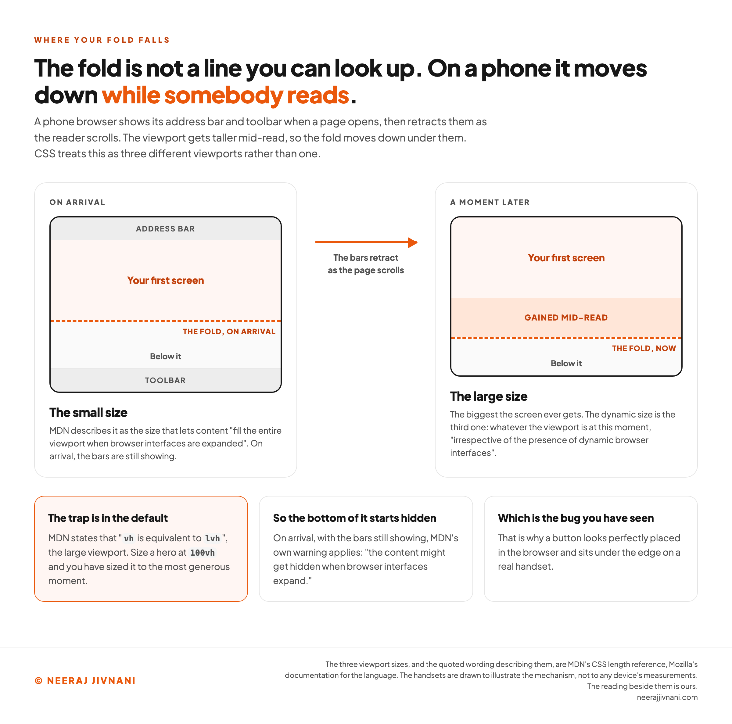
A phone browser shows its address bar and toolbar when a page opens, then retracts them as the reader scrolls. The viewport gets taller mid-read, so the fold moves down under them.
CSS treats this as three different viewports rather than one.
MDN (Mozilla Developer Network), Mozilla's reference for the language, describes the small size as the one that lets content "fill the entire viewport when browser interfaces are expanded". The dynamic size is the one that fits "irrespective of the presence of dynamic browser interfaces".
The trap is in the default. MDN states that "vh is equivalent to lvh", the large viewport, which is the biggest the screen ever gets.
Design a hero section at 100vh and you have sized it to the most generous moment. On arrival, with the bars still showing, MDN's own warning applies: "the content might get hidden when browser interfaces expand."
That is why a button looks perfectly placed in the browser and sits under the edge on a real handset.
Getting Your Own Number
Three steps, and none of them costs anything.
- Find out what your visitors are using. Your analytics already reports device category and screen size. One or two sizes usually account for most of your traffic, and those are the only folds worth designing to.
- Read the viewport height on that size. Open your page, open the browser console, type
window.innerHeightand press enter. The number that comes back is the viewport height in CSS pixels, which is where your fold sits on that device at that moment. - Check whether anybody goes past it. Scroll depth in your analytics, or a scroll heat map, tells you how far real visitors got on that page. That is the only number that says whether your first screen is doing its job.
Write the result down with the date. It changes when your header changes, when a banner is added, and when you ship a new template.
The fold in this window
Nothing is typed in here. It reads the window in front of you, which is the number the console line comes back with: the viewport height in CSS pixels, where your fold sits on that device at that moment.
What this window can show, right now
1,280 × 900CSS pixels
That is a rectangle, not a line. The fold gets drawn as a horizontal line, and that picture leaves out three quarters of the problem. The question underneath is how much of the page a single visitor can see at the moment it loads.
The three sizes CSS carries
CSS treats this as three different viewports rather than one. Measured here, on this device:
900px
Small
The browser's own bars showing. On arrival, they still are.
900px
Large
The bars retracted. The biggest the screen ever gets.
900px
Dynamic
Whatever the viewport is at this moment.
The small and the large measure the same in this window, so nothing moves here.
Open the same page on a phone and they separate. A phone browser shows its address bar and toolbar when a page opens, then retracts them as the reader scrolls, and the viewport gets taller mid-read.
Folds this device has produced since you arrived
1 so far, at 900 pixels. Scroll on a phone, resize this window, or turn the device on its side, and watch it climb.
A responsive page has as many folds as it has layouts, which is why no pixel height was ever going to be the answer. Write yours down with the date: it changes when your header changes, when a banner is added, and when you ship a new template.
Use this chart — embed code and citation
<a href="https://neerajjivnani.com/blog/above-the-fold/"><img src="https://neerajjivnani.com/infographics/above-the-fold/the-fold-moves-while-they-read.png" alt="Two handsets drawn side by side showing the same page at two moments. On the left, on arrival, the browser's address bar sits across the top and its toolbar across the bottom, the first screen is shaded, and a dashed orange line marks the fold part way down the frame. On the right, a moment later, both bars have gone, the shaded first screen has grown by a band labeled gained mid-read, and the dashed fold line now sits lower. An arrow between the two says the bars retract as the page scrolls. The left frame is labeled the small size, which MDN describes as the size that lets content fill the entire viewport when browser interfaces are expanded, and the right is labeled the large size, the biggest the screen ever gets, with a note that the dynamic size is the third one, whatever the viewport is at this moment. Three cards underneath say that the trap is in the default, because MDN states that vh is equivalent to lvh, the large viewport, so a hero sized at 100vh is sized to the most generous moment; that on arrival, with the bars still showing, MDN's own warning applies that the content might get hidden when browser interfaces expand; and that this is why a button looks perfectly placed in the browser and sits under the edge on a real handset." width="1200"></a>
<p>Chart: <a href="https://neerajjivnani.com/blog/above-the-fold/">Neeraj Jivnani</a></p>Neeraj Jivnani, "What Above the Fold Means, and Where Yours Actually Falls", neerajjivnani.com, https://neerajjivnani.com/blog/above-the-fold/Free to republish with a link back to this page.
What the First Screen Owes
A first screen has one job, and it is smaller than the phrase "prime real estate" suggests. It has to make a stranger believe the rest of the page is worth their scroll.
Three things do that, and they fit comfortably.
- What this is, in words a stranger recognizes. Not a slogan, not a category, and not a claim they have to decode.
- Why it is for them. One line that names the situation they are in, so they can tell in a glance whether they are on the wrong page.
- A visible edge. Something cut off at the bottom of the screen, so the page reads as continuing rather than ending.
That third one does more work than it gets credit for. A layout that finishes neatly at the fold looks complete, and a reader who thinks they have seen everything has no reason to move.
What Does Not Belong There
The common failure is not putting the wrong thing at the top. It is putting everything there.
Cramming comes from treating the first screen as a container that has to hold the argument. It cannot hold the argument, and a screen with six competing elements reads as noise rather than as thoroughness.
Carousels are the clearest case. A rotating banner is usually the result of nobody being willing to choose, and it spends the most valuable space on the site saying several things quietly.
The test is blunt. Cover everything below the fold, look at what is left, and ask whether a stranger could say what your page is for.
If they could say three things, the screen is carrying three messages and landing none.
Where the Ask Goes
Above or below is the wrong way to ask it. The answer depends on what the reader already knows when they land.
Put the ask in the first screen when they arrive knowing what they want, which is most of what a product page or a pricing page gets.
Put it after the explanation when they do not, because an ask reads as pressure until there is a reason behind it.
Doing both is usually right, and it is not a compromise. A visitor who never scrolls only ever sees the first one, and a visitor who does read on meets the second where it makes sense.
Above the Fold Is Not the Same as Seen
Getting something into the first screen does not mean anybody looked at it. Placement and attention are two different things, and nothing about the first guarantees the second.
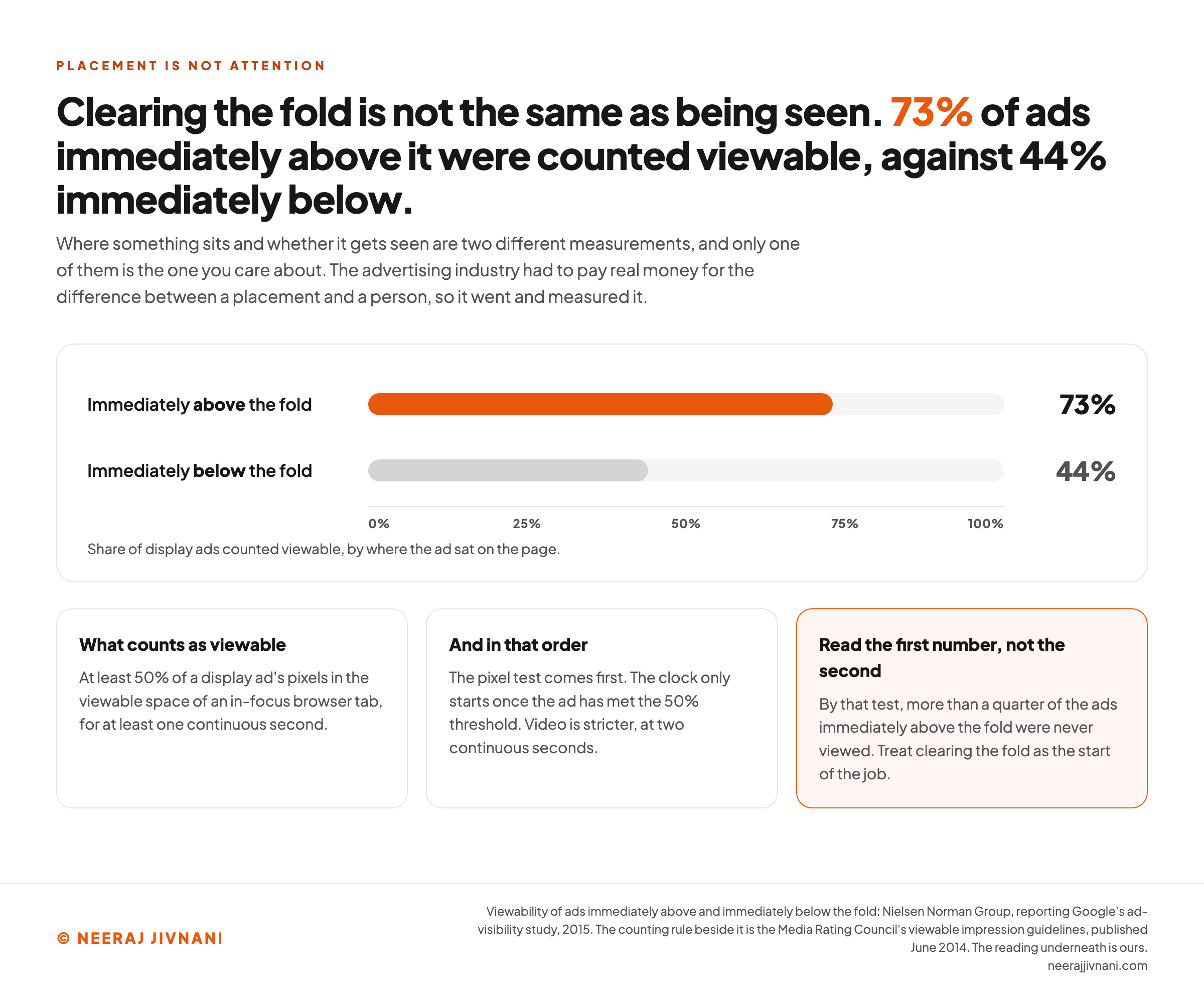
Somebody has counted the difference. Nielsen Norman Group, reporting Google's ad-visibility study in 2015, put ads immediately above the fold at 73% viewability and ads immediately below it at 44%.
Read the first number rather than the second one.
Almost three quarters of the ads in that band were counted as seen. More than a quarter of them were not.
That is still a far better result than the position underneath, and it is not a delivery guarantee. Treat clearing the fold as the start of the job rather than the end of it.
What Counts as Being Seen
Viewable is a defined word, not a loose one, and the definition is worth knowing before you trust a share built on it.
The advertising industry had to pay real money for the difference between a placement and a person, so it went and defined one.
The Media Rating Council's viewable impression guidelines, published in June 2014, set the test in pixels and seconds rather than in where the ad sat.
A display ad counts as viewable when at least 50% of its pixels sit in the viewable space of an in-focus browser tab for at least one continuous second.
The order matters and the document is specific about it. The pixel test comes first, and the clock only starts once the ad has met the 50% threshold.
Video is stricter at two continuous seconds.
The same document treats above and below the fold as concepts "once referred to", and says why: placement and viewable status are separate attributes to be assessed.
That is the finding in one sentence. Where something sits and whether it gets seen are two different measurements, and only one of them is the one you care about.
Use this chart — embed code and citation
<a href="https://neerajjivnani.com/blog/above-the-fold/"><img src="https://neerajjivnani.com/infographics/above-the-fold/cleared-the-fold-and-missed-anyway.png" alt="A horizontal bar chart of display ad viewability by position, on a scale running from zero to one hundred percent. Ads immediately above the fold are drawn in orange at 73 percent and ads immediately below the fold in gray at 44 percent, under an axis reading share of display ads counted viewable, by where the ad sat on the page. Three cards read the chart. What counts as viewable is at least 50 percent of a display ad's pixels in the viewable space of an in-focus browser tab, for at least one continuous second. The order matters, because the pixel test comes first and the clock only starts once the ad has met the 50 percent threshold, with video stricter at two continuous seconds. And the reading to take is the first number rather than the second, because by that test more than a quarter of the ads immediately above the fold were never viewed." width="1200"></a>
<p>Chart: <a href="https://neerajjivnani.com/blog/above-the-fold/">Neeraj Jivnani</a></p>Neeraj Jivnani, "What Above the Fold Means, and Where Yours Actually Falls", neerajjivnani.com, https://neerajjivnani.com/blog/above-the-fold/Free to republish with a link back to this page.
Has Anything Changed
One thing changed and one thing did not, and both were measured rather than argued about.
The folklore says people do not scroll. That was closer to true in the 1990s, when scrolling was awkward and pages were built not to need it, and it has been repeated ever since.
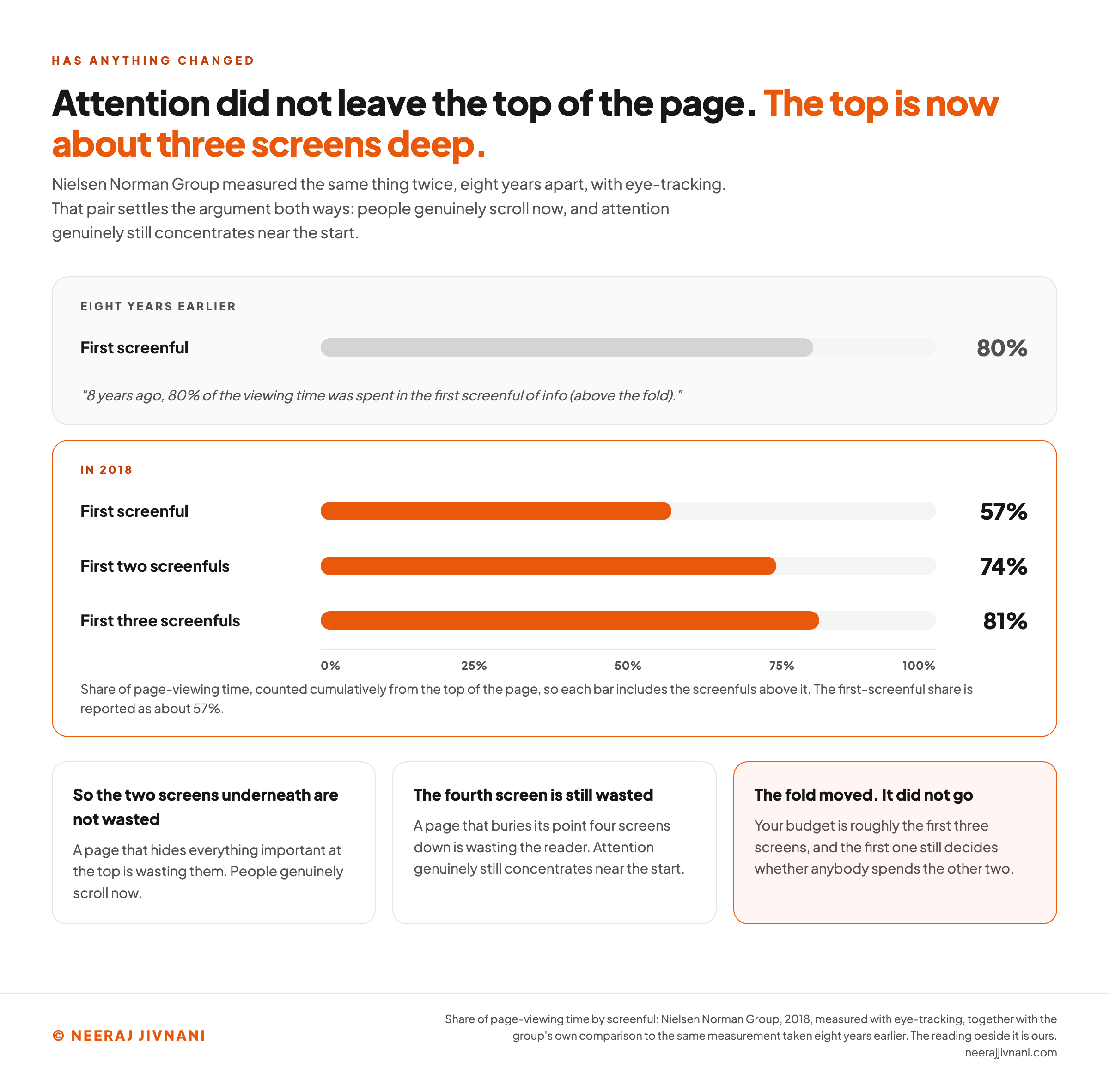
Nielsen Norman Group measured the same thing twice, eight years apart, with eye-tracking.
In 2018 it reported that "8 years ago, 80% of the viewing time was spent in the first screenful of info (above the fold)", and that "today, 81% of the viewing time is spent in the first three screenfuls of information."
That pair settles the argument both ways.
People genuinely scroll now, so a page that hides everything important at the top is wasting the two screens underneath. And attention genuinely still concentrates near the start, so a page that buries its point four screens down is wasting the reader.
The 2018 study puts about 57% of page-viewing time above the fold and 74% in the first two screenfuls.
The practical reading is that the fold has moved rather than disappeared. Your budget is roughly the first three screens, and the first one still decides whether anybody spends the other two.
Use this chart — embed code and citation
<a href="https://neerajjivnani.com/blog/above-the-fold/"><img src="https://neerajjivnani.com/infographics/above-the-fold/the-top-is-three-screens-deep.png" alt="Two stacked panels comparing the same eye-tracking measurement eight years apart. The upper gray panel, labeled eight years earlier, carries a single bar at 80 percent for the first screenful beside the quoted line that 8 years ago, 80 percent of the viewing time was spent in the first screenful of info above the fold. The lower panel, labeled in 2018 and outlined in orange, carries three cumulative bars: the first screenful at 57 percent, the first two screenfuls at 74 percent, and the first three screenfuls at 81 percent, on the same zero to one hundred percent scale. Three cards underneath say that the two screens underneath the first are not wasted because people genuinely scroll now, that a page burying its point four screens down is still wasting the reader, and that the fold moved rather than went, so the budget is roughly the first three screens and the first one still decides whether anybody spends the other two." width="1200"></a>
<p>Chart: <a href="https://neerajjivnani.com/blog/above-the-fold/">Neeraj Jivnani</a></p>Neeraj Jivnani, "What Above the Fold Means, and Where Yours Actually Falls", neerajjivnani.com, https://neerajjivnani.com/blog/above-the-fold/Free to republish with a link back to this page.
The Fold and Search
The fold is a reader problem before it is a search problem, and keeping it that way avoids most of the bad advice here.
Nothing gets ranked higher for sitting in the first screen. A search engine reads the whole page, and moving a paragraph up the template does not change what it says.
What the first screen changes is what happens after the click. Somebody who arrives, cannot tell what the page is, and leaves does not come back, and no amount of good material further down gets a second chance at them.
Two things are worth keeping in view.
Whatever sits in the first screen is what a visitor waits on, so every extra thing you put there is time before they see any of it.
And a first screen that is mostly advertising pushes the thing they came for out of view, which is a bad experience before it is a ranking question.
Fix both for the reader. The search benefit follows and is the smaller half.
Four Questions Worth a Straight Answer
Four questions come up more than the rest, and each one has a short answer.
What Does Above the Fold Mean?
Above the fold means whatever fits on somebody's screen when your page loads. Anything they have to scroll to reach sits below it.
No pixel height defines the line. It depends on the screen and the browser window in front of that particular reader.
Is Above the Fold Still a Thing?
Yes, with the boundary in a different place. People scroll far more readily than they used to, and attention still drops away further down the page.
Nielsen Norman Group's 2018 eye-tracking put about 57% of page-viewing time above the fold. The first screen decides whether anybody reads the rest.
What Does Above the Fold Mean in Newspaper?
In a newspaper, above the fold is the upper half of the front page, the part visible when the paper is stacked folded on a newsstand. Editors put the strongest headline and photograph there to sell the copy.
The web borrowed the term for the same situation, not for the same measurement.
What Is Above and Below the Fold?
Above and below the fold are the two halves of a page, split by whatever a visitor's screen can show at once.
Above the fold costs a visitor nothing. Below the fold costs them a scroll they have to choose to make, which is what makes the first screen worth thinking about at all.
The Rule Worth Keeping
Keep one rule and the rest of this takes care of itself. The fold is the amount of a page that a single visitor can see while they decide whether to stay.
It is not a pixel height you can look up, and it is not a container you have to fill.
So find where your own fold falls on the one or two screen sizes your visitors use, then make that screen say what the page is, who it is for, and that there is more underneath.
Everything else here follows from what that screen says. That is the rule worth keeping, and every pixel number quoted at you was always somebody else's screen.