What a Call to Action Is, and How to Write One That Names the Next Step
Your reader should know what happens after the click. How to write a call to action, size it, place it, and tell whether it worked.

/ On this page10 sections
A reader should be able to tell what happens after they click, before they click. That single test decides more calls to action than wording style, button color or urgency ever will.
What follows is the whole job: what a call to action is, how to write one, how big it has to be, where on the page it belongs, and how to tell whether the one you have is working.
What a Call to Action Is
A call to action is the sentence that asks someone to do one specific thing next.
It is the ask itself, not the box the ask sits in.
It might be a button, a text link, a line at the end of an email, a sentence spoken at the close of a video, or a printed line on a leaflet.
The form is older than the web. Sales scripts and direct mail carried calls to action long before anyone put one on a page, which is why the good ones still read like something a person would say out loud.
Without one, a reader who agrees with you has nowhere to put that agreement. They finish the page, feel positive, and leave.
The Button Is Not the Call to Action
The button is a container. Treating the two as one thing is why pages get redesigned when they needed rewriting.
Separate them before you touch either. There is the ask, which is the thing you want to happen, and there is the label, which is the handful of words that carry it.
A plain text link with the right words will beat a beautiful button with the wrong ones. That is not an argument against design; it is an argument about which problem you are solving.
The Ask, and What It Costs the Person You Are Asking
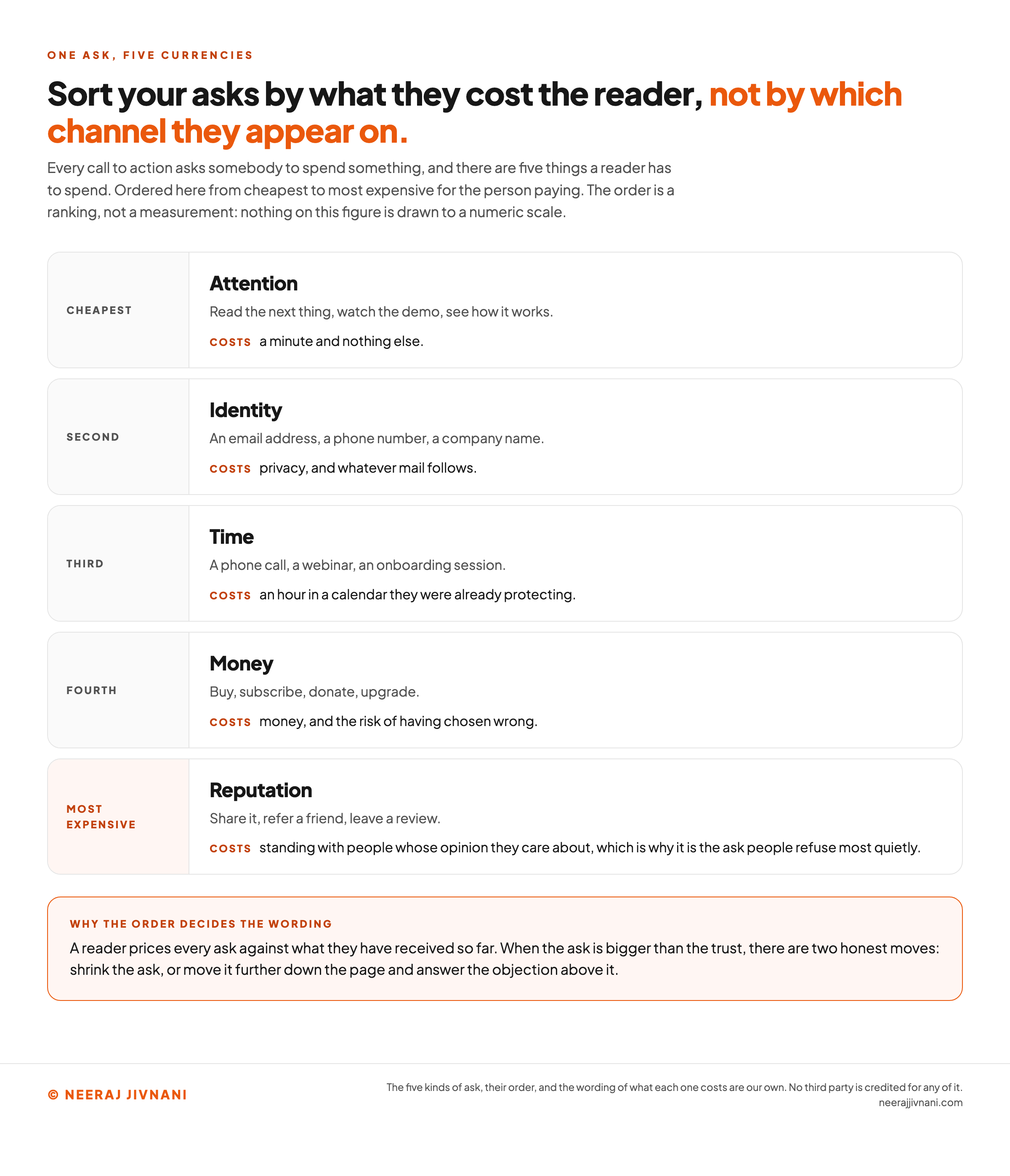
Sort your asks by what they cost the reader, not by which channel they appear on.
The cost is what decides whether the ask lands.
Every call to action asks somebody to spend something, and there are five things a reader has to spend.
Here are the kinds of ask, from cheapest to most expensive for the person paying:
- Attention. Read the next thing, watch the demo, see how it works. Costs a minute and nothing else.
- Identity. An email address, a phone number, a company name. Costs privacy and whatever mail follows.
- Time. A phone call, a webinar, an onboarding session. Costs an hour in a calendar they were already protecting.
- Money. Buy, subscribe, donate, upgrade. Costs money and the risk of having chosen wrong.
- Reputation. Share it, refer a friend, leave a review. Costs standing with people whose opinion they care about, which is why it is the ask people refuse most quietly.
The familiar labels sit inside those five. Sign up, download, try it free, learn more, add to cart, see a demo, donate, share, leave feedback.
Naming which one you are making is the first useful thing you can do, because a reader prices every ask against what they have received so far.
Use this chart — embed code and citation
<a href="https://neerajjivnani.com/blog/call-to-action/"><img src="https://neerajjivnani.com/infographics/call-to-action/five-things-a-reader-spends.png" alt="Ladder of the five things a call to action can ask a reader to spend, ordered from cheapest to most expensive for the person paying and marked as a ranking rather than a numeric scale: attention, where the ask is to read the next thing, watch the demo or see how it works, and the cost is a minute and nothing else; identity, an email address, a phone number or a company name, costing privacy and whatever mail follows; time, a phone call, a webinar or an onboarding session, costing an hour in a calendar they were already protecting; money, buy, subscribe, donate or upgrade, costing money and the risk of having chosen wrong; and, at the expensive end, reputation, share it, refer a friend or leave a review, costing standing with people whose opinion they care about, which is why it is the ask people refuse most quietly. A band underneath says a reader prices every ask against what they have received so far, and that when the ask is bigger than the trust there are two honest moves, shrinking the ask or moving it further down the page and answering the objection above it." width="1200"></a>
<p>Chart: <a href="https://neerajjivnani.com/blog/call-to-action/">Neeraj Jivnani</a></p>Neeraj Jivnani, "What a Call to Action Is, and How to Write One That Names the Next Step", neerajjivnani.com, https://neerajjivnani.com/blog/call-to-action/Free to republish with a link back to this page.
Write the Promise, Not the Mechanism
A call to action is a promise about the next thirty seconds of somebody's life, so write the promise rather than the machinery behind it.
Four rules do the bulk of that work. The first two are about the words, and the last two are about the ask underneath them.
They are set out in that order because that is the order a reader meets them in, not the order you should fix them in.
On a page you have not written yet, settle the third one first. The size of an ask is invisible from inside the sentence, and no wording rescues an ask the reader was never going to make.
Name What Happens After the Click
"Submit" names an operation your database performs.
Nobody arrives at your page wanting to submit anything.
Write the reader's outcome instead: send my question, see the plans, take the checklist, talk to an engineer. The verb belongs to them.
Here is the test.
Show the label to somebody who has not read the page. If they cannot say what happens next, the label is naming your mechanism, not their result.
Put the Cost in the Words
The cost is going to be discovered anyway.
Discovering it on the next screen feels like a trick. Reading it on the button feels like an offer.
So say how long it takes, what it costs, and whether a card is needed. "Talk to an engineer for 20 minutes" answers the question that was stopping the click, and "Talk to an engineer" leaves it open.
"Free" is the strongest word available to you, and only when it is true of the whole next step.
Ask for as Much as the Page Has Earned
The same words fail on one page and work on another, and the difference is what the reader already knows.
Someone on your pricing page has done their research. Someone who arrived from an ad thirty seconds ago has not, and asking them for a sales call is asking a stranger for an hour.
When the ask is bigger than the trust, you have two honest moves: shrink the ask, or move it further down the page and answer the objection above it.
Is the ask bigger than the trust?
Answer for the ask in front of you, before you touch the wording. The first two rules are about words, and this one is about size, which is the part that stays invisible from inside the sentence.
Answer both, and the two halves of the question sit next to each other: what you are asking for, and what the page in front of them has earned.
Rank the Second Ask Below the First
Real pages carry more than one link.
Rank them. One ask gets the weight, the position and the strongest verb. Everything else gets quieter words, smaller type and less contrast.
Two matching buttons side by side stop being an ask and become a question.
The reader answers questions by leaving.
The Words on the Button
Short is a useful ceiling and a poor target.
A label that keeps growing is usually a sign that the ask underneath it has not been decided.
A longer label that removes doubt beats a shorter one that adds it. "See the pricing sheet" says more than "See it" and is worth the two extra words.
Person is worth a look too. "Price my order" and "Price your order" both read fine, and the first sometimes wins because the reader is speaking rather than being spoken to.
That switch goes wrong when the rest of the page is written in the second person, because then one line in the reader's voice sits oddly against everything around it.
What a Label Has to Survive
Your label will be read alone, without the paragraph you wrote above it, and the words inside it have to carry the meaning on their own.
Screen reader software can list every link on a page for the person using it. A page of "Learn more" becomes a list of identical entries with no way to choose between them.
The same thing happens to a search engine reading link text, and to anyone scanning a page rather than reading it.
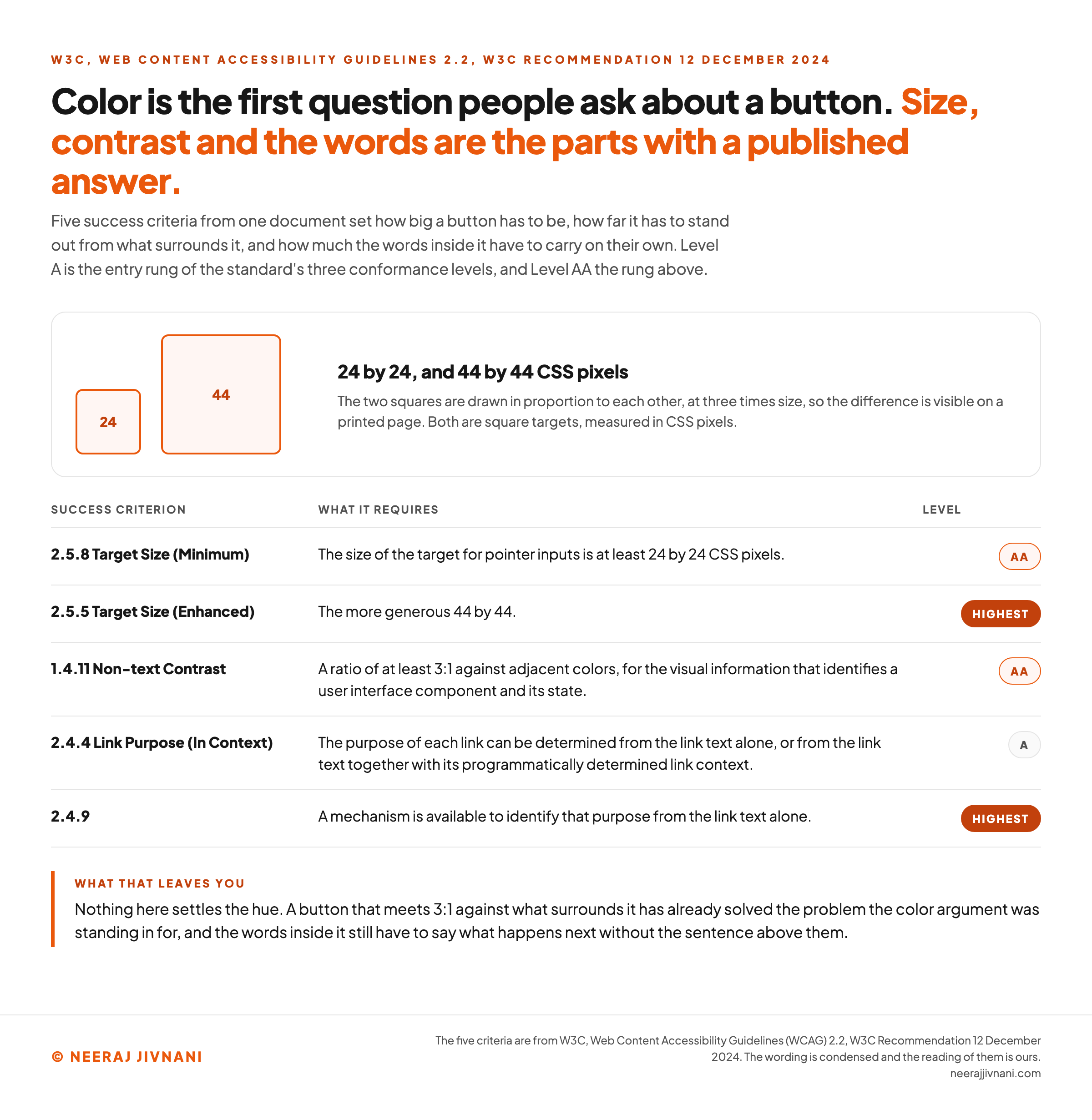
Web Content Accessibility Guidelines 2.2, a W3C Recommendation dated 12 December 2024, carries two criteria on the purpose of a link.
Success Criterion 2.4.4 Link Purpose (In Context) requires that the purpose of each link can be determined from the link text alone, or from the link text together with its programmatically determined link context.
That sits at Level A, the entry rung of the standard's three conformance levels. Success Criterion 2.4.9 goes further at the highest level, asking that a mechanism be available to identify each link's purpose from the link text alone.
Level A lets nearby text carry part of that meaning. We are asking for more than that floor, because the reader who most needs the label is the one who never meets the text around it.
How Big, and How Much Contrast
Make the button at least 24 by 24 CSS pixels, and 44 by 44 where the layout allows it, which are the two sizes Web Content Accessibility Guidelines 2.2 sets.
Success Criterion 2.5.8 Target Size (Minimum) requires that the size of the target for pointer inputs is at least 24 by 24 CSS pixels. That one is at Level AA, the rung above.
Success Criterion 2.5.5 Target Size (Enhanced) sets the more generous 44 by 44, at the highest level.
Both carry exceptions, and the one worth knowing is that a target sitting inside a sentence is exempt. The rule bites on buttons rather than on links in prose.
For contrast, Success Criterion 1.4.11 Non-text Contrast asks for a ratio of at least 3:1 against adjacent colors, for the visual information that identifies a user interface component and its state, at the same rung.
Color is the first question people ask about a button and the least settled one.
The part with a published answer is the contrast, not the hue. A button that meets 3:1 against what surrounds it has already solved the problem the color argument was standing in for.
Use this chart — embed code and citation
<a href="https://neerajjivnani.com/blog/call-to-action/"><img src="https://neerajjivnani.com/infographics/call-to-action/what-the-standard-requires.png" alt="Reference table of the five success criteria that govern a button, with two squares drawn in proportion to each other at three times size and labeled 24 and 44 to show the difference between the two target sizes in CSS pixels. The rows are 2.5.8 Target Size (Minimum) at Level AA, requiring that the size of the target for pointer inputs is at least 24 by 24 CSS pixels; 2.5.5 Target Size (Enhanced) at the highest level, setting the more generous 44 by 44; 1.4.11 Non-text Contrast at Level AA, asking for a ratio of at least 3:1 against adjacent colors for the visual information that identifies a user interface component and its state; 2.4.4 Link Purpose (In Context) at Level A, requiring that the purpose of each link can be determined from the link text alone or from the link text together with its programmatically determined link context; and 2.4.9 at the highest level, asking that a mechanism be available to identify that purpose from the link text alone. A note says Level A is the entry rung of the three conformance levels and Level AA the rung above, and that nothing here settles the hue." width="1200"></a>
<p>Chart: <a href="https://neerajjivnani.com/blog/call-to-action/">Neeraj Jivnani</a></p>Neeraj Jivnani, "What a Call to Action Is, and How to Write One That Names the Next Step", neerajjivnani.com, https://neerajjivnani.com/blog/call-to-action/Free to republish with a link back to this page.
Where the Ask Belongs
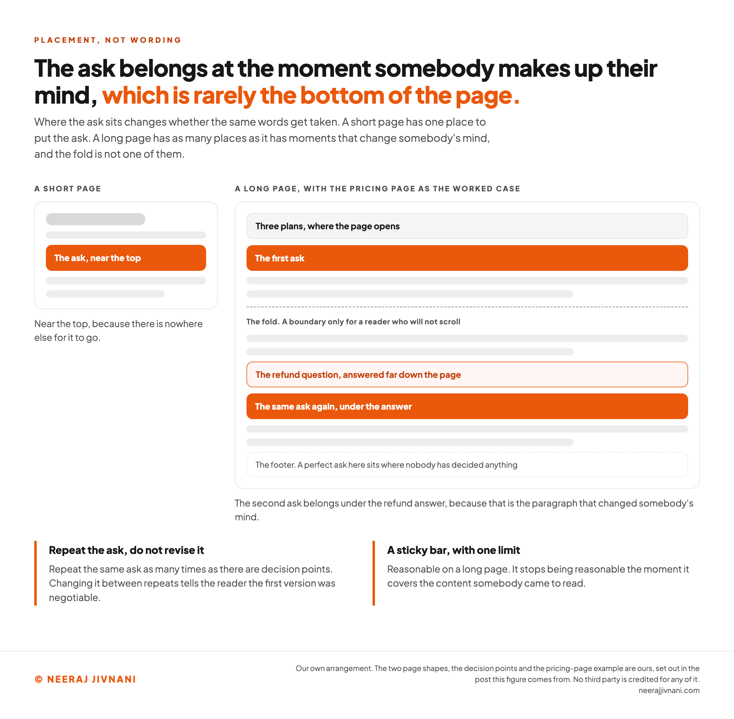
The ask belongs at the moment somebody makes up their mind, which is rarely the bottom of the page.
On a short page that is near the top, because there is nowhere else for it to go. On a long one it belongs after the section that answers the objection standing between the reader and the ask.
Say a pricing page opens with three plans and answers the refund question far down, past several screens of feature comparison.
The second ask belongs under the refund answer, because that is the paragraph that changed somebody's mind.
Above the fold is a rule for pages the reader will not scroll. Once they are scrolling, the fold has stopped being a boundary and the decision points are what matter.
Repeat the same ask as many times as there are decision points. Repeating it is fine, and changing it between repeats is not, because the second version tells the reader the first one was negotiable.
A sticky bar is a reasonable answer on a long page.
It stops being one the moment it covers the content somebody came to read.
Use this chart — embed code and citation
<a href="https://neerajjivnani.com/blog/call-to-action/"><img src="https://neerajjivnani.com/infographics/call-to-action/where-the-decision-is-made.png" alt="Two page mockups side by side showing where a call to action belongs. On the left a short page, with the ask near the top because there is nowhere else for it to go. On the right a long page, using a pricing page as the worked case: three plans where the page opens, the first ask under them, a dashed line marked as the fold and described as a boundary only for a reader who will not scroll, then the refund question answered far down the page, then the same ask again directly under that answer because that is the paragraph that changed somebody's mind, and at the bottom a footer marked as the place where a perfect ask sits where nobody has decided anything. Two notes beneath say to repeat the same ask as many times as there are decision points without revising it between repeats, and that a sticky bar is reasonable on a long page until it covers the content somebody came to read." width="1200"></a>
<p>Chart: <a href="https://neerajjivnani.com/blog/call-to-action/">Neeraj Jivnani</a></p>Neeraj Jivnani, "What a Call to Action Is, and How to Write One That Names the Next Step", neerajjivnani.com, https://neerajjivnani.com/blog/call-to-action/Free to republish with a link back to this page.
What Changes From a Landing Page to an Ad
The ask stays the same everywhere; the room you have to make it changes completely. Writing as though it does not is how a good line dies in an inbox.
- A landing page carries one ask, repeated. Everything else on the page is either supporting it or competing with it.
- A product page already tells the reader what the ask is, so the words matter less than the position and the clarity of what is in the cart.
- A guide or a blog post has earned attention and nothing more. The honest ask here is the next thing to read, or a small identity step in exchange for something specific.
- An email wants one button high on the message and one text link low, and both have to match the promise the subject line made.
- A social post often cannot put the link where the words are, so the words have to name the destination and where to find it.
- Video and audio need an ask that can be said out loud and remembered. A spoken address with query parameters in it is not one.
- Printed material needs an ask that survives being retyped by somebody holding a phone.
The Surface Where You Pick Instead of Write
Advertising platforms are the exception, and the difference is worth knowing before you spend an afternoon on copy for a slot that will not accept it.
On Meta's platforms you choose the call to action from a fixed list rather than writing it.
Meta's own developer reference for ad creative link data describes the field as an optional call to action button. It notes that where none is specified, Instagram applies a default of LEARN_MORE, and that LIKE_PAGE is not supported.
On Instagram, not choosing is still a choice. The platform makes it for you.
Weak Lines, and What They Should Have Said
Five weak lines and their rewrites, with the rule each one follows. Say you sell a payroll tool to restaurant owners and you want somebody into the product.
The business is made up. The pattern is not.
| The weak line | What it names | Rewritten | The rule it follows |
|---|---|---|---|
| Submit | Your form handler | Send my question | Name what happens after the click |
| Learn more | Nothing at all | See the three plans and prices | Name what happens after the click |
| Get started | An event, not an outcome | Run your first payroll, about 10 minutes | Put the cost in the words |
| Sign up today | The urgency, not the offer | Try it free, no card needed | Put the cost in the words |
| Talk to sales | An hour of their day | Watch the 4-minute setup video | Ask for as much as the page has earned |
The rewrites are longer than the originals in every case.
That is the trade, and it is a good one. The extra words are the ones doing the work.
Every one of them also passes the stranger test. Read any right-hand cell alone, with no page around it, and you can say what happens next.
Where a Call to Action Actually Breaks
Three things have to be right, and each one breaks on its own: the ask, the words, and the place.
Deciding which of the three you are looking at is the whole diagnosis. Rewrite a label that was never the problem and you spend a week to learn nothing.
When the Ask Is Wrong
The words are fine and the ask is bigger than the page has earned.
Or two asks are competing. Three equal buttons, a chat bubble and a newsletter box all pull at once, and none of them wins.
Neither of those is a writing problem. Shrink the ask or rank one above the rest, and the same words start working.
When the Words Are Wrong
The label names your system instead of the reader's result. Submit, click here, continue, next: all of them describe software doing something.
Or the cost stays hidden until one screen later, when the card requirement, the sales call or the length of the form finally turns up.
Sometimes the destination disagrees with the label. "See pricing" that opens a contact form is the fastest way to lose somebody who was ready.
Invented urgency is the fourth. A countdown that resets on refresh is a claim your reader can check, and they check it once.
When the Place Is Wrong
The sentence is right and nobody reading it has decided anything yet.
That is the perfect ask in the footer of a page whose argument peaks halfway down. Moving it up is the entire fix.
The tell is a page with nothing obviously wrong on it. When the ask and the label both survive inspection, look at where the ask sits before you touch either one again.
The Only Result Worth Counting
The only result worth counting is the action completed. Clicks are the cheaper number and the one that lies to you most often.
A label that lifts the click-through rate and loses completions has not removed a cost. It has moved that cost one screen later, where it is more expensive to discover.
When you have a change to make and no diagnosis to point at, change it in this order: the ask itself, then the words, then the shape and position, then the color.
The first two are where the differences live, and the last one is where the arguments live.
And leave a change alone long enough to mean something. A label swapped every Tuesday tells you about Tuesdays.
The Line That Does the Work
A call to action is a small piece of copywriting carrying a large amount of weight, and the good ones are plain rather than clever.
Name the thing that happens next, in the reader's words. Say what it costs them, in the same breath.
Ask for no more than the page in front of them has earned. Set it at the point where the reader decides, and make it large enough to hit and clear enough to read alone.
Do that, and the button stops being a design problem. It becomes the shortest true sentence on the page.