Brand Guidelines That Someone Can Follow Without Asking You
Your rules only work if someone can follow them without asking you. What belongs in the document, at the level of detail that makes it usable.

/ On this page7 sections
Brand guidelines are the written rules for using your name, your mark, your colors, your type, your pictures and your words, so that anyone making something can get it right on their own.
That last part is the whole test. A rule nobody can apply without checking with you is not a rule, it is a question with a heading on it.
So the useful question is not which sections to include. It is what each rule has to say before people stop asking.
A Guideline Is a Rule Somebody Else Has to Follow
Brand guidelines are the instructions for applying a brand consistently: what the logo may sit next to, which colors are yours in which color space, which typefaces go where, what the photography looks like, how the name is spelled.
They are not the brand, and they are not the identity either.
The identity is the set of signals you chose. The guidelines are the rules for using those signals after the choosing is finished.
One is a decision, the other is an instruction, and mixing them is why so many of these documents open with forty pages of values nobody reads.
Here is our position, and it decides everything below. A guideline earns its page only if the person applying it can finish the job without you in the conversation.
Most fail it in the same way. They describe an intention instead of setting a limit.
"Give the logo room to breathe" is an intention. "Leave clear space equal to the height of the capital S" is a measurement a printer can act on.
Which of the Four Documents You Are Being Asked For
Four labels get used for overlapping documents, and the confusion is worth clearing up before you write anything, because you may need more than one.
Brand guidelines are the rules for applying the brand. Logo, color, type, imagery, language, and the surfaces they appear on.
A brand book is the story: purpose, positioning, personality, what the company believes. It persuades rather than instructs.
A style guide usually means the writing rules specifically, though plenty of companies use it as a synonym for the whole thing. Ask which one somebody means before you agree to produce it.
A design system is the engineering version: components, tokens, code, states. It is what the guidelines become once a product team has to build with them.
Large organizations split them apart on purpose.
The United Nations Volunteers publishes its guidelines as a how-to document and says on its own opening page that it works alongside a separate brand book and a separate communications toolkit, which holds the logo files and the templates.
Dropbox splits it on the web too, keeping the partner toolkit and the legal resources as their own destinations.
You probably need one document. Knowing which of the four it is stops you writing the wrong one.
What Changes Once It Is Written Down
Three things change, and they are worth naming precisely, because the usual answer of "consistency" is too vague to plan around.
The same decision stops being made twice. Every time somebody picks a blue, that is a decision being remade by a person with less context than you had.
Work gets produced without you in the room. A freelancer, an agency, a printer and a new hire can all start on the same day.
Wrong work becomes correctable without an argument. With a written rule, a rejection points at a line. Without one, it is your taste against theirs, and taste loses to whoever has more time.
What it does not buy you is care. A document is a reference, not a supervisor, and people apply the parts they can find quickly.
That is an argument for making it findable and exact, not for making it longer.
When It Is Too Early to Write One
Sometimes the honest answer is that you do not need this yet.
If one person makes everything you publish, guidelines change nothing. The consistency is already there, held in their head, and writing it down costs a week and saves nothing until somebody else starts producing work.
Wait until one of three things is true.
- Someone outside your own head is making things with your brand on them.
- You are about to hand assets to a partner, a printer or a platform.
- You have caught yourself answering the same question twice.
Until then, a single page with your logo files, your hex codes and your two typefaces does the job. That is not a compromise version. It is the correct size for the problem you have.
What Belongs Inside
Six sections do the work, and they are not equally hard to write.
Nobody argues about a hex code. The arguments start at the words and the surfaces, where a rule has to survive somebody else's judgment.
Logo Rules, Down to the Number
The logo section is the one people open first, and it needs four things.
The approved versions. Full color, one color, reversed for dark backgrounds, and any stacked or horizontal lockups. Say which one is the default and which are for named situations.
Clear space, measured against something. Not "plenty of room". A measurement taken from the artwork itself.
The easiest thing to measure against is a letter out of your own logo. It sits in the artwork, so the rule survives every resize without anybody recalculating it.
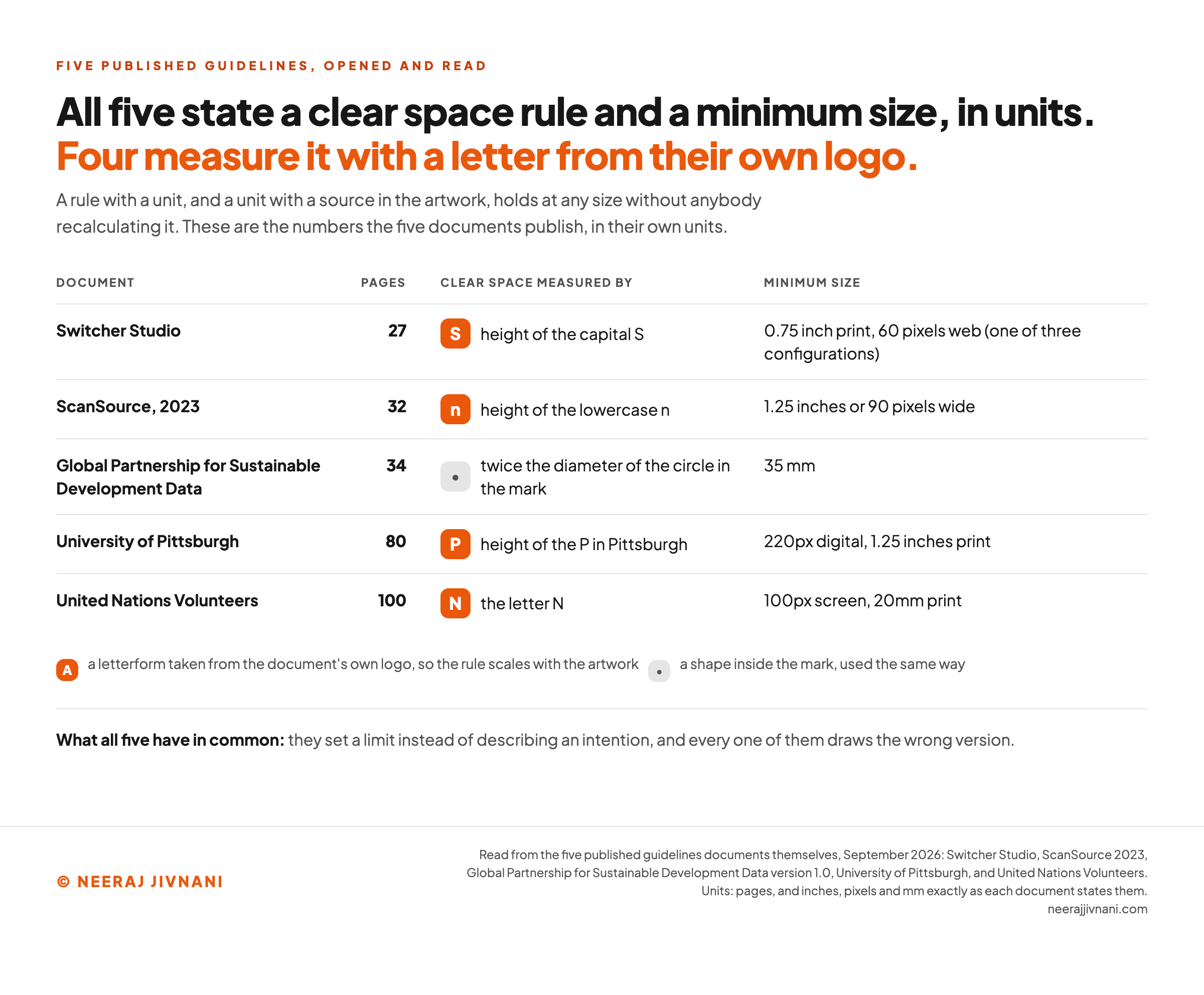
Four of the five published documents read here do exactly that, and the fifth uses a shape inside its mark. The table further down carries which letter each one chose.
A minimum size, in units, for screen and for print. A number, not advice. All five published documents read here state one.
Then set a separate floor for any process that loses detail. ScanSource's ordinary minimum is 1.25 inches or 90 pixels wide, and it sets 2.75 inches for embroidery, because thread cannot hold the detail.
The embroidery floor is the tell of a document written by people who had been burned. It is the kind of rule you only add after a batch of polo shirts comes back wrong.
A page of things not to do, drawn. A drawn wrong version prevents more mistakes than a paragraph of prose, because people match pictures faster than they read.
All five carry one, and the useful ones get oddly specific. Pittsburgh lists nine, each one drawn, including the instruction not to rotate the mark at angles other than 90 degrees.
Color, in Every Space You Publish In
Name the colors, then give every one of them a value in each space you publish in, because different machines read the same swatch differently.
- HEX for the web.
- RGB for anything lit from behind, which is every screen.
- CMYK for four-color print.
- Pantone for a spot color.
The Pantone is the one you can skip unless something gets physically produced. Switcher prints CMYK, RGB and hex for all sixteen of its swatches, and adds a Pantone to one.
This is the section that saves the most money. A brand blue that was only ever written down as a hex code will come back from a printer as a different blue, and nobody will be able to say who was wrong.
Then say where each color may be used, and where it may not.
Values alone are still not a rule. They tell somebody what the color is and nothing about whether it belongs behind a headline, on a button, or across a full page.
A swatch list with no stated use is a set of options, and options get picked by taste.
Typefaces, and What Is Off Limits
Give the family, say which weights are the everyday ones and which are held back, and be blunt about where a secondary face may go.
The restrictions are what keep a typographic system intact.
Switcher's two secondary faces are sanctioned only for short headlines, one of two to four words and the other of a single word, and neither may be set in capitals.
Say what happens when the licensed typeface is unavailable, because it will be: in an email client, in a shared slide deck, on a partner's system. Naming the fallback yourself is how you keep control of the answer.
Imagery and Icons
Photography direction is hard to write and worth the effort, because it is the element people get wrong most confidently.
Describe what the pictures are OF and what they are LIKE. Who is in them, what they are doing, how they are lit, how they are cropped, whether they are staged.
Then show three that are right and two that are not.
Icons need construction rules rather than taste: a bounding box, a stroke weight, and an instruction to outline the strokes before an icon is scaled.
Switcher's guide sets its box at 40 by 40 with a 2-pt stroke. The outlining is the one that decides whether a set stays consistent or drifts every time somebody adds to it.
The Words: the Name, the Capitals, the Conventions
Voice work is its own project. What the guidelines document owes is the mechanical layer, and it is short.
Start with your own name.
Mailchimp's brand page opens by stating that the name is one word, spelled with a big M and a little c. ScanSource tells writers to capitalize both S's and not to abbreviate the company as SCSC except when naming its stock listing.
That looks trivial and it is the most frequently broken rule in any brand.
Then add the conventions: title case or sentence case in headings, the serial comma, how you write dates and numbers, product names that take a capital and features that do not, and the words you never use about your own product.
Where It Gets Applied
Rules become finished work at the point where somebody has to make a real thing.
The United Nations Volunteers document spends its last quarter on exactly this: stationery, email footers, presentations, pull-up banners, event backdrops, promotional items. Naming the surfaces is what turns the abstract rules above into a decision somebody can copy.
Templates do more here than instructions do. A correctly built slide master gets followed by people who will never open a PDF about typography.
A rule, or a question with a heading on it
The headings are fixed and you cannot add one, because the section list was never the work. Write the line underneath each and watch it stop being a question.
Nothing here reads your words. It counts what is still blank, because whether a sentence can be applied is the one thing no checker can tell you.
Still coming back to you
- Logo clear space: How much space do I leave around it, and measured against what?
- Minimum size: How small can I take this before it stops holding up?
- Color: Which one is this in print, and does it belong behind a headline or on a button?
- Typefaces: Which weight is this, and what do I set it in where the license does not reach?
- Imagery: What am I looking for, and can you show me one that is right?
- Your own name: Is that one word or two, and does it take a capital in the middle?
Six headings with nothing under them. Every one of them is a message somebody has to send you before they can start.
What Real Guidelines Documents Specify
Five published documents, read end to end, have one thing in common in the parts that get used. They are dry, specific and drawn.
| Document | Pages | Clear space measured by | Minimum size |
|---|---|---|---|
| Switcher Studio | 27 | height of the capital S | 0.75 inch print, 60 pixels web (one of three configurations) |
| ScanSource, 2023 | 32 | height of the lowercase n | 1.25 inches or 90 pixels wide |
| Global Partnership for Sustainable Development Data | 34 | twice the diameter of the circle in the mark | 35 mm |
| University of Pittsburgh | 80 | height of the P in Pittsburgh | 220px digital, 1.25 inches print |
| United Nations Volunteers | 100 | the letter N | 100px screen, 20mm print |
One thing the table settles: exactness has nothing to do with length. Switcher states its rules as tightly in 27 pages as Pittsburgh does in 80.
One move here is worth stealing outright: build the rule into the file, so following it takes no discipline at all.
The Global Partnership states its exclusion zone, then says the zone is built into every file in the asset pack, and tells people to use the supplied originals rather than screenshotting the logo.
The rule is enforced by the file, not by the reader's diligence.
The Public Page Is Not the Working Document
The famous brand guidelines you have been told to study are usually the permission page, published for people outside the company, and deliberately unspecific.
Mailchimp's is a good example, and a short one. Its spacing rule is to provide plenty of space around the logo and let it breathe, with no measurement anywhere on the page and no minimum size at all.
Four of its rules are prohibitions aimed at third parties, including not using the graphics as part of your own product or business name.
That is not a weak document. It is a correctly written one for its job, which is to let journalists and partners use the logo without a lawyer, while giving away nothing about how the brand is built.
Copy its structure and you will produce a permission page when what your team needed was a manual. The working documents are the ones nobody links to, and several of them, including all five above, are public PDFs sitting on the organization's own website.
Use this chart — embed code and citation
<a href="https://neerajjivnani.com/blog/brand-guidelines/"><img src="https://neerajjivnani.com/infographics/brand-guidelines/what-they-specify.png" alt="Comparison table of five published brand guidelines documents, showing for each one its page count, the thing it measures logo clear space against, and its stated minimum size. Switcher Studio, 27 pages, clear space measured by the height of the capital S, minimum 0.75 inch in print and 60 pixels on the web, one of three configurations it lists. ScanSource 2023, 32 pages, the height of the lowercase n, minimum 1.25 inches or 90 pixels wide. Global Partnership for Sustainable Development Data, 34 pages, twice the diameter of the circle inside the mark, a single minimum size of 35 millimeters. University of Pittsburgh, 80 pages, the height of the P in Pittsburgh, minimum 220 pixels digital and 1.25 inches print. United Nations Volunteers, 100 pages, the letter N, minimum 100 pixels on screen and 20 millimeters in print. Four of the five measure clear space with a letterform taken from their own logo." width="1200"></a>
<p>Chart: <a href="https://neerajjivnani.com/blog/brand-guidelines/">Neeraj Jivnani</a></p>Neeraj Jivnani, "Brand Guidelines That Someone Can Follow Without Asking You", neerajjivnani.com, https://neerajjivnani.com/blog/brand-guidelines/Free to republish with a link back to this page.
Who Else Is Allowed to Use It
Say who is allowed to use the marks and for what, and say what needs your written permission first.
Once anybody outside your company uses them, the document needs a section addressed to them rather than to your own team.
Say plainly that use of your name and logo must not imply a partnership, an endorsement or an affiliation that does not exist. That is the clause a well-meaning partner breaks without noticing.
ScanSource devotes two pages to this and states the terms directly. The marks stay its property, they may not be used in a way that implies affiliation, and they may not be registered or adopted by anyone else in any jurisdiction.
And it shows what a written-permission clause looks like: put any part of the mark in a domain name and you need ScanSource's permission in writing first, because people associate a domain with the company that owns the name.
Then supply the files.
A resellers page or press kit with the approved artwork, the color values and one short list of prohibitions prevents more damage than any amount of policing. Much of the misuse comes from somebody who could not find the right file and used a screenshot.
How Long It Should Be
Twenty to forty pages if you have a team producing work. One page if you are still the only one making things.
That first number is not a preference. It is where published guidelines sit, and it can be counted. The second is our answer, and nothing in the counts argues you out of it.
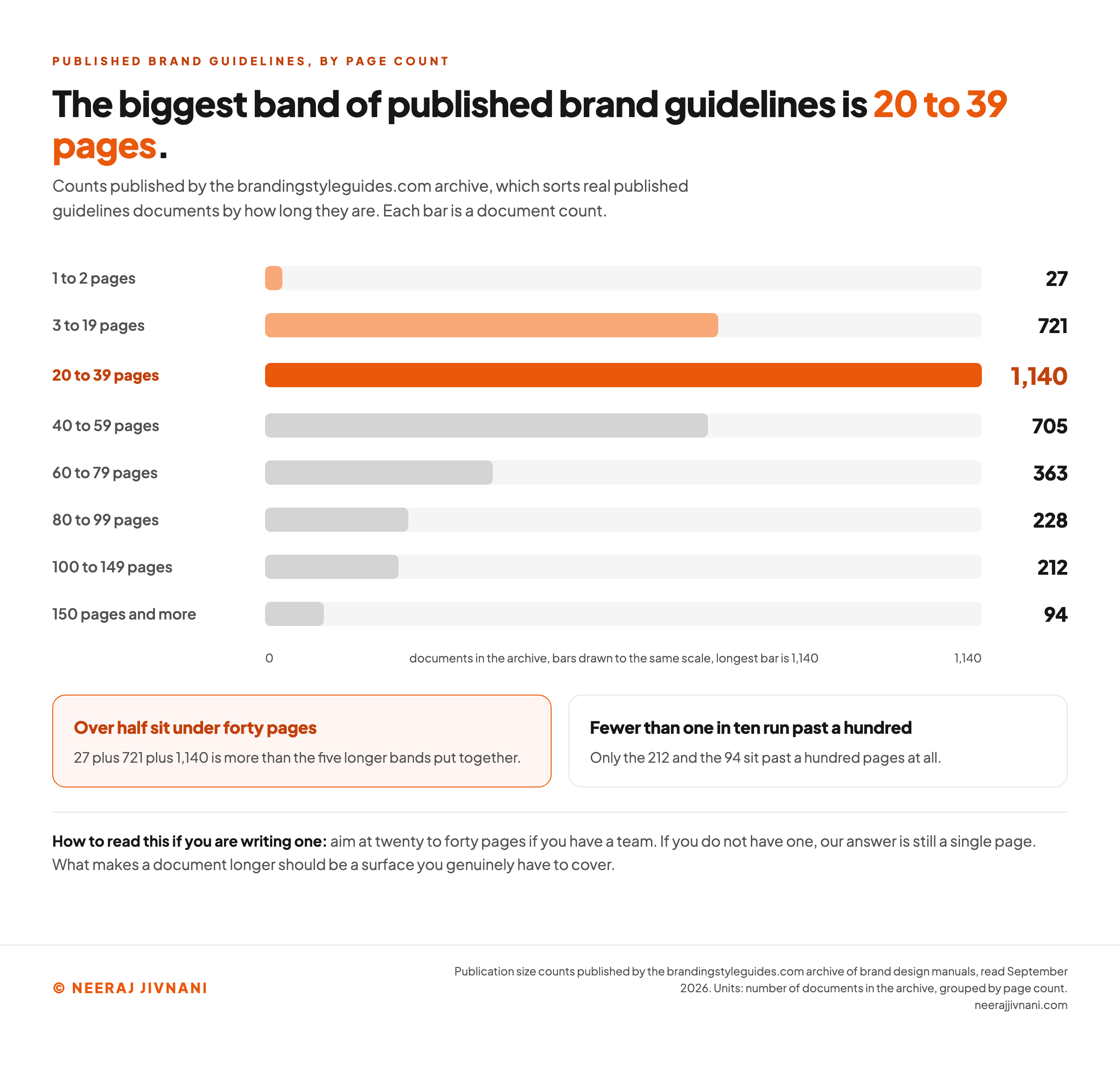
The design archive at brandingstyleguides.com sorts real published documents by length. Its own counts, read in September 2026, are these.
| Size of document | Documents |
|---|---|
| 1 to 2 pages | 27 |
| 3 to 19 pages | 721 |
| 20 to 39 pages | 1,140 |
| 40 to 59 pages | 705 |
| 60 to 79 pages | 363 |
| 80 to 99 pages | 228 |
| 100 to 149 pages | 212 |
| 150 pages and more | 94 |
The single biggest band is 20 to 39 pages, over half of every document in the archive sits under forty, and fewer than one in ten runs past a hundred.
The two longest of the five read here are a university and a United Nations body, which is the kind of organization that has many hands on one brand and genuinely needs the length.
What makes a document longer should always be a surface you genuinely have to cover, never a section added because other people's documents have one.
Use this chart — embed code and citation
<a href="https://neerajjivnani.com/blog/brand-guidelines/"><img src="https://neerajjivnani.com/infographics/brand-guidelines/how-long-they-actually-are.png" alt="Horizontal bar chart of the size distribution of published brand guidelines documents in the brandingstyleguides.com archive, read September 2026. The bands and their document counts are 1 to 2 pages with 27 documents, 3 to 19 pages with 721, 20 to 39 pages with 1,140, 40 to 59 pages with 705, 60 to 79 pages with 363, 80 to 99 pages with 228, 100 to 149 pages with 212, and 150 pages and more with 94. The 20 to 39 page band is the largest and is highlighted, and the chart notes that over half of all the documents sit under forty pages." width="1200"></a>
<p>Chart: <a href="https://neerajjivnani.com/blog/brand-guidelines/">Neeraj Jivnani</a></p>Neeraj Jivnani, "Brand Guidelines That Someone Can Follow Without Asking You", neerajjivnani.com, https://neerajjivnani.com/blog/brand-guidelines/Free to republish with a link back to this page.
Keeping It Usable
Nobody notices a guidelines document going out of date, and keeping it usable is a separate job from writing it.
The rules stay on the page while the brand moves, and the version people are working from is the one somebody emailed them last year.
Put the version and the date on the cover. A version number lets two people check they are holding the same file, and the date tells them how old the rules are.
A document with neither is how a team ends up working from three different files. The Global Partnership opens on version 1.0 and December 2021, Pittsburgh on version 2.2.
Keep one address. One link, one location, and every old copy deleted rather than superseded.
Ship the files with the rules. The document explains; the asset pack executes. Fonts, logo files in the formats people need, color swatches, templates.
Set a trigger for rewriting, not a calendar slot. Rewrite the document when something real changes: a new product line, a market you did not have, a surface you have never published on. An annual rewrite of a document nothing has happened to produces edits for their own sake.
Brand guidelines are a working document, and the measure of one is boring. It is whether the last three things your company published were right, and whether anybody had to ask.
Write the rules exactly enough that they can be applied, put them where people already look, and give away the files that make following them the path of least resistance.