What Brand Identity Is, and Which Parts You Cannot Afford to Move
See what an identity is made of, the order to decide it in, and which five signals you commit to and then leave alone once customers know them.

/ On this page8 sections
Your brand identity is the set of signals you choose so people can recognize you again without reading your name.
That is the whole job. Below is what those signals are, the order to decide them in, and which five you commit to and then leave alone.
Most identities fail on the last one, and rarely because the logo was bad.
What Brand Identity Is
Brand identity is everything a company deliberately puts into the world so people can tell it apart: the name, the mark, the colors, the typefaces, the imagery, the way it writes, and the way the product itself looks.
It is the sending side.
Two things in that definition carry more weight than the list does.
It is chosen. Every company already has an identity, because every company already publishes things, and the only question is whether anyone picked it.
It is a system, not an artifact. A logo file is one output. The identity is the agreement about which signals go out, in what combination, every time.
That agreement is what a customer learns. They are not memorizing your logo, they are learning a pattern, and a pattern needs repetition before it becomes one.
Identity, Image and Branding Are Three Different Words
The three get used interchangeably, and separating them makes the rest of this usable.
Identity is what you send. It originates with you: the name, the mark, the palette and the register, all decided before anyone has reacted.
Image is what lands. It belongs to the audience, and it is assembled out of your identity plus your product, your prices, your support queue and whatever a competitor said about you.
Branding is the work in between. It is the activity of choosing the signals, applying them, and repeating them until the second one resembles the first.
You control the first, you influence the second, and the third is how.
That distinction settles a common argument. When identity and image disagree, changing the identity is usually the wrong move, because the gap is rarely caused by the signals.
It is caused by what the signals are attached to.
What a Brand Identity Is Made Of
An identity is normally described as a list of elements, and the list is worth having as long as you remember that the items are not equal.
Here is the whole set, split by whether a customer meets it with their eyes or not.
| Visual | Non-visual |
|---|---|
| The wordmark or symbol | The name |
| The color palette | The voice and tone |
| The typefaces | The story you tell about why you exist |
| Photography and illustration style | The tagline |
| Iconography and graphic devices | The personality you write with |
| The product and its packaging | The way you answer a complaint |
The right column is the half that carries an email, a support reply or a pricing page, none of which arrive with a logo on them. That is most of what a customer receives from you.
Nothing in that table is optional in the sense of not existing. If you have not decided the voice, you still have one, and it is whatever mood your last writer was in.
The Five That Do the Most Work
If you want five, these are the five, and they are the five because of a single test: could a customer identify you from this alone?
- The name. The only element that survives being spoken aloud, typed into a search box, or repeated by somebody who has never seen your website.
- The mark. A wordmark or a symbol, at the sizes it will meet the world in: an app icon, a favicon, a sponsor board.
- One color. Not a palette. The single color that a customer would pick you out by at a distance.
- One typeface. The one your own words are set in, everywhere, which is why it is felt more than it is noticed.
- The voice. The register your writing holds across a launch, an outage and an invoice.
The other elements matter, and they are not what you are recognized by. Photography style and iconography make a system feel finished, and almost nobody could describe yours from memory.
Get the five right and the rest can be improved at leisure.
Get them wrong and no amount of illustration style rescues it.
Why a Brand Identity Matters
Recognition is cheaper than persuasion, and an identity is the machine that produces it.
A customer who recognizes you starts the conversation somewhere further along. They are not deciding whether you are real, which is the expensive part of every first meeting.
That is the honest case, and it does not need a percentage attached to it.
You will meet percentages for this, a revenue lift attributed to consistent branding. Before you repeat one, find out who ran the survey and what they sell.
The internal case needs no survey at all. Several people publish on your behalf every week, and without a written identity each of them is guessing.
That produces work which is individually fine and collectively anonymous.
Say a regional bakery with four locations, a part-time social media freelancer and a manager who writes the newsletter. Nothing any of them publishes is wrong, and no two pieces look like they came from one company.
There is a later cost too. An identity nobody decided cannot be enforced, so every new hire, agency and contractor adds their own version, and by year three you are recovering an identity rather than maintaining one.
The Parts That Have to Hold Still
What you are willing to keep matters more than what you make. An identity is worth something in proportion to how long it has stayed the same.
Recognition works by repetition. A signal becomes yours only after a customer has met it enough times to expect it, and every change resets that counter to zero.
The real question in front of a new identity, then, is not "does this look good". It is "will we still be using this in five years".
That question sorts the elements into two piles.
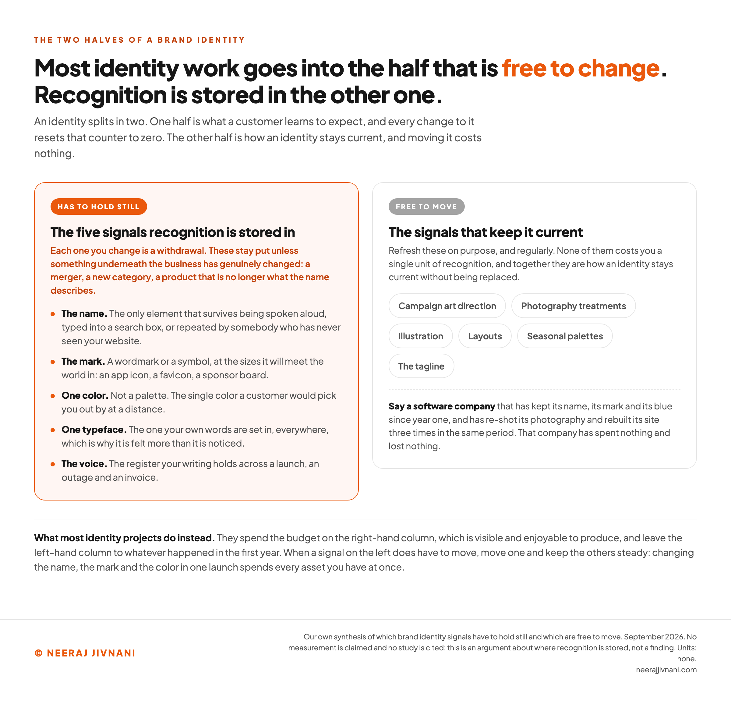
The ones that must hold. The name, the mark, the one color, the typeface, the voice. These are the signals recognition is stored in, and each one you change is a withdrawal.
The ones that are free to move. Campaign art direction, photography treatments, illustration, layouts, seasonal palettes, the tagline. These can and should move, because they are how an identity stays current without spending anything.
Most identity projects invert this. They spend the budget on the second list, which is visible and enjoyable to produce, and leave the first list to whatever happened in the first year.
What Coca-Cola and Patagonia Actually Own
Coca-Cola's brand identity is a red, a script wordmark, a contoured bottle and the name, and what it owns is how little any of them has moved.
The bottle is the part worth studying, because a container carrying no name and no color can do the work of identification on its own.
That is what holding a signal still eventually buys. The Coca-Cola Company's own history of the bottle records the shape being recognized as a trademark on "April 12th, 1961", and calls it "highly unusual for a commercial package to be granted that status".
The grant was bolstered in part by something measured twelve years earlier: "a 1949 study showed that less than 1% of Americans could not identify the bottle of Coke by shape alone", the same history records.
No campaign produces that. Decades of not changing it do.
Patagonia is evidence of the other half. Its mark is a mountain skyline and its type and color barely move.
What you recognize, though, is less the logo than a position held consistently enough that the products, the copy and the company's public arguments all read as one source.
Both are the same lesson from different directions. One shows how far a purely visual signal can go when it is left alone, and the other shows that the non-visual half counts as identity too.
What neither is, is a template. They are consumer brands with decades of repetition banked, and copying the output of that is not the same as doing the work.
Use this chart — embed code and citation
<a href="https://neerajjivnani.com/blog/brand-identity/"><img src="https://neerajjivnani.com/infographics/brand-identity/what-you-keep.png" alt="Two-column diagram splitting a brand identity into the half that has to hold still and the half that is free to move. The left column, marked has to hold still, lists the name, the mark, one color, one typeface and the voice as the five signals recognition is stored in, each with a one-line note on what that signal is and where a customer meets it. The right column, marked free to move, lists campaign art direction, photography treatments, illustration, layouts, seasonal palettes and the tagline, with a note that none of them costs a single unit of recognition. A closing line states that most identity projects spend the budget on the right-hand column and leave the left-hand column to whatever happened in the first year." width="1200"></a>
<p>Chart: <a href="https://neerajjivnani.com/blog/brand-identity/">Neeraj Jivnani</a></p>Neeraj Jivnani, "What Brand Identity Is, and Which Parts You Cannot Afford to Move", neerajjivnani.com, https://neerajjivnani.com/blog/brand-identity/Free to republish with a link back to this page.
How to Build a Brand Identity
Build it in this order, because each step is a decision the next one needs. The sequence is the useful part, more than any individual step.
- Decide what you are, in words.
- Choose a name you can keep.
- Build the visual system on those decisions.
- Set the voice.
- Write it all down.
Steps three, four and five can overlap. Steps one and two cannot be reordered, and skipping straight to three is the single most common way this goes wrong.
Decide the Words Before the Pictures
Before any design begins, you need four things written down: who this is for, what you do that the alternatives do not, what you want to be recognized for, and what you refuse to be.
Start with what you have. Take a month of your own output and list the signals a customer would have met in it, because that is the identity you are proposing to replace.
Then look at what your category already owns. Line up the competitors your buyers weigh against you and write down their colors, their mark shapes and their typographic habits.
A blue software company in a category of blue software companies is teaching customers to recognize the category, not itself.
If a designer is doing this work for you, this is the material they need. Handed nothing, they will make these decisions themselves, in a medium where changing your mind costs a rebuild.
Choosing a Name You Can Keep
A name is judged on three things: whether people can say it, whether they can spell it after hearing it, and whether you can own it.
The third is the one that gets skipped, and it is not a matter of taste. It runs on a rule you can apply to a shortlist this afternoon.
The more plainly a name says what you sell, the less of it you can own. That one measure sorts every candidate onto a ladder, and where yours lands decides what protection is available to it.
| The rung | How it relates to the product | Example | How well you can defend it |
|---|---|---|---|
| Fanciful | A made-up word that meant nothing until you used it | Exxon, Pepsi | Best. Nobody else has a use for the word |
| Arbitrary | A real word with no connection to what you sell | Apple, for computers | Almost as well, inside your category |
| Suggestive | Alludes to a quality without naming it | Coppertone, for sun-tanning products | Well, and it is the last rung that still counts as strong |
| Descriptive | Describes the goods or some aspect of them | "Creamy" for yogurt | Poorly. Registrable only in narrow circumstances |
| Generic | The everyday name for the goods themselves | "Bagel shop" for a bagel shop | Not at all. It is not federally registrable |
That ladder is the United States Patent and Trademark Office's, and its guidance, unchanged since November 2023, draws the line in one sentence: "Strong trademarks are suggestive, fanciful, or arbitrary. Weak trademarks are descriptive or generic."
The boundary that decides a shortlist sits between suggestive and descriptive, because that is where most candidate names land.
A descriptive name tells you what the product is the moment you hear it. A suggestive one only points at it, which is why "bronzer" for suntan oil is descriptive while Coppertone, sold off the same shelf, is suggestive.
That pair is the agency's own example.
Landing on the wrong side of that line has a price. Descriptive marks are "only registrable in certain circumstances, such as your trademark gaining distinctiveness through extensive use in commerce over many years", the agency says, and "generic trademarks are not federally registrable" at all.
So the name everyone in the room likes, because it explains the business at a glance, is usually the one you will spend the most defending when a competitor picks something close to it. That trade is worth making knowingly rather than by accident.
Building the Visual System
Now the visuals, and they get built as one system rather than as four separate shopping trips.
Design the mark in black and white first. Color hides a weak shape, and the mark has to survive an app icon, an embroidered shirt and a fax at the bottom of an invoice.
Then the palette, and keep it small at the top. One color does the recognizing, two or three support it, and a handful of neutrals do the actual work of building pages.
Typography is where most small identities quietly improve. Two typefaces are enough and three is a maximum, and the discipline is applying them consistently rather than choosing well.
One of those is the typeface your own words are set in, and that is the one in the holding half.
Then the supporting layer: photography treatment, illustration, iconography, chart styling. This is the part that makes a system look finished, and it is also the part you are allowed to revisit every couple of years.
Test everything at the smallest size it will ever appear. Identities fail on phones and favicons far more often than they fail on the presentation where they were approved.
Setting the Voice
Voice is a signal in the same way the mark is, and it is the one that most often reaches a reader without ever having been decided.
Every other signal leaves the build as something you can hand over.
A mark ships as artwork, a color as a value, a typeface as a license, and the name is a word you type. Someone can apply all four correctly on their first day.
The voice ships as a description, and every writer rebuilds it from scratch. That is why it drifts even after you have decided it.
The other four move when somebody commissions a change, and this one moves when you hire.
So the thing to protect at this step is not the quality of the writing. It is that the voice gets decided inside the project at all.
An identity project that ends when the visual system is signed off has decided four of the five. The fifth gets settled by whoever needs to publish something on Monday.
Tone sits in the moving half, and it should.
Writing It Down
An identity that lives in one person's judgment becomes a bottleneck the first week that person is unavailable.
The document does not have to be impressive. It has to be findable.
At minimum: the decisions from step one, the logo files with their clear space and minimum sizes, the color values, the typefaces with a hierarchy, the register you have decided to hold, and the handful of things nobody may do to the mark.
For a company with no design team, the honest version of this is one page somebody can find in ten seconds. That is worth considerably more than an unread fifty-page manual.
What Is Allowed to Move, and What Is Not
Consistency does not mean an identity is frozen. It means knowing which half of it is allowed to move.
Refresh the moving half on purpose, and put it on a schedule rather than waiting for somebody to complain.
The holding half stays put unless something underneath the business has genuinely changed: a merger, a new category, a product that is no longer what the name describes.
Say a software company that has kept its name, its mark and its blue since year one, and re-shot its photography and rebuilt its site three times in the same period. That company has spent nothing and lost nothing.
A new marketing lead is not a reason. Neither is a team that has grown bored of the logo, and boredom inside a building always arrives years before anyone outside has noticed the logo at all.
When a holding signal does have to move, move one and keep the others steady. Changing the name, the mark and the color in one launch spends every asset you have at once.
The test for any proposed change is short. Ask what a customer would fail to recognize afterwards, and whether what you are gaining is worth that.
What is this change actually costing you?
Tick what your next identity project is going to change. Half of these cost you nothing and need no justification at all. The other half is where recognition is stored, and the moment you touch one of those this will ask you why.
What the project is changing
Nothing ticked yet. Start with whatever the project is already scoped to change, not with what you think it ought to change.
Whether Anyone Recognizes You Yet
The only test that matters is subtraction: remove your name and see whether anyone can still tell the work is yours.
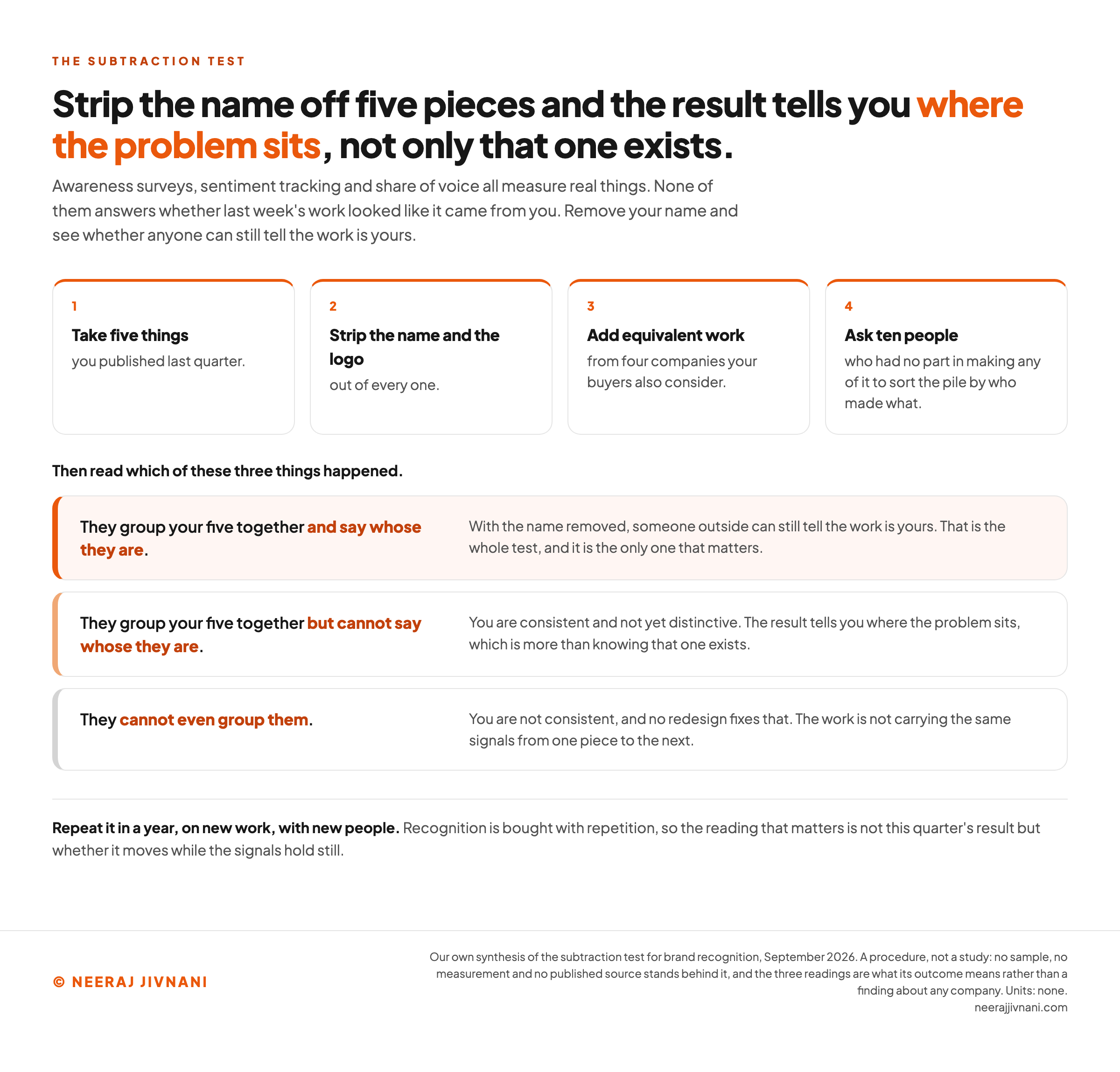
Take five things you published last quarter and strip the name and the logo out of every one. Put them in a pile with equivalent work from four companies your buyers also consider.
Then ask ten people who had no part in making any of it to sort the pile by who made what.
The result tells you where the problem sits, not only that one exists. If people group your five together but cannot say whose they are, you are consistent and not yet distinctive.
If they cannot even group them, you are not consistent, and no redesign fixes that.
This is the same principle Coca-Cola's bottle demonstrates at the extreme end, run at a scale you can afford. Repeat it in a year, on new work, with new people.
Awareness surveys, sentiment tracking and share of voice all measure real things. None of them answers whether last week's work looked like it came from you.
Use this chart — embed code and citation
<a href="https://neerajjivnani.com/blog/brand-identity/"><img src="https://neerajjivnani.com/infographics/brand-identity/the-subtraction-test.png" alt="Diagram of the subtraction test in four steps and three results. The steps are to take five things you published last quarter, strip the name and the logo out of every one, add equivalent work from four companies your buyers also consider, and ask ten people who had no part in making any of it to sort the pile by who made what. The three results are that they group your five together and say whose they are, meaning someone outside can still tell the work is yours; that they group them but cannot say whose they are, meaning you are consistent and not yet distinctive; and that they cannot even group them, meaning you are not consistent and no redesign fixes that." width="1200"></a>
<p>Chart: <a href="https://neerajjivnani.com/blog/brand-identity/">Neeraj Jivnani</a></p>Neeraj Jivnani, "What Brand Identity Is, and Which Parts You Cannot Afford to Move", neerajjivnani.com, https://neerajjivnani.com/blog/brand-identity/Free to republish with a link back to this page.
Pick a Few Signals and Leave Them Alone
Choosing an identity is the easy half. Keeping one is what produces recognition, and it is the skill almost nobody plans for.
The choice that matters is not which color or which typeface. It is which handful of signals you are prepared to still be using when you are bored of them, and which ones you are leaving free to change.
Write that split down before the design work starts.
A company that knows which half is which can refresh confidently for a decade. A company that does not will rebuild the same identity every three years and wonder why nobody recognizes it.