What a Mega Menu Is, and When Your Site Actually Needs One
Work out whether your catalog is big enough to justify one, what belongs in the panel, and how it should open on hover, keyboard and a phone.

/ On this page9 sections
A mega menu is a large, two-dimensional panel that opens from an item in your main navigation and shows a whole branch of your site at once, in columns, with no scrolling.
The pattern is easy to build and easy to get wrong. Whether you need one is a capacity question rather than a style question, and the answer is usually sitting in your own category list.
After that it comes down to three things: what belongs in the panel, how it opens, and what replaces it on a phone.
Does Your Site Actually Need One?
Probably not, and that is the honest answer for most sites.
Here is the test we would apply. Write out your top-level navigation, then the children under each item.
If your deepest branch holds a handful of children, and there are about seven top-level links, a plain dropdown does the job.
Reach for a mega menu when one of these is true:
- A single branch has more children than fits on one screen. This is the real trigger, and it is a capacity problem, not a taste problem.
- Your catalog has a genuine third level. Shoes, then men's shoes, then boots. A dropdown can show two of those three.
- You serve groups who need different doors. Different audiences, industries or roles, each wanting a different route in.
- The choice needs pictures. Some categories are hard to tell apart in words and easy to tell apart in a photograph.
Notice what is not on that list: having a lot of pages.
Plenty of large sites navigate fine without a mega menu because their branches are shallow. Depth in one branch is what breaks a dropdown, not page count.
There is a size on the other side too.
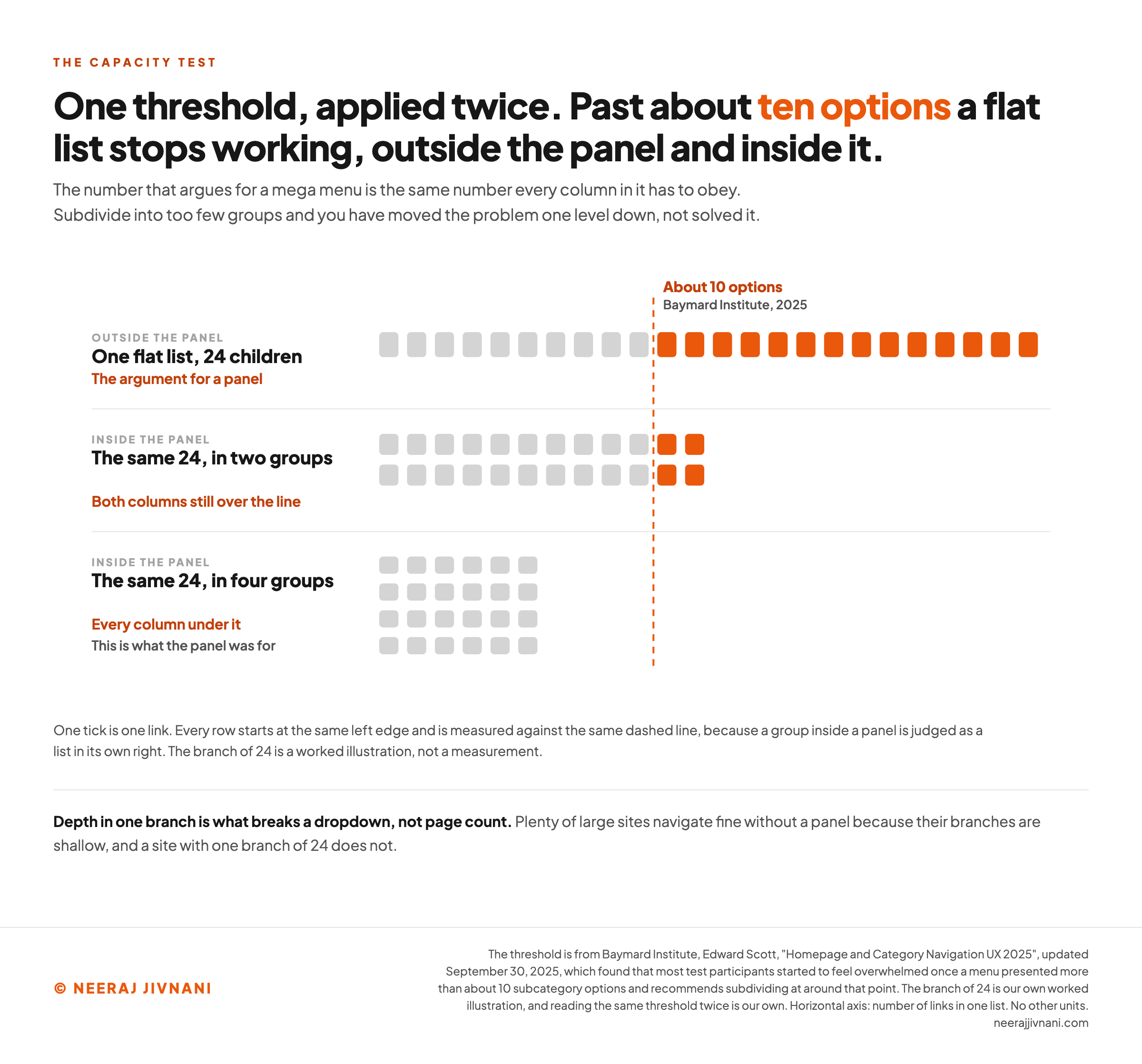
About 10 subcategory options in one menu is where most people start to feel overwhelmed. That is what Baymard Institute found with its test participants in the 2025 navigation benchmark of leading US and European ecommerce sites, and it recommends subdividing at around that point.
That finding cuts both ways.
Past roughly ten children a flat list stops working, which is the argument for a mega menu. Inside the mega menu, a group of more than about ten links has the same problem again.
Say a branch has 24 children. As one flat list it sits well past that line, and split into two columns of 12 it still does.
Split it into four columns of six and every column sits under it.
When It Is the Wrong Answer
Three cases where we would not build one, even for a site that technically qualifies.
Your problem is the taxonomy, not the menu. If you cannot name your groups clearly, a bigger panel exposes the confusion rather than hiding it. Fix the category structure first; the navigation follows it.
Most of your traffic arrives on a phone. The two-dimensional panel is the entire benefit and it does not exist below your breakpoint. You will be building and maintaining a desktop luxury, so it goes last if it goes at all.
Nobody owns the behavior. A mega menu is not a layout, it is an interaction. If there is no one to specify the delay, the dismiss and the focus order, you will ship the layout and inherit the bugs.
Run the test on your own navigation
Write out your top-level navigation, then the children under each item, and put the deepest branch in here. One threshold answers this twice: once about whether you need a panel, and once about whether the panel you are planning is any better.
Asked so it can be set aside. Width is not the trigger.
This is the number that decides it, and it decides the columns later too.
Any of these true as well?
Where does most of your traffic arrive?
Put your deepest branch in above, or tick a trigger, and the reading appears here.
Use this chart — embed code and citation
<a href="https://neerajjivnani.com/blog/mega-menu/"><img src="https://neerajjivnani.com/infographics/mega-menu/the-threshold-cuts-both-ways.png" alt="Seven rows of tick marks, one tick per link, every row starting at the same left edge and measured against a single dashed line at about ten options. One flat list of 24 children runs 14 ticks past the line. The same 24 split into two groups still leaves both columns over it. The same 24 split into four groups puts every column under it." width="1200"></a>
<p>Chart: <a href="https://neerajjivnani.com/blog/mega-menu/">Neeraj Jivnani</a></p>Neeraj Jivnani, "What a Mega Menu Is, and When Your Site Actually Needs One", neerajjivnani.com, https://neerajjivnani.com/blog/mega-menu/Free to republish with a link back to this page.
What Goes Inside It, and How to Group It
The grouping is the design. Everything else in a mega menu is presentation.
Five rules do most of the work here, and Nielsen Norman Group set them out in 2017.
- Chunk by how people think, not by how you file. Groups should match the mental model your visitors already have, which a card sort will tell you and an org chart will not.
- Keep the groups medium. Too few groups and each one is a wall of links. Too many and the visitor has to understand your grouping scheme before they can use it.
- Front-load the labels. Start each label with its most informative word. A column of labels that all begin "Pre-Owned" gives a scanner nothing to scan.
- Order the groups deliberately. By workflow where there is one, otherwise by importance, with the most-used group top-left for a left-to-right language.
- Show each choice once. A link that appears in two groups makes people stop and work out whether they are the same thing.
Make the Group Headings Clickable
Clickable group headings are the cheapest part of the whole pattern to get right, and a third of sites still do not.
Baymard's 2025 research found that 33% of the sites it measured do not provide clickable headers in the main navigation.
The majority of its test participants expected those headers to work and often tried clicking them anyway, even when the cursor told them the label was inert.
The reason is worth understanding.
A visitor who has narrowed to "Shoes" but has not chosen between boots and sneakers wants the broad page. Offer only the narrow links and you have forced a decision they are not ready to make.
So every group heading goes somewhere: a real category page for that group, not a text label.
How the Panel Should Open
Open on click, unless you have a specific reason not to.
A panel that opens on hover is the more common choice, and it is where the bugs live.
A pointer crossing your navigation bar on the way somewhere else is not a request to see anything. A menu that cannot tell the difference flickers at everyone who walks past.
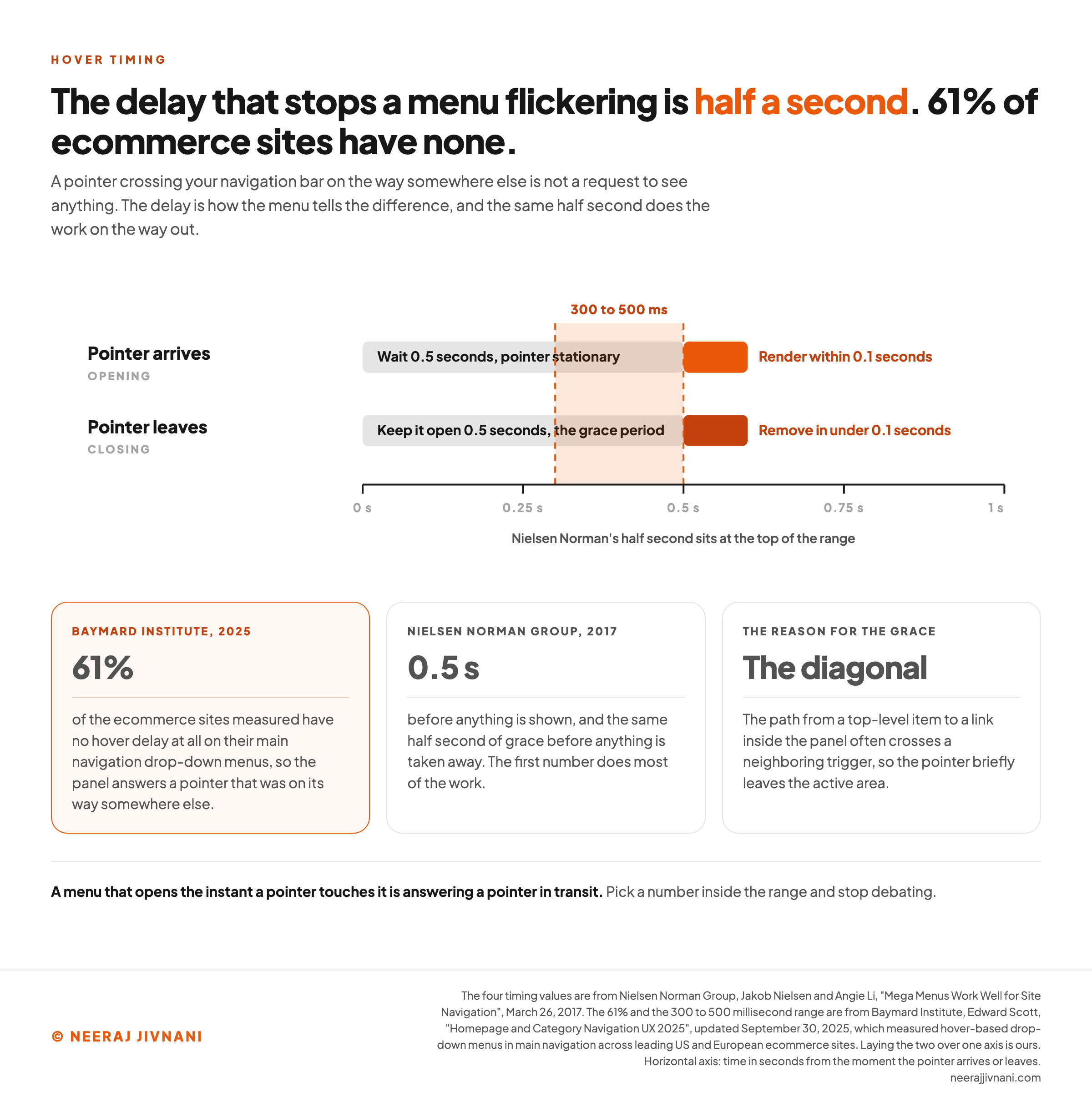
The whole fix is four numbers, published by Nielsen Norman Group in 2017:
- Wait 0.5 seconds with the pointer stationary before showing anything.
- Once it opens, render the panel within 0.1 seconds.
- Keep it open until the pointer has been outside both the trigger and the panel for 0.5 seconds.
- Then remove it in under 0.1 seconds.
The first number does most of the work. A menu that opens the instant a pointer touches it is answering a pointer in transit.
Baymard Institute's 2025 navigation research found that 61% of the ecommerce sites it measured have no hover delay at all on their main navigation drop-down menus, and recommends 300 to 500 milliseconds as the working range.
Nielsen Norman's half-second sits at the top of that range, so the two line up. Pick a number inside it and stop debating.
The Diagonal Problem
The path from a top-level item to a link inside the panel is a diagonal, not a straight drop, and Nielsen Norman Group named the problem that lives on it in 2017.
That diagonal often crosses a neighboring trigger, which means the pointer briefly leaves the active area.
Close the panel the instant that happens and you punish anyone who moves a mouse slowly.
The half-second grace is the cheap fix. Tracking the pointer's direction is the better one.
Why Click Usually Wins
Click is simpler, in three ways that matter.
- Nothing opens by accident. A click is a stated intention; a hover is a guess about one.
- It survives a touchscreen. A click menu is one behavior across every device, instead of one for pointers and a second one for taps.
- It gives you a real open and closed state, which is what a keyboard and a screen reader both need to announce.
None of that says hover cannot work. Baymard Institute's 2025 research found hover-based drop-down menus outperformed other main navigation menus in its testing.
The difference is that hover has to be built right to work at all, and click works by default.
Use this chart — embed code and citation
<a href="https://neerajjivnani.com/blog/mega-menu/"><img src="https://neerajjivnani.com/infographics/mega-menu/the-delay-that-stops-the-flicker.png" alt="Two timelines running from zero to one second. On opening, the menu waits 0.5 seconds with the pointer stationary and then renders the panel within 0.1 seconds. On closing, it holds the panel open for 0.5 seconds after the pointer leaves and then removes it in under 0.1 seconds. A shaded band marks the 300 to 500 millisecond range, and a card records that 61% of the ecommerce sites Baymard measured have no hover delay at all." width="1200"></a>
<p>Chart: <a href="https://neerajjivnani.com/blog/mega-menu/">Neeraj Jivnani</a></p>Neeraj Jivnani, "What a Mega Menu Is, and When Your Site Actually Needs One", neerajjivnani.com, https://neerajjivnani.com/blog/mega-menu/Free to republish with a link back to this page.
Keyboard, Screen Readers and the Pattern You Pick
Build it as a disclosure pattern, and do not reach for role="menu".
Navigation is the one component that appears on every page of your site, so a keyboard or screen-reader failure here is not a failure on one page. It is a failure everywhere at once.
That makes this the most expensive place to get the markup wrong, and there is a single decision underneath it that settles the rest.
Three Patterns That Look Identical
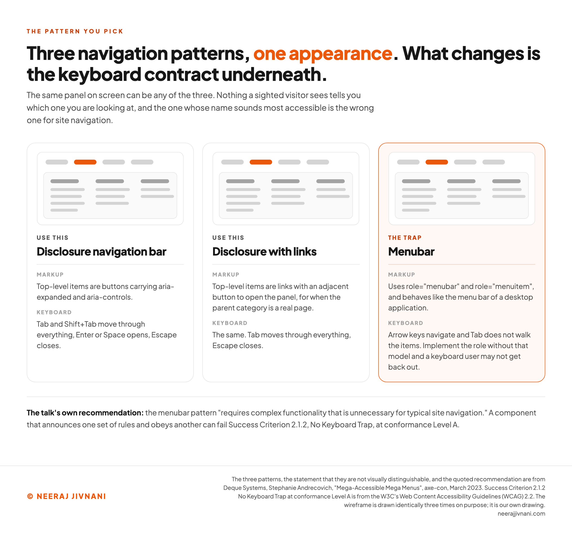
Three patterns can produce the same navigation bar, and nothing on screen tells them apart. The panel a visitor sees can be any of the three underneath, a point Stephanie Andrecovich makes first in Deque Systems' 2023 axe-con talk on accessible mega menus.
- Disclosure navigation bar. Top-level items are buttons carrying
aria-expandedandaria-controls. Tab and Shift+Tab move through everything, Enter or Space opens, Escape closes. - Disclosure with links. The same, except top-level items are links with an adjacent button to open the panel, for when the parent category is a real page.
- Menubar. Uses
role="menubar"androle="menuitem"and behaves like the menu bar of a desktop application, where arrow keys navigate and Tab does not walk the items.
The talk's own recommendation is that the first two suit typical site navigation, and that the menubar pattern "requires complex functionality that is unnecessary for typical site navigation".
Why the Third One Is a Trap
The trap is the name. role="menu" reads like the accessible choice for something called a menu, so it gets added by people trying to do the right thing.
Adding it changes the keyboard contract. Assistive technology is now told this behaves like an application menu, so a user reaches for arrow keys and expects Tab to leave the whole component.
Implement the role without implementing that model and you have a component that announces one set of rules and obeys another.
At its worst, a keyboard user cannot get back out of it. That is a failure of Success Criterion 2.1.2, No Keyboard Trap, in the W3C's Web Content Accessibility Guidelines (WCAG) 2.2, at conformance Level A.
What a Hover Menu Owes Under WCAG
A hover menu owes the visitor three things, and all three are conformance requirements rather than preferences.
They come from Success Criterion 1.4.13, Content on Hover or Focus, which sits at conformance Level AA in WCAG 2.2 and whose Note 2 names sub-menus that display on hover as covered content:
- Dismissible. There is a way to close the panel without moving the pointer or the focus. In practice, Escape.
- Hoverable. The pointer can move onto the panel without it disappearing. This is the diagonal problem again, written as a conformance requirement.
- Persistent. The panel stays until the trigger is released, the user dismisses it, or its content stops being valid. No auto-closing timer.
A hover mega menu that closes before your cursor can reach the panel is not merely irritating. It fails Hoverable, and that is a Level AA failure on the most-used component you have.
The Screen Magnifier Case
The case worth designing for here is a screen magnifier.
Magnify the page and only a fragment of a full-width panel is on screen at once. The markup can be flawless, the focus order right, and the visitor still has no idea that six more columns exist to the right.
You fix it with layout. Panels that stay near their trigger, groups that read top to bottom before left to right, and headings that survive being seen alone.
Use this chart — embed code and citation
<a href="https://neerajjivnani.com/blog/mega-menu/"><img src="https://neerajjivnani.com/infographics/mega-menu/three-patterns-one-appearance.png" alt="Three identical wireframes of the same navigation bar with an open three-column panel, drawn side by side, each labeled with a different pattern underneath it. A disclosure navigation bar using buttons that carry aria-expanded, a disclosure with links, and a menubar using role equals menubar, which is marked as the trap because arrow keys navigate, Tab does not walk the items, and a keyboard user may not get back out." width="1200"></a>
<p>Chart: <a href="https://neerajjivnani.com/blog/mega-menu/">Neeraj Jivnani</a></p>Neeraj Jivnani, "What a Mega Menu Is, and When Your Site Actually Needs One", neerajjivnani.com, https://neerajjivnani.com/blog/mega-menu/Free to republish with a link back to this page.
What Happens on a Phone
On a phone, a mega menu is not shrunk. It is replaced.
The reason is mechanical rather than aesthetic. The whole benefit of the panel is that it uses two dimensions, and a phone gives you one narrow column.
Render the same panel at phone width and you get one endless list with headings in it. That is a worse dropdown, not a mega menu.
The trigger changes too. A touchscreen has no hover state at all.
So whatever your desktop panel does on hover has to become a tap, and the phone gets a pattern of its own.
The Pattern That Works Is a Drilldown
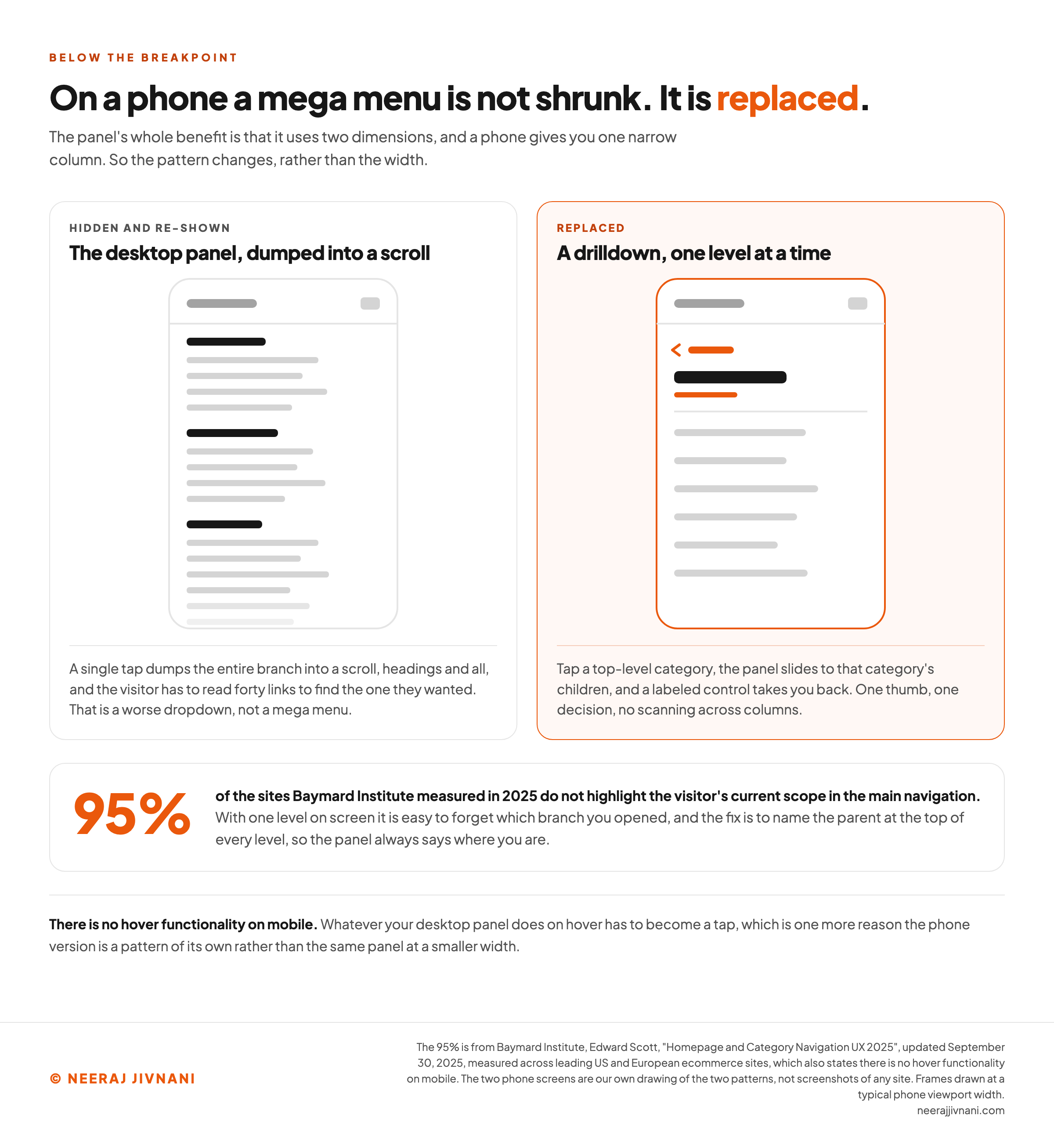
A drilldown shows one level at a time. Tap a top-level category, the panel slides to that category's children, and a labeled control takes you back.
That is not a compromise for a small screen. It matches how someone holds a phone: one thumb, one decision, no scanning across columns.
Two things break it, and both are worth designing against on purpose.
The visitor loses their place. Only one level is on screen, so it is easy to forget which branch you opened. Baymard's 2025 benchmark found that 95% of the sites it measured do not highlight the visitor's current scope in the main navigation.
The fix is small: name the parent at the top of every level, so the panel always says where you are.
The desktop panel gets hidden instead of replaced. This is the common shortcut, and it is the one that produces the worst mobile menus.
A single tap dumps the entire branch into a scroll, headings and all, and the visitor has to read forty links to find the one they wanted.
If most of your traffic arrives on a phone, design the drilldown first and treat the desktop panel as the enhancement. Build it the other way around and the phone version is always leftovers.
Use this chart — embed code and citation
<a href="https://neerajjivnani.com/blog/mega-menu/"><img src="https://neerajjivnani.com/infographics/mega-menu/on-a-phone-it-is-replaced.png" alt="Two phone screens side by side. The left one shows the desktop panel hidden and re-shown as a single endless scroll of headings and links running off the bottom edge. The right one shows a drilldown with a labeled back control, the parent category named at the top as the current scope, and six child links. Beneath them a figure records that 95% of the sites Baymard measured do not highlight the visitor's current scope." width="1200"></a>
<p>Chart: <a href="https://neerajjivnani.com/blog/mega-menu/">Neeraj Jivnani</a></p>Neeraj Jivnani, "What a Mega Menu Is, and When Your Site Actually Needs One", neerajjivnani.com, https://neerajjivnani.com/blog/mega-menu/Free to republish with a link back to this page.
How to Build One
There are three routes, and the route matters much less than the behavior you make it obey.
A plugin or app on your content management system. On WordPress this is the busiest category, and it is where the free-versus-paid question usually lands.
Max Mega Menu, one of the widely used ones, is free on the WordPress plugin directory and sells a Pro version for the extras: sliding panels, sticky menus, custom icons.
Free core with a paid tier is the common shape here. So the honest answer to "is it free" is usually that the menu is and the extras are not.
A page builder or design tool component. Webflow, Elementor and similar tools ship a navigation component with the panel already wired up, which is the fastest route if you are already building there.
Hand-coded markup. A button for each top-level item, aria-expanded on the button, aria-controls pointing at the panel, and a short piece of JavaScript for open, close and Escape.
That is genuinely less work than it sounds, and it is the only route where you control every behavior below.
What None of the Three Gives You
All three hand you a layout. The behavior is yours either way, and it is the part that decides whether the thing works.
Here is the specification to hold any of them to:
- The trigger is a button, not a styled div. A button is focusable, announces its state, and responds to Enter and Space without you writing anything.
- It waits before it opens on hover, and it does not close while the pointer is on the panel. Both halves matter; the second one is the diagonal.
- Escape closes the panel and puts focus back on the trigger. Without the second half a keyboard visitor is left in an empty place in the tab order.
- Focus moves through the panel in reading order, and Tab eventually leaves it. If it does not, you have a keyboard trap.
- The panel is replaced below the breakpoint, not hidden and re-shown at a different width.
Five lines. Buy the layout if you like, and own the behavior.
What to Get Right First
Most sites asking this question do not need a mega menu, and ten minutes with your own category list will tell you which kind you are.
If your deepest branch still fits on one screen, a dropdown is the right answer and there is nothing else to do.
If it does not, the order of the work is what saves you a rebuild.
- Fix the grouping first. The panel exposes your taxonomy at full size. If the groups are not clean, a bigger panel makes that more obvious, not less.
- Make every group heading a link. It is the cheapest of these five to do.
- Prefer click, and if you go with hover, commit to the timing. Build the delay and the grace period together, because a hover menu missing either one flickers at everyone.
- Build it as a disclosure pattern. Buttons,
aria-expanded, Escape. Leaverole="menu"alone. - Design the phone version as its own thing, and do it before the desktop panel if that is where your visitors are.
A mega menu makes one promise: that a visitor can see a whole branch of your site at once and choose without guessing. Everything on that list is what keeps the promise after the panel opens.