The BCG Matrix: The Four Boxes, the Two Numbers, and Where It Misleads
Place any product in the right quadrant using two figures you can defend, then find out where the answer stops being reliable.

/ On this page8 sections
Boston Consulting Group's growth share matrix, or BCG matrix, sorts your products into four boxes using two numbers: how fast their market is growing, and how big your share is next to the largest competitor's.
Get those two numbers and every line in your portfolio lands somewhere. The box it lands in tells you where the next unit of cash should go.
It is also a framework from 1970, and there is a point past which its answer stops being reliable.
Knowing where that point sits matters more than drawing the chart neatly.
What the BCG Matrix Is
The BCG matrix is a portfolio tool. It takes the products and business units you already own and sorts them by how much cash each one throws off against how much it will need.
Two measurements do the sorting. Market growth rate goes on the vertical axis, and relative market share goes on the horizontal.
Split each axis into high and low and you get four boxes.
Boston Consulting Group, the firm that produced the tool, calls them stars, cash cows, question marks and pets. Almost everyone else says dogs for the fourth.
You will meet the same tool under several names. The growth share matrix is BCG's own; the Boston Box, the Boston Matrix and the product portfolio matrix all mean this.
The unit you plot matters more than the label. It can be a business unit inside a group or a single product line inside one company, and the arithmetic is identical either way, as long as one chart holds one kind of thing.
Who Made It, and When
Alan Zakon, who went on to lead the firm, first sketched it and then refined it with colleagues, on BCG's own account.
Bruce Henderson, the firm's founder, popularized the concept in a 1970 essay called "The Product Portfolio".
The tool then traveled a long way. On the estimate BCG cites, it or an approach based on it was in use at about half of all Fortune 500 companies in the late 1970s and early 1980s.
Why It Sorts Cash and Not Profit
The matrix answers one question: which of the things you own should fund the others.
That is a cash question, which is why a product can be profitable on paper and still sit in the box marked for disposal.
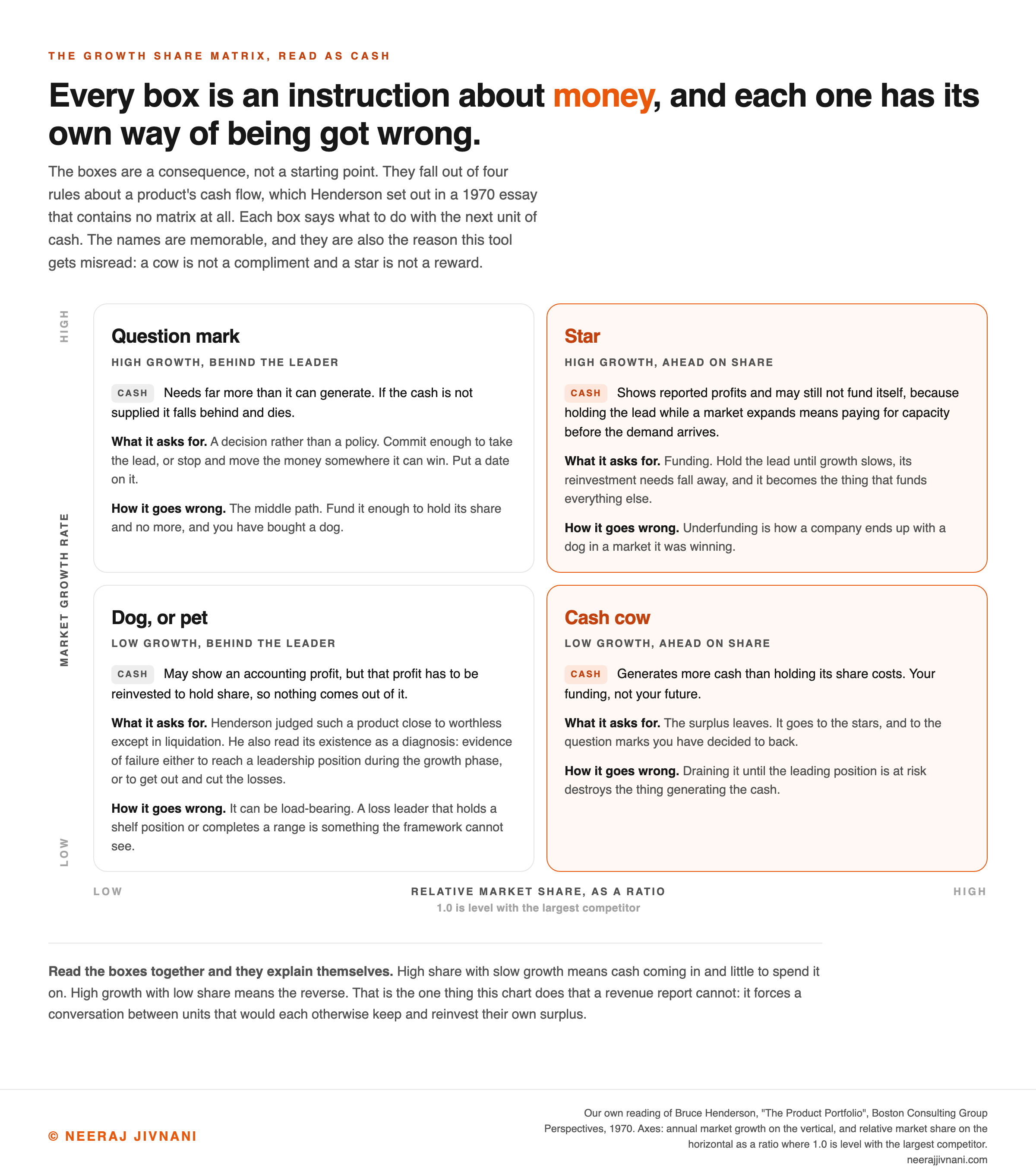
The boxes are a consequence, not a starting point. They fall out of four rules about a product's cash flow, which Henderson set out in a 1970 essay that contains no matrix at all.
- Margins and cash generated follow market share. He attributed that to the experience curve: the biggest producer has made the most units, so it has had the most practice at making them cheaply.
- Growth needs cash. Holding your share in an expanding market means funding capacity, inventory and people ahead of the demand, and the faster it grows the more that costs.
- Share has to be earned or bought. Nobody drifts into leadership, and buying it takes investment on top of everything else.
- No market grows forever. Henderson put the consequence bluntly: the payoff from growth must come when the growth slows, or it never will.
What Those Four Rules Give You
Read them together and the boxes explain themselves.
High share with slow growth means cash coming in and little to spend it on. High growth with low share means the reverse.
This is the one thing the matrix does that a revenue report cannot. It forces a conversation between units that would each otherwise keep and reinvest their own surplus, which is the habit BCG built the tool to interrupt.
The Four Quadrants, and What Each One Asks For
The four quadrants are the combinations of those two axes, and each one implies a different use of money rather than a different level of quality.
Read every box as a cash position. The names are memorable and they are also the reason this tool gets misread: a cow is not a compliment and a star is not a reward.
Stars: High Growth, High Share
A star leads a market that is still growing quickly.
It is the most expensive box to own. Henderson's second rule applies at full force here, because holding the lead while a market expands means paying for capacity before the demand arrives.
A star may not fund itself yet. Henderson wrote that it nearly always shows reported profits without necessarily generating all of its own cash.
What it buys is the future. Hold the lead until growth slows, its reinvestment needs fall away, and it becomes the thing that funds everything else.
So fund it. Underfunding a star is how a company ends up with a dog in a market it was winning.
Cash Cows: Low Growth, High Share
A cash cow leads a market that has stopped growing. It is your funding, not your future.
The definition is the surplus: a cow generates more cash than holding its share costs.
Henderson was specific about what not to do with that surplus. Where the rate of return exceeds the growth rate, the cash cannot be reinvested in that product indefinitely without depressing returns.
So the money leaves.
It goes to the stars, and to the question marks you have decided to back.
There is a limit. A leader's position is the one worth defending above all others, and draining it until that position is at risk destroys the thing generating the cash.
Question Marks: High Growth, Low Share
A question mark sits in a fast-growing market where you are not the leader. It is the only box that demands a decision rather than a policy.
Henderson called it a liability unless it becomes a leader. It almost always needs far more cash than it can generate, and if that cash is not supplied it falls behind and dies.
The trap is the middle path.
Fund it enough to hold its share and no more, and you have bought a dog. Henderson said as much: even with the cash supplied, a product that only holds its share is a pet once the growth stops.
So the decision is binary, and it is timed. Commit enough to take the lead, or stop and move the money somewhere it can win.
Write down what would have to be true, and by when.
A question mark with no date on it is a subsidy.
Dogs, or Pets: Low Growth, Low Share
A dog holds a small share of a market that is no longer growing.
Henderson's word was pets, and he judged such a product close to worthless except in liquidation.
The reasoning is cash rather than sentiment. A pet may show an accounting profit, but that profit has to be reinvested to hold share, so nothing comes out of it.
He also read its existence as a diagnosis. Pets, he wrote, are evidence of failure either to reach a leadership position during the growth phase or to get out and cut the losses.
One real exception is worth checking first. A low-share, low-growth line can earn its keep as a loss leader, holding a shelf position or completing a range that sells the profitable items around it.
The framework cannot see that. It measures one product at a time and has no way to price what a product does for its neighbors.
Use this chart — embed code and citation
<a href="https://neerajjivnani.com/blog/bcg-matrix/"><img src="https://neerajjivnani.com/infographics/bcg-matrix/four-cash-positions.png" alt="Two by two grid of the growth share matrix read as cash positions, with market growth on the vertical axis and relative market share on the horizontal, showing the question mark needing far more cash than it can generate, the star showing reported profits while paying for capacity ahead of the demand, the dog turning an accounting profit that has to be reinvested to hold share, and the cash cow generating a surplus, each cell carrying what it asks for and the way it goes wrong." width="1200"></a>
<p>Chart: <a href="https://neerajjivnani.com/blog/bcg-matrix/">Neeraj Jivnani</a></p>Neeraj Jivnani, "The BCG Matrix: The Four Boxes, the Two Numbers, and Where It Misleads", neerajjivnani.com, https://neerajjivnani.com/blog/bcg-matrix/Free to republish with a link back to this page.
How to Plot Your Own
Two numbers per product, and two choices you make before calculating either.
The two choices are which market each product competes in, and which competitor goes in the divisor. They decide the box every product lands in, so they matter more than the arithmetic does.
Five steps, in the order you do them.
1. Write Down the Market
Pick the market each product competes in, and write the definition in a sentence.
This is the step that decides the chart. A cordless drill is a rounding error in power tools and a serious position in eighteen-volt professional drills, and those two definitions put it in different boxes.
Neither definition is dishonest. What is dishonest is choosing the one that flatters the product and then not saying which you used.
2. Get the Two Numbers
You need the market's growth rate, your share, and the share held by your largest competitor.
Growth usually comes from an industry association, a trade publication, or your own multi-year revenue if you are a large enough part of the category to stand in for it.
Share is harder, because competitors do not publish it.
Reasonable substitutes are unit shipments from an industry body, distributor or retailer data for the category, and revenue divided by a credible market size estimate.
If your competitive analysis cannot produce a defensible competitor number, say so on the chart. A plotted point with an invented denominator looks exactly like a plotted point with a real one.
3. Choose the Divisor
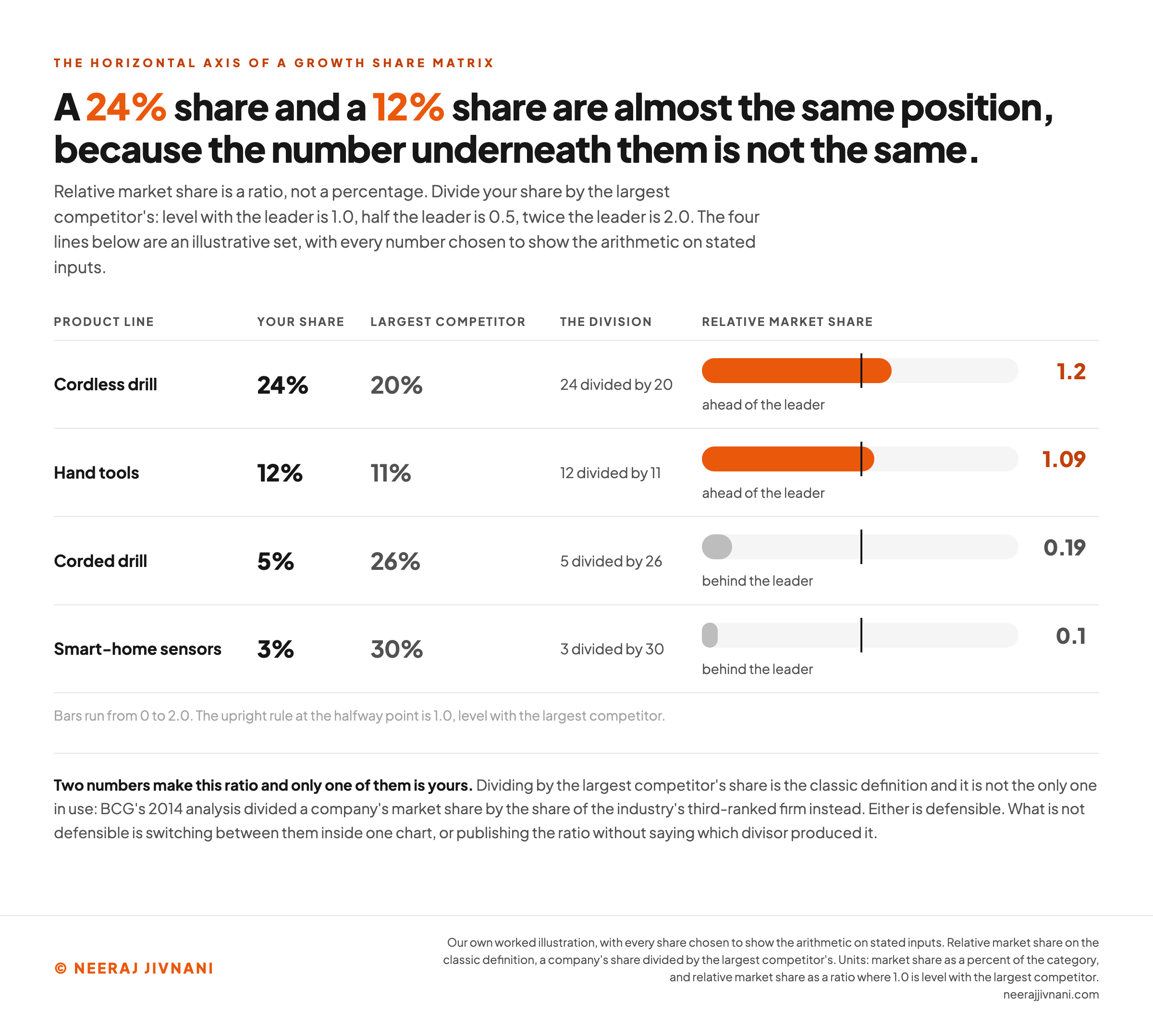
Relative market share is a ratio, not a percentage. Divide your share by the largest competitor's, so 1.0 is level with the leader, 0.5 is half the leader and 2.0 is twice the leader.
Anything under 1.0 means somebody else is bigger than you are.
That is the classic definition and it is not the only one in use. BCG's own 2014 analysis divided a company's market share by the share of the industry's third-ranked firm instead.
Either is defensible.
What is not defensible is switching between them inside one chart, or publishing the ratio without saying which divisor produced it.
4. Choose the Growth Line
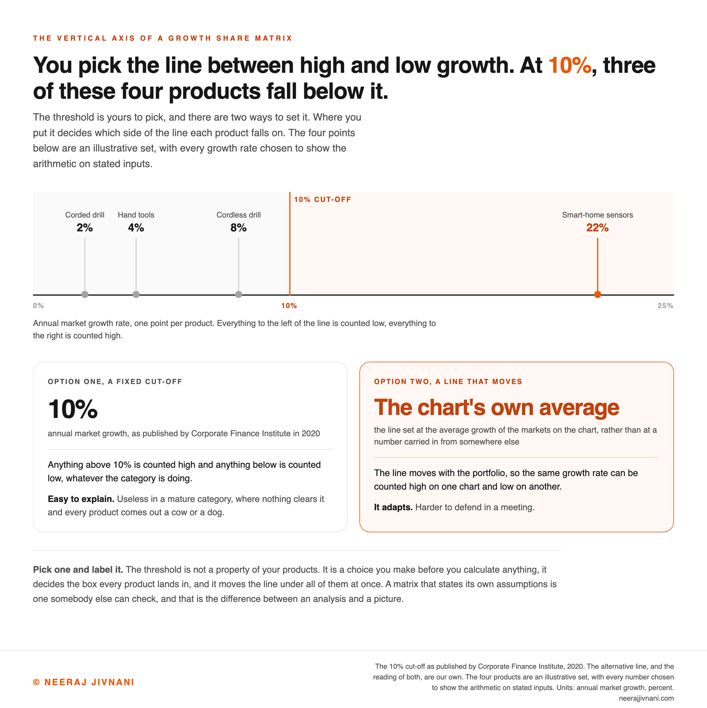
The vertical axis needs a line between high and low growth, and you pick where it goes.
The conventional cut-off is 10%: anything above counts as high growth, anything below as low. That is the number Corporate Finance Institute's 2020 explainer gives.
A fixed 10% is easy to explain and useless in a mature category, where nothing clears it and every product comes out a cow or a dog.
The alternative is a line you set from the chart itself, at the average growth of the markets on it, rather than at a number carried in from somewhere else. It adapts, and it is harder to defend in a meeting.
The line is not the only choice available. The variable can move too, which is what BCG's own 2014 analysis did when it plotted each company's growth rate relative to its market's, rather than the market's growth alone.
Pick your line and label it.
5. Plot, Then Decide
Put growth on the vertical axis and relative share on the horizontal, then draw each product as a circle sized by its revenue.
The circle size is what stops a marginal line and a third of the business looking equally important.
Now read each quadrant as an instruction about money rather than as a score. The chart has done its job when it changes where the next unit of cash goes.
Plot one product
Three numbers put a product in a box. Two choices decide which box that is. Change either choice below and watch the same product move.
Every number below is a number about this market and nothing wider. Widen it or narrow it and the product moves.
Those four are the illustrative product set, loaded with their stated inputs.
Step 2. The three numbers
Step 3. Choice one, the divisor
Relative share is a ratio, not a percentage. What goes underneath your share is a choice, and both of these are in use.
Step 4. Choice two, the growth line
The vertical axis needs a line between high and low growth, and you pick where it goes.
Relative share
1.2
ahead of the largest competitor
It lands in
Cash cow
Low growth, ahead on share
Your funding, not your future: it generates cash in excess of what it needs to hold its share. So the money leaves, to the stars and to the question marks you have decided to back. Not so far that the position itself is at risk.
Write this next to the chart
Cordless drills. Relative share 1.2, 24% divided by the largest competitor's 20%. Growth 8%, read against a fixed 10% line. Box: cash cow.
Use this chart — embed code and citation
<a href="https://neerajjivnani.com/blog/bcg-matrix/"><img src="https://neerajjivnani.com/infographics/bcg-matrix/where-the-line-goes.png" alt="Number line of annual market growth from zero to twenty-five percent with the ten percent cut-off marked, showing four illustrative products placed on it, smart-home sensors at twenty-two percent above the line and the cordless drill at eight percent, hand tools at four percent and the corded drill at two percent all below it, beside a comparison of the fixed ten percent cut-off published by Corporate Finance Institute in 2020 and the alternative of a line set at the average growth of the markets on the chart." width="1200"></a>
<p>Chart: <a href="https://neerajjivnani.com/blog/bcg-matrix/">Neeraj Jivnani</a></p>Neeraj Jivnani, "The BCG Matrix: The Four Boxes, the Two Numbers, and Where It Misleads", neerajjivnani.com, https://neerajjivnani.com/blog/bcg-matrix/Free to republish with a link back to this page.
A Worked Example
Say a hardware brand sells four things: a flagship cordless drill, a range of hand tools, a new line of smart-home sensors, and a corded drill it has sold for as long as it has existed.
Every number in the example below is illustrative, chosen to show the arithmetic on stated inputs. Taking the post's own instruction first: the divisor is the largest competitor's share, and the growth line is a fixed 10%.
Each line below reads the same way: market growth, then your share, then the largest rival's share, then the division that gives relative share.
- Cordless drill.
8%, 24%, 20%, 24 / 20 = 1.2. You are bigger than your nearest rival and the market has slowed, so this is the cash cow, and the biggest circle on the chart. - Hand tools.
4%, 12%, 11%, 12 / 11 = 1.09. Barely ahead, in an even flatter category. Another cow, and a reminder that a ratio barely over one is a lead somebody could take from you. - Smart-home sensors.
22%, 3%, 30%, 3 / 30 = 0.1. The only line clearing the threshold, at a tenth of the leader. Everything about the year ahead turns on whether that gets funded properly or stopped. - Corded drill.
2%, 5%, 26%, 5 / 26 = 0.19. Nothing here is in dispute. It is the dog, and the only question is the one the framework cannot answer.
Notice what the chart does not tell you.
Whether that corded drill is worth keeping depends on what it does to the cordless one's sales, and no version of this matrix can see either direction.
What About Coca-Cola's Matrix?
Matrices for Coca-Cola, Apple and Samsung are all over the internet, and every one of them is somebody's estimate.
Companies do not publish market share brand by brand, so the share on those charts is an outsider's estimate, and usually the growth rate is too.
That is not a reason to skip the exercise. It is a reason to build your own from numbers you can defend, and to treat a published company matrix as a demonstration of the method rather than a fact about the company.
Use this chart — embed code and citation
<a href="https://neerajjivnani.com/blog/bcg-matrix/"><img src="https://neerajjivnani.com/infographics/bcg-matrix/a-ratio-not-a-percent.png" alt="Table of four illustrative product lines with each one's market share, the largest competitor's share, the division and the resulting relative market share drawn as a bar on a scale from zero to two, showing the cordless drill at twenty-four percent against a twenty percent leader giving 1.2, hand tools at twelve percent against eleven giving 1.09, the corded drill at five percent against twenty-six giving 0.19, and smart-home sensors at three percent against thirty giving 0.1." width="1200"></a>
<p>Chart: <a href="https://neerajjivnani.com/blog/bcg-matrix/">Neeraj Jivnani</a></p>Neeraj Jivnani, "The BCG Matrix: The Four Boxes, the Two Numbers, and Where It Misleads", neerajjivnani.com, https://neerajjivnani.com/blog/bcg-matrix/Free to republish with a link back to this page.
Whether It Still Holds
The four boxes still sort cash correctly. What has changed is how long a position in them lasts.
Positions turn over roughly twice as fast as they did. BCG measured that itself.
Four Years, Then Under Two
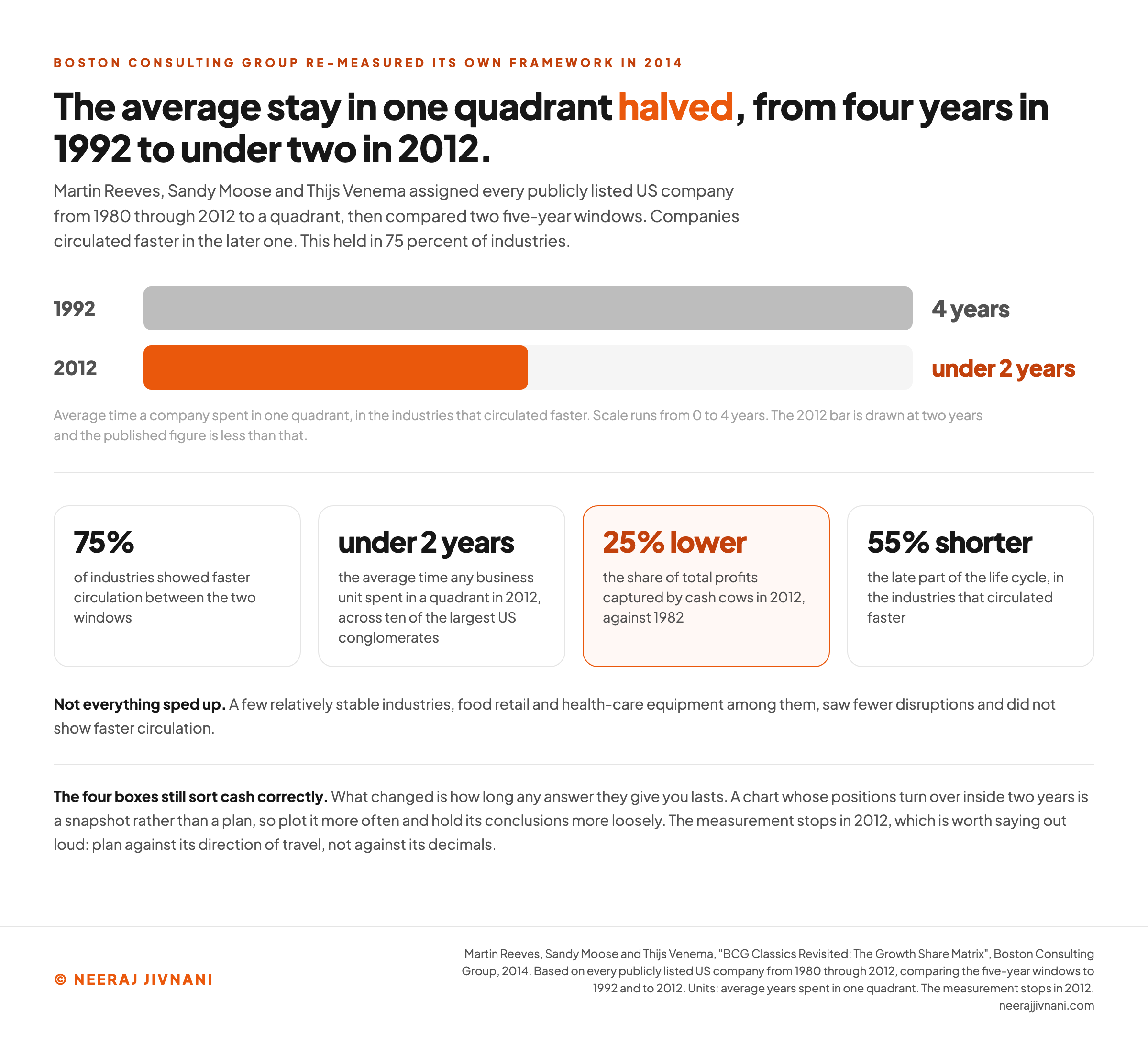
In 75 percent of industries the average time spent in one quadrant halved, from four years in 1992 to less than two years in 2012.
That comes from BCG's 2014 analysis, which assigned every publicly listed US company from 1980 through 2012 to a quadrant and compared two five-year windows.
Real portfolios showed the same thing. Across ten of the largest US conglomerates, the average time any business unit spent in a quadrant was less than two years in 2012.
Cash cows also carry less than they did.
In the same analysis, the share of total profits captured by cash cows in 2012 was 25 percent lower than in 1982, and the late part of the life cycle shortened by 55 percent in the industries that circulated faster.
Not everything sped up. BCG found that a few relatively stable industries, food retail and health-care equipment among them, saw fewer disruptions and did not show faster circulation.
What That Means for Your Chart
BCG drew a broader conclusion. Market share is no longer a direct predictor of sustained performance, and the horizontal axis needs a new measure of competitiveness to replace it.
BCG's finding and the boxes still working are not in conflict. Share still tells you which product is throwing off cash today, which is the only question the four boxes ask.
What it no longer tells you is which product will still be winning in five years.
Ours is narrower and more practical. A chart whose positions turn over inside two years is a snapshot rather than a plan, so plot it more often and hold its conclusions more loosely.
The measurement stops in 2012, which is worth saying out loud.
Plan against its direction of travel, not against its decimals.
Use this chart — embed code and citation
<a href="https://neerajjivnani.com/blog/bcg-matrix/"><img src="https://neerajjivnani.com/infographics/bcg-matrix/half-the-shelf-life.png" alt="Paired bar chart of the average time a company spent in one quadrant, four years in 1992 against under two years in 2012, with the supporting figures from BCG's 2014 re-measurement beside it, faster circulation in 75 percent of industries, under two years for a business unit across ten of the largest US conglomerates, cash cows capturing a share of total profits 25 percent lower in 2012 than in 1982, and the late part of the life cycle 55 percent shorter." width="1200"></a>
<p>Chart: <a href="https://neerajjivnani.com/blog/bcg-matrix/">Neeraj Jivnani</a></p>Neeraj Jivnani, "The BCG Matrix: The Four Boxes, the Two Numbers, and Where It Misleads", neerajjivnani.com, https://neerajjivnani.com/blog/bcg-matrix/Free to republish with a link back to this page.
Where the Matrix Misleads
Six limitations come up often enough to check before you present a chart, and every one of them changes what you should do rather than adding a caveat.
- The market definition sets the answer. Every quadrant position is a function of a boundary somebody drew, so part of what the chart measures is your framing. That is the one limitation with no fix inside the framework, only a disclosure.
- Share is not profitability. The whole tool rests on the experience curve, the idea that the largest producer has the lowest costs. In a fragmented market, a differentiated niche, or a category where scale buys nothing, a high share can sit on thin margins and the box will still call it a cow.
- There is no box for a shrinking market. The vertical axis runs from low growth to high growth, and low means slow rather than negative. A category in real decline gets filed alongside one that is merely mature, and those two need completely different decisions.
- It scores one product at a time. The unit of analysis is a single line, so no cross-effect between two of your products reaches the chart. Neither direction shows up: not the loss leader carrying a range, and not the cannibal eating a sibling's share.
- The surplus is not the whole surplus. A cow's cash figure is what is left after holding its position, and the chart shows the figure while the holding cost stays invisible. Read it as a budget and a spreadsheet will bless the decision that ends the cow.
- Symmetry is not the goal. Four boxes invite the idea that a good portfolio owns one of each, and that is not what Henderson argued. He wanted a portfolio that funds itself, with cows paying for the stars and the question marks, and said plainly that pets are not necessary. A company sitting on mostly cows has the cash and not yet the thing to spend it on.
Two of those are checks you can run in a minute. Redraw the market one step wider and one step narrower and see which products move, then look at the margin on every high-share product before calling it a source of funds.
What the Matrix Is For
The BCG matrix is a cash-allocation argument from 1970 with a picture attached. Its job is to stop four product managers each quietly reinvesting their own surplus, and to move the money to wherever it compounds fastest.
Judged on that, it still does the job. Speed is the reason.
An afternoon of it makes a portfolio legible in a way a stack of profit and loss statements does not. It is still central in business school teaching of strategy, BCG says.
Judged as a verdict on whether a product is any good, it never worked. Reading it that way is how a loss leader gets cut and a market leader gets drained.
The two numbers are mechanical. The two judgment calls in front of them, which market and which divisor, decide every box on the chart, so those are the ones to argue about.
Write both on the chart. A matrix that states its own assumptions is one somebody else can check, and that is the difference between an analysis and a picture.