TAM, SAM and SOM: Two Filters, and the One Number You Will Be Held To
Size your market in the right order, with every assumption printed. Learn what each filter takes out, and which of the three numbers you get held to.


/ On this page10 sections
Market sizing has an order, and taking it out of order is the quickest way to a wrong answer.
Start with the whole category, take out the part you cannot serve, then take out the part you will not win, and print every assumption you made along the way.
The three numbers that come out of that are the total addressable market (TAM), the serviceable addressable market (SAM) and the serviceable obtainable market (SOM). The last of the three is the one your plan gets judged on, and the other two set the stage for it.
What TAM, SAM and SOM Are
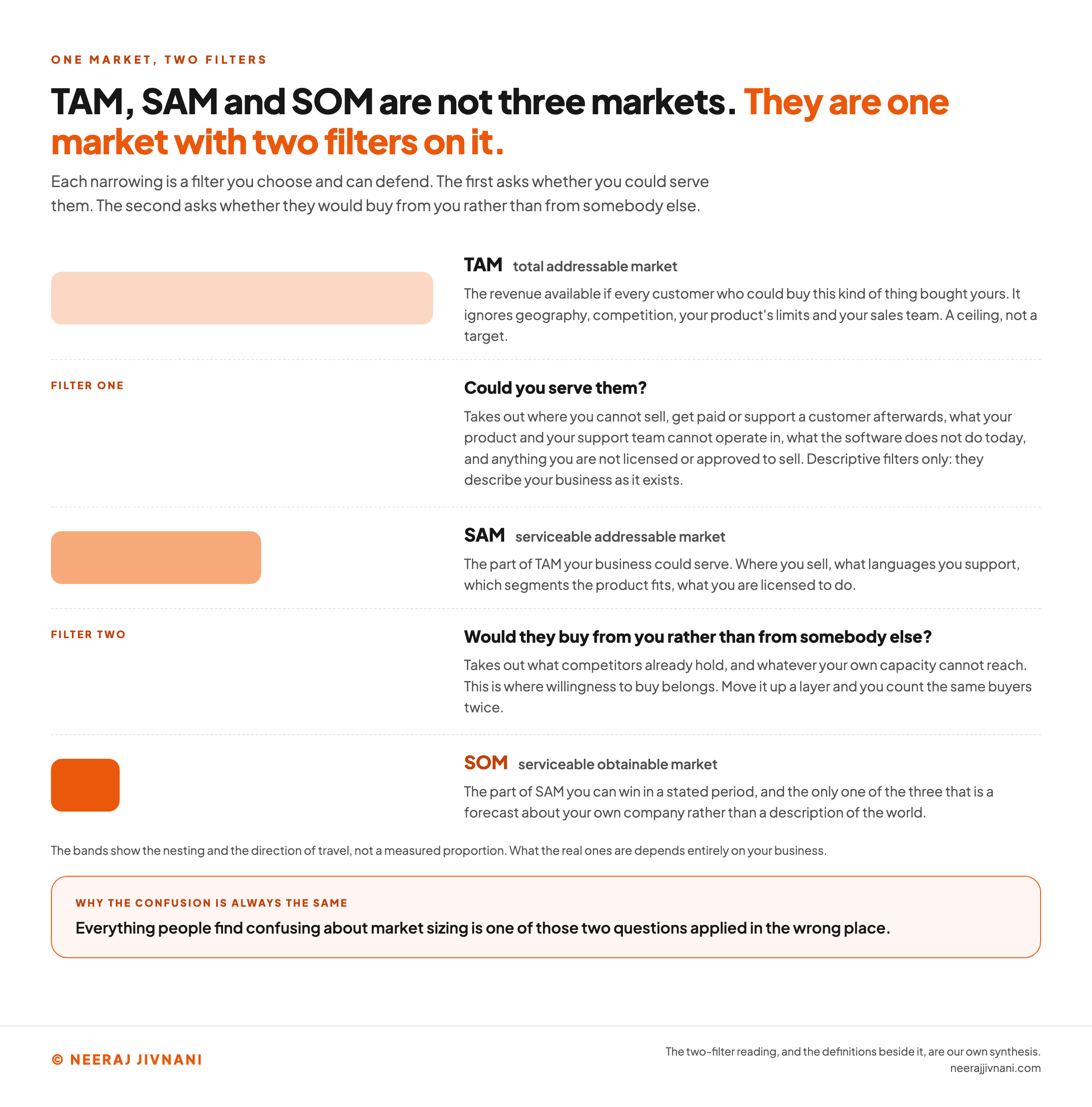
TAM, SAM and SOM are three estimates of the same market, each narrower than the last, and each narrowing is a filter you choose and can defend.
TAM, the total addressable market, is the revenue available if every customer who could buy this kind of thing bought yours. It ignores geography, competition, your product's limits and your sales team.
TAM is a ceiling, not a target.
SAM, the serviceable addressable market, is the part of TAM your business could serve. Where you sell, what languages you support, which segments the product fits, what you are licensed to do.
SOM, the serviceable obtainable market, is the part of SAM you can win in a stated period. Competitors already hold most of it, and your own capacity limits the rest.
A tax software company selling only in the United States has a global TAM, a domestic SAM, and a SOM the size of whatever its sales team signs this year.
The two filters are the whole framework.
The first asks whether you could serve them. The second asks whether they would buy from you rather than from somebody else.
Everything people find confusing about market sizing is one of those two questions applied in the wrong place.
The Middle Word: Addressable or Available
The middle word moves. SAM is usually written serviceable addressable market. It also appears as serviceable available market, including in a handout published on the City University of New York's open textbook platform, which sets it out that way beside total addressable market.
TAM has the same problem in reverse, turning up as both total addressable market and total available market.
This is worth thirty seconds of your attention and no more.
The risk is not that somebody writes the wrong word. It is that "addressable" gets used for the outer ring by one person and the middle ring by another, so the acronym stops telling anybody which filter has been applied.
Say what you filtered on and the ambiguity disappears.
Use this chart — embed code and citation
<a href="https://neerajjivnani.com/blog/tam-sam-som/"><img src="https://neerajjivnani.com/infographics/tam-sam-som/one-market-two-filters.png" alt="Diagram of one market with two filters applied to it. A full-width band labeled TAM, total addressable market, is the revenue available if every customer who could buy this kind of thing bought yours, ignoring geography, competition, your product's limits and your sales team, and it is a ceiling rather than a target. The first filter asks whether you could serve them, and takes out where you cannot sell, get paid or support a customer afterwards, what your product and your support team cannot operate in, what the software does not do today, and anything you are not licensed or approved to sell. A narrower band labeled SAM, serviceable addressable market, is the part of TAM your business could serve: where you sell, what languages you support, which segments the product fits, what you are licensed to do. The second filter asks whether they would buy from you rather than from somebody else, and takes out what competitors already hold and whatever your own capacity cannot reach, which is where willingness to buy belongs, because moving it up a layer counts the same buyers twice. The narrowest band, SOM, serviceable obtainable market, is the part of SAM you can win in a stated period and the only one of the three that forecasts your own company rather than describing the world. A note says the bands show the nesting and the direction of travel, not a measured proportion. A band across the foot says everything people find confusing about market sizing is one of those two questions applied in the wrong place." width="1200"></a>
<p>Chart: <a href="https://neerajjivnani.com/blog/tam-sam-som/">Neeraj Jivnani</a></p>Neeraj Jivnani, "TAM, SAM and SOM: Two Filters, and the One Number You Will Be Held To", neerajjivnani.com, https://neerajjivnani.com/blog/tam-sam-som/Free to republish with a link back to this page.
How the Three Numbers Fit Together
SOM is a share of SAM, and SAM is a share of TAM. That chain is the single most useful thing to hold on to, and it is the point people most often get wrong.
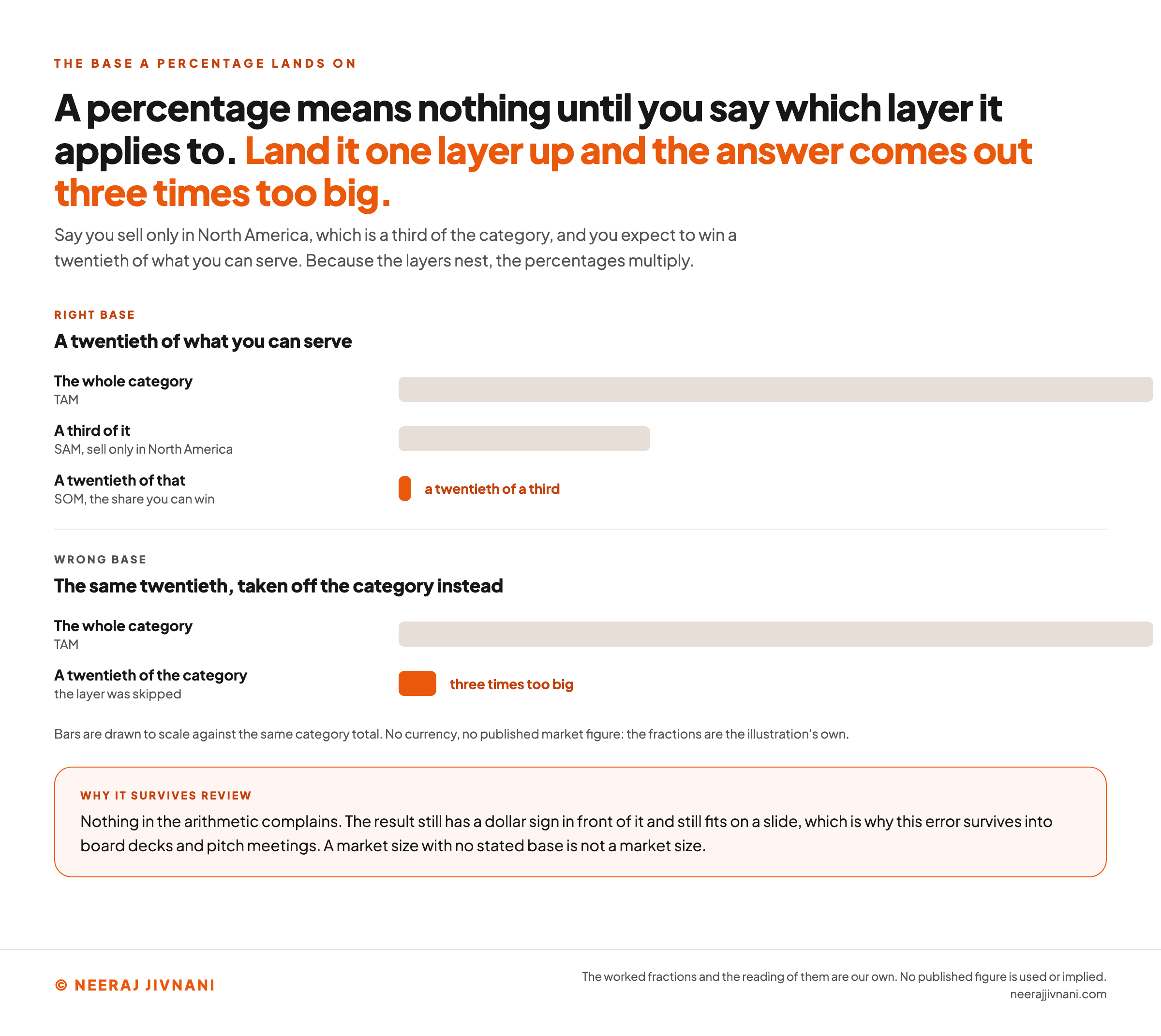
Because the layers nest, the percentages multiply.
Say you sell only in North America, which is a third of the category, and you expect to win a twentieth of what you can serve.
Your SOM is not a twentieth of the category. It is a twentieth of a third, a much smaller slice than either figure suggests on its own.
Apply the second percentage to TAM instead of SAM and the answer comes out three times too big.
It happens most often when a worldwide category total and a domestic market share end up in the same sentence.
Nothing in the arithmetic complains. The result still has a dollar sign in front of it and still fits on a slide, which is why this error survives into board decks and pitch meetings.
So write the layers down in order, and write down which base each percentage applies to.
A market size with no stated base is not a market size.
Use this chart — embed code and citation
<a href="https://neerajjivnani.com/blog/tam-sam-som/"><img src="https://neerajjivnani.com/infographics/tam-sam-som/which-layer-the-percentage-lands-on.png" alt="Two sets of bars drawn to scale against the same category total, showing what happens when a percentage is applied to the wrong layer. In the first set, labeled the right base, a full-width bar is the whole category, a bar a third as long is the serviceable addressable market for a company that sells only in North America, and a very short bar a twentieth of that third is the share it can win. In the second set, labeled the wrong base, the same twentieth is taken off the whole category instead, and the resulting bar is three times longer than the correct one. A note under the bars says no currency and no published market figure are used, and the fractions are the illustration's own. A band across the foot says nothing in the arithmetic complains, the result still has a dollar sign in front of it and still fits on a slide, which is why the error survives into board decks and pitch meetings, and that a market size with no stated base is not a market size." width="1200"></a>
<p>Chart: <a href="https://neerajjivnani.com/blog/tam-sam-som/">Neeraj Jivnani</a></p>Neeraj Jivnani, "TAM, SAM and SOM: Two Filters, and the One Number You Will Be Held To", neerajjivnani.com, https://neerajjivnani.com/blog/tam-sam-som/Free to republish with a link back to this page.
Getting to TAM: Top Down and Bottom Up
Two routes do nearly all the work: start from a published category total and narrow it, or count your customers and multiply. A third exists for a product with no market to count yet, and it is named below.
Walk the first two. They are cheap next to what a wrong TAM costs, they rest on different evidence, and comparing them is the cheapest quality check you can run on a number you assembled yourself.
What a Top-Down Number Actually Counts
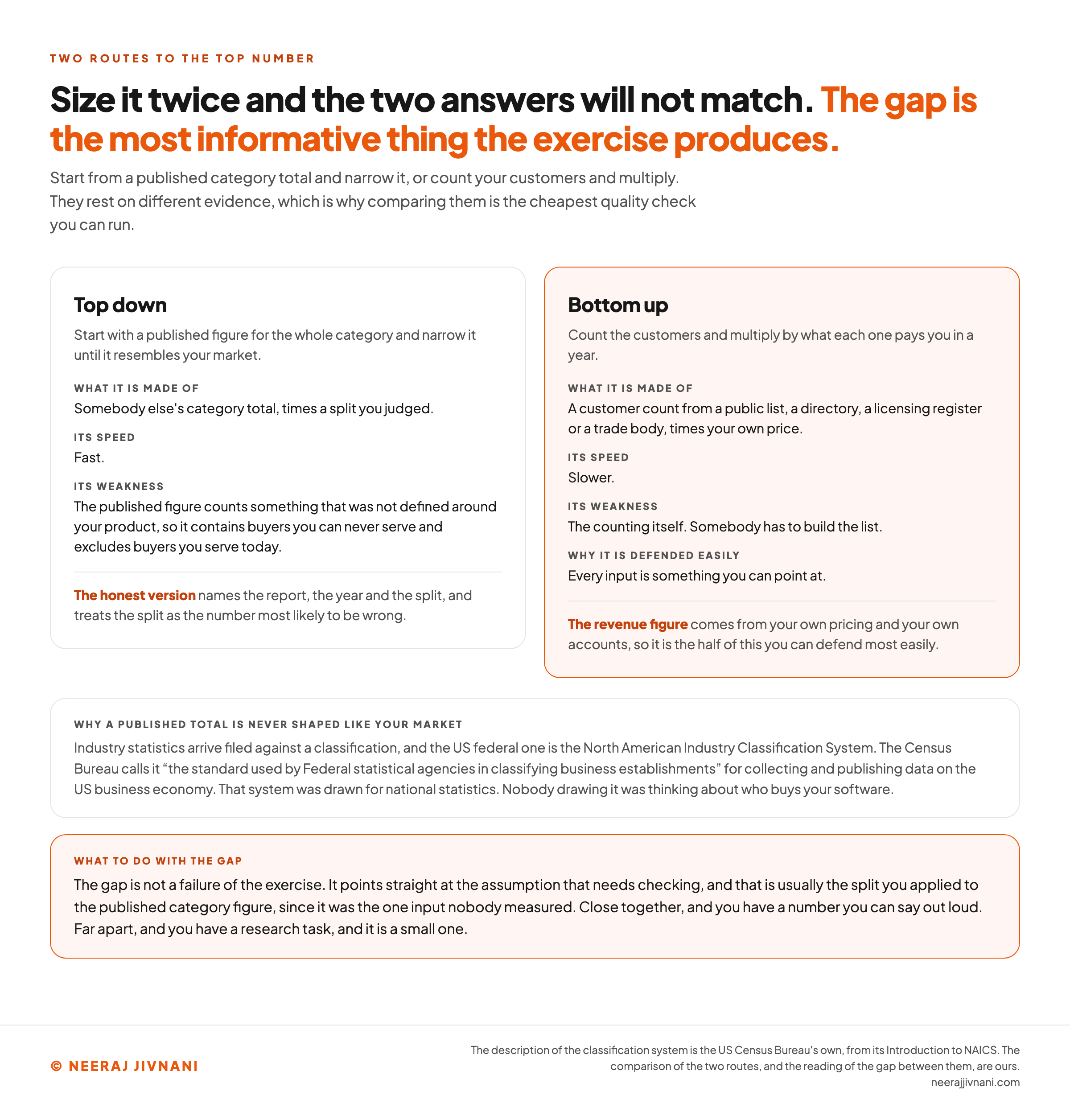
Top down means starting with a published figure for the whole category and narrowing it until it resembles your market.
It is fast, and its weakness is always the same: the published figure counts something that was not defined around your product.
Industry statistics arrive filed against a classification, and the US federal one is the North American Industry Classification System. The Census Bureau calls it "the standard used by Federal statistical agencies in classifying business establishments" for collecting and publishing data on the US business economy.
That system was drawn for national statistics. Nobody drawing it was thinking about who buys your software.
So a category total will contain buyers you can never serve and exclude buyers you serve today, and the split you apply to fix that is an assumption doing more work than the source figure is.
The honest version of a top-down estimate names the report, the year and the split, and treats the split as the number most likely to be wrong.
What a Bottom-Up Number Costs You
Bottom up means counting the customers and multiplying by what each one pays you in a year.
It is slower, because somebody has to build the list, and far easier to defend, because every input is something you can point at.
The customer count comes from a public list, a directory, a licensing register or a trade body. The revenue figure comes from your own pricing and your own accounts.
There is a third route, value theory, used when the product is new enough that no market exists to count. You estimate what the value is worth to a buyer and price from there.
It is the weakest of the three and worth naming only so you know why it exists.
Do Both, and Read the Gap
Run both and you get two answers, and they will not match.
That gap is not a failure of the exercise. It is the most informative thing the exercise produces, because it points straight at the assumption that needs checking.
Usually that is the split you applied to the published category figure, since it was the one input nobody measured.
When the two answers land close together, you have a number you can say out loud. When they are far apart, you have a research task, and it is a small one.
Use this chart — embed code and citation
<a href="https://neerajjivnani.com/blog/tam-sam-som/"><img src="https://neerajjivnani.com/infographics/tam-sam-som/two-routes-two-answers.png" alt="Two cards comparing the two routes to a top-down and a bottom-up market size. Top down starts with a published figure for the whole category and narrows it until it resembles your market. It is made of somebody else's category total times a split you judged, it is fast, and its weakness is that the published figure counts something that was not defined around your product, so it contains buyers you can never serve and excludes buyers you serve today; the honest version names the report, the year and the split, and treats the split as the number most likely to be wrong. Bottom up counts the customers and multiplies by what each one pays you in a year. It is made of a customer count from a public list, a directory, a licensing register or a trade body, times your own price. It is slower, and its weakness is the counting itself, because somebody has to build the list, while every input being something you can point at is why it is far easier to defend; the revenue figure comes from your own pricing and your own accounts. A panel underneath explains that industry statistics arrive filed against a classification, that the US federal one is the North American Industry Classification System, which the Census Bureau calls the standard used by Federal statistical agencies in classifying business establishments, for collecting and publishing data on the US business economy, and that the system was drawn for national statistics rather than for who buys your software. A band across the foot says the gap between the two answers is not a failure of the exercise but points straight at the assumption that needs checking, usually the split applied to the published category figure." width="1200"></a>
<p>Chart: <a href="https://neerajjivnani.com/blog/tam-sam-som/">Neeraj Jivnani</a></p>Neeraj Jivnani, "TAM, SAM and SOM: Two Filters, and the One Number You Will Be Held To", neerajjivnani.com, https://neerajjivnani.com/blog/tam-sam-som/Free to republish with a link back to this page.
A Worked Example, Sized Two Ways
Sized both ways, the same market gives two different answers, and here is what that looks like with the arithmetic printed.
Say a company sells scheduling software to independent dental practices in the United States. Every figure in this worked example is an assumption, chosen to show the shape rather than to describe a real market.
Top down, say a report puts annual spend on practice management software at $1.2 billion. You judge that dentistry is about 15% of that spend, which gives a TAM of $180 million.
Bottom up, you count 120,000 practices you would sell to and price the product at $1,200 a year. That gives a TAM of $144 million.
The two answers sit about a quarter apart, measured against the smaller of the two, and the split you assumed is the thing to go and check.
Take the lower one. Both routes counted inside the United States, so this TAM is already a national number rather than the global ceiling the definition describes.
That leaves product fit as the filter to apply here. The product needs a practice with 3 or more chairs, which is 40% of them, so SAM is $57.6 million across 48,000 practices.
Now SOM. Your team runs 60 demos a month and closes 1 in 5, which is 144 new practices a year, or $172,800.
Compare that with what a percentage would have given you.
Take 3% of SAM, a figure that sounds modest in any meeting, and you get $1.73 million. That is ten times what the sales team can deliver, and the arithmetic that produced it is correct.
Narrowing TAM to SAM
Narrowing TAM to SAM means applying your own constraints, and only the ones that are true today.
Legitimate filters describe your business as it exists:
- Geography. Where you can sell, get paid, and support a customer afterwards.
- Language. What your product and your support team can operate in.
- Product fit. What the software does today, as opposed to what the roadmap says it will do.
- Permission. Any license, certification or approval the buyer requires before signing.
One filter is not legitimate, and it is the one people reach for first.
Do not narrow SAM by how likely somebody is to buy. Willingness to buy belongs in SOM, and moving it up a layer double counts it: you shrink SAM for the buyers you might not win, then shrink it again for the same buyers when you work out your share.
Keep the filters descriptive here. Save the judgments for the next number.
The other habit worth keeping is to run one population all the way down.
If TAM counted practices, SAM counts practices, and the revenue per customer stays the same figure unless you have a reason to change it and say so.
SOM Is the Only One of the Three That Is a Forecast
TAM and SAM describe the world. SOM forecasts your company, and that difference decides where the effort should go.
TAM and SAM can be checked against other people's numbers, because somebody else can count the same population once you have stated where its edges are.
SOM cannot. No external source can confirm a claim about how much of a market you personally will win.
What That Changes About Where You Spend Your Time
TAM and SAM are cheap to get roughly right, and roughly right is enough as long as you name what you assumed. Arguing a category total to two decimal places is time spent on the number nothing hangs on.
SOM deserves most of the effort, because it is the only one that will be wrong in a way that costs money.
Hire against an inflated SOM and you carry the payroll into a year that never arrives.
Build It From Capacity, Not From a Share
How many customers can your team reach, demo and sign in a year at the close rate you are getting now? Multiply by what each one pays.
That is a forecast built from evidence you already own, and you can defend every step of it.
A share of SAM is not evidence. It is a guess wearing a percentage sign, and the worked example above shows how far it can sit from what the same team is capable of.
If you have not launched, the honest version is a range with the assumptions printed beside it. Say what close rate and what capacity you assumed, and give whoever reads it the means to disagree with you.
The one you will be held to
One population, one price, all the way down, and then the last number asked for twice. The boxes start on the worked example earlier in this post, where every figure is an assumption chosen to show the shape rather than to describe a real market. Put your own in and nothing here is ours.
1. The category, and the part of it you can serve
TAM, the whole category
$144 million
120,000 customers at $1,200 each. A ceiling, not a target.
SAM, the part you can serve
$57.6 million
48,000 customers at the same price, which is 40% of the category.
2. The base that percentage lands on
SOM is a share of SAM, and SAM is a share of TAM. Because the layers nest, the percentages multiply.
3% of SAM
$1.73 million
The right base. SOM is a share of what you can serve.
3% of TAM
$4.32 million
The wrong base, and the arithmetic does not complain.
Same percentage, one layer up, and because your SAM is 40% of the category the answer comes out 2.5 times too big. A market size with no stated base is not a market size.
3. The same SOM, asked for twice
How many customers your team can reach, demo and sign in a year at the close rate you are getting now, multiplied by what each one pays.
Built from your capacity
$172,800
144 new customers a year at $1,200 each. Evidence you already own, and you can defend every step of it.
Taken as 3% of SAM
$1.73 million
A guess wearing a percentage sign.
The percentage is claiming 10 times what the sales team can deliver, and the arithmetic that produced it is correct.
Your own funnel puts you at 0.3% of your SAM. That figure is an output of the two boxes above, not an input to them, which is the whole difference between the two numbers here.
TAM and SAM describe the world and can be checked against other people's numbers. This one cannot, and it is the only one of the three that will be wrong in a way that costs money. Hire against an inflated SOM and you carry the payroll into a year that never arrives.
What You Actually Do With Three Numbers
The numbers earn their keep in planning, and the investor conversation is a use rather than the point.
Deciding whether to enter at all. If SOM cannot cover the cost of serving the market, the answer is no, and no amount of TAM fixes it.
Setting the plan. SOM is your revenue target and your hiring plan. Budget against SOM. Never against TAM.
Allocating budget between segments. Size two or three segments separately and the split usually becomes obvious. One of them turns out to be most of the reachable market.
The pitch. An investor reads all three together, and what they are testing is whether you understand your own constraints. A huge TAM with a tiny SAM reads as a business that cannot reach its own market, and a SOM close to SAM reads as one with nowhere left to go.
Finding where to grow next. The distance between SOM and SAM tells you how much room is left before you need a new segment. The distance between SAM and TAM tells you what a new segment would open up.
Six Mistakes That Break the Number
Most bad market-size numbers come from a handful of repeatable mistakes, and they are easier to catch in your own work than to spot in somebody else's.
Treating TAM as revenue potential. It is a ceiling that assumes no competitors and no limits. The tell is a revenue target that nobody put through either filter.
Applying a percentage to the wrong layer. The tell is a percentage sitting in the plan with no base written beside it.
Mixing units. Customers times price is one unit. A share of a revenue figure is another. Multiply across the two without noticing and the answer is meaningless.
Sizing before defining. Write the market definition as a sentence first: who they are, where they are, what they buy. Every number after it inherits that sentence.
Combining figures from different years or geographies. A customer count from one country and a price from another produce a number describing nowhere.
Taking a capture rate from an article. A published penetration band cannot know your sales capacity. Your own funnel does.
When the Number Needs Redoing
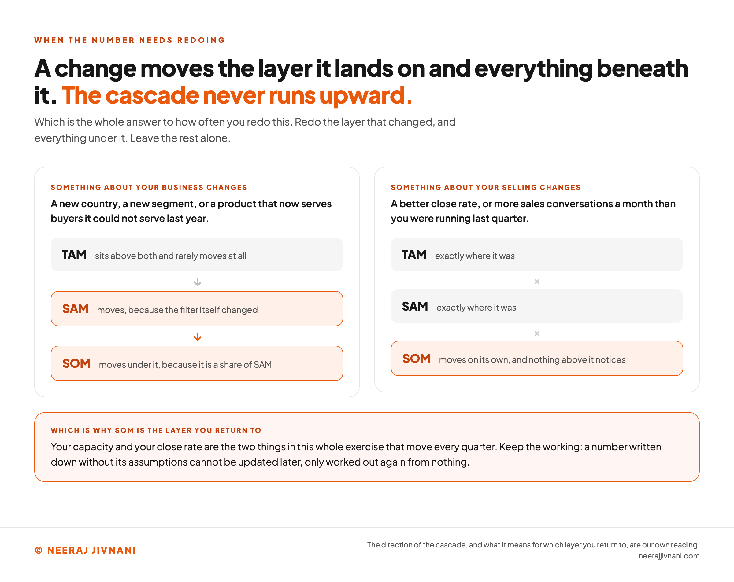
Redo the layer that changed and everything beneath it, because the cascade only ever runs downward.
A new country, a new segment, or a product that now serves buyers it could not serve last year all move SAM. A moved SAM moves SOM under it, and TAM sits above both and rarely moves at all.
The reverse never happens.
Price behaves differently, because it is not one of the filters. If you built the layers from your own price, a change to it multiplies all three at once, so the ratios between them never move.
A better close rate changes SOM and leaves SAM exactly where it was, which is why SOM is the layer worth returning to most often. Your capacity and your close rate are the two things in this whole exercise that move every quarter.
Keep the working. A number written down without its assumptions cannot be updated later, only worked out again from nothing.
Use this chart — embed code and citation
<a href="https://neerajjivnani.com/blog/tam-sam-som/"><img src="https://neerajjivnani.com/infographics/tam-sam-som/the-cascade-runs-downward.png" alt="Two columns showing that a change moves the layer it lands on and everything beneath it, and never anything above it. In the first column, something about your business changes: a new country, a new segment, or a product that now serves buyers it could not serve last year. TAM sits above both and rarely moves at all, an arrow points down to SAM, which moves because the filter itself changed, and a second arrow points down to SOM, which moves under it because it is a share of SAM. In the second column, something about your selling changes: a better close rate, or more sales conversations a month than you were running last quarter. TAM is exactly where it was, SAM is exactly where it was, the links between the layers are crossed out, and only SOM moves, on its own, with nothing above it noticing. A band across the foot says SOM is therefore the layer you return to, because your capacity and your close rate are the two things in the whole exercise that move every quarter, and that a number written down without its assumptions cannot be updated later, only worked out again from nothing." width="1200"></a>
<p>Chart: <a href="https://neerajjivnani.com/blog/tam-sam-som/">Neeraj Jivnani</a></p>Neeraj Jivnani, "TAM, SAM and SOM: Two Filters, and the One Number You Will Be Held To", neerajjivnani.com, https://neerajjivnani.com/blog/tam-sam-som/Free to republish with a link back to this page.
The Number You Can Defend
A market size you can defend is one where the judgment is visible, and the judgment lives in the two filters rather than in the arithmetic.
Keep the layers in the order they nest, write down the base of every percentage, and build the last number from what your team can do this year.
A market size built that way can be questioned, and that is the whole of what makes it worth anything. Anything else is a large number with nothing underneath it.