Breadcrumb Navigation: Which Sites Need One, and What Goes on the Page
Find out whether your site is deep enough to need a trail, which single path each page should show, and the exact markup to put on the page.


/ On this page11 sections
Breadcrumb navigation is the row of small links above a page's title naming the sections that page sits inside. Home > Shoes > Running > Trail Runners, with the last item as plain text because you are already on it.
Whether your site needs one is a depth question, not a taste question.
Past that, almost every decision reduces to picking the single path a page sits on, and then saying the same thing on the page and in the markup.
What Breadcrumb Navigation Is
A breadcrumb trail is a short list of links to the current page's ancestors, in order, from the top of the site down to where the reader is standing.
It is secondary navigation. The main menu says what the whole site contains; the trail says where this one page sits inside it.
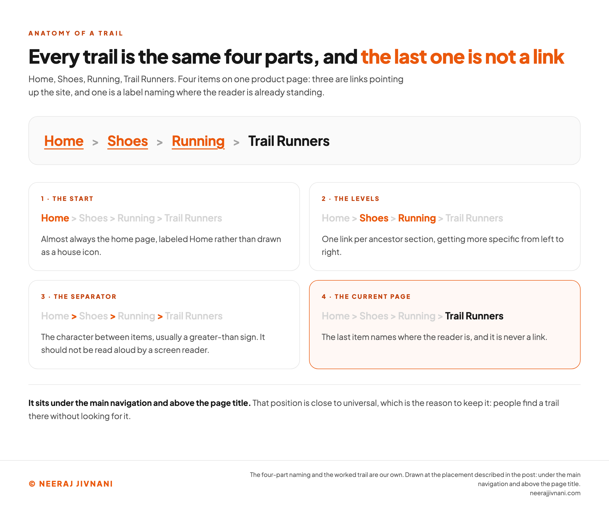
Four parts make one up, and every trail you have ever seen has all four:
- The start. Almost always the home page, labeled Home rather than drawn as a house icon.
- The levels. One link per ancestor section, getting more specific left to right.
- The separator. The character between items, usually a greater-than sign.
- The current page. The last item, which names where you are and is not a link.
It sits at the top of the page, under the main navigation and above the page title. That position is close to universal, which is the reason to keep it: people find a trail there without looking for it.
Three things it is not. It is not a replacement for your main menu, and it is not a browser back button, because it points up your site rather than back through a visit.
It is also not the feature of the same name on a hiking watch, which records the route you have walked rather than where you are standing.
Use this chart — embed code and citation
<a href="https://neerajjivnani.com/blog/breadcrumb-navigation/"><img src="https://neerajjivnani.com/infographics/breadcrumb-navigation/anatomy-of-a-trail.png" alt="Diagram naming the four parts of a breadcrumb trail using a worked example reading Home, then Shoes, then Running, then Trail Runners. The first item is labeled the start, almost always the home page and spelled out as the word Home rather than drawn as a house icon. The three greater-than signs between items are labeled the separator, and a note beside them says it should not be read aloud by a screen reader. The middle two items are labeled the levels, one link per ancestor section, getting more specific from left to right. The final item, Trail Runners, is shown in plain unlinked text and labeled the current page, with a note that it names where the reader is and is never a link. A band across the foot reads that the trail sits under the main navigation and above the page title, and that the position is close to universal, which is the reason to keep it." width="1200"></a>
<p>Chart: <a href="https://neerajjivnani.com/blog/breadcrumb-navigation/">Neeraj Jivnani</a></p>Neeraj Jivnani, "Breadcrumb Navigation: Which Sites Need One, and What Goes on the Page", neerajjivnani.com, https://neerajjivnani.com/blog/breadcrumb-navigation/Free to republish with a link back to this page.
Location, Path and Attribute, and Which of Them Is a Trail
Three kinds of breadcrumb get named everywhere: location, path and attribute. They are not three options you choose between.
Two of them are different components that happen to be drawn the same way, and knowing which is which settles most of the arguments about how a trail should behave.
Location Crumbs, the Only Kind That Is a Trail
A location crumb shows where the page sits in the site's structure. It is the same for every visitor, whether they arrived through four category pages or straight from a search result.
That last part is what makes it useful. A trail that depends on how somebody got here tells a person who came from search precisely nothing.
Path and Attribute Crumbs Are Doing Other Jobs
A path crumb replays the pages this visitor opened. It is a back button with extra steps, and browsers have shipped a better one for thirty years.
An attribute crumb shows the filters somebody has applied: men's shoes, size 9, black. It is worth building on a shop with real faceted search, and it is a filter panel rather than a trail.
The distinction is not pedantry. Rules written for one kind get applied to another, and that is where the contradictory advice comes from.
Take the rule that a trail should show the full path from home. Right for a location crumb, meaningless for a filter.
Build location crumbs. Build the other two as themselves, next to the trail, and label them in your own head as what they are.
Sites That Need a Trail, and Sites That Do Not
A breadcrumb earns its space when your site is at least three levels deep and a visitor can land on a page in the middle of it.
Shops, universities, documentation, help centers, news archives and anything with categories inside categories all qualify. So does any site where a meaningful share of visitors arrive on a deep page from a search result rather than through your home page.
A university: Home > Courses > Postgraduate > MSc Data Science. A help center: Home > Support > Billing > Failed Payments.
It is the wrong component in four cases:
- A flat site. One or two levels, and the main navigation already shows the whole structure. A trail reading Home > About adds nothing.
- A linear journey. Checkouts, onboarding, multi-step forms. Those are sequences, not hierarchies, and a progress indicator is the honest component.
- The home page. A trail on the home page is a one-item list linking to itself.
- Where a section already has its own sidebar. If a left-hand menu is already showing the reader where they sit inside the section, the trail restates it.
There is a faster version of the same test. Open any page on your site and try to write its trail by hand.
If you cannot, or if you find two plausible answers and no way to choose, you do not have a breadcrumb problem yet. You have a structure problem, and the trail would only publish it.
The Benefit Is Orientation, Not Clicks
Orientation is what a trail buys you. Not clicks, not time on page, and not a ranking.
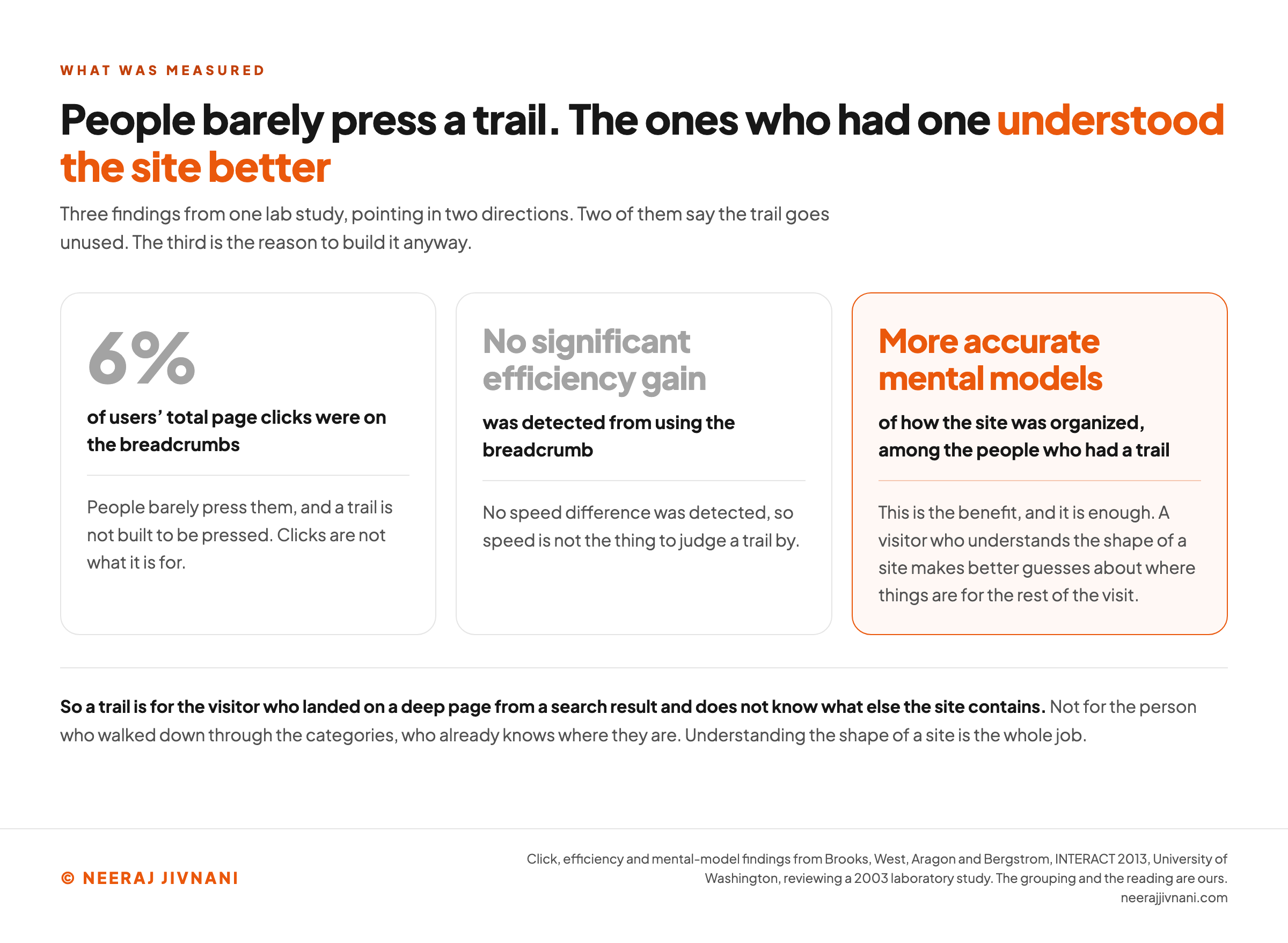
People barely press them. In a 2003 lab study reviewed by Brooks and colleagues at the University of Washington in 2013, breadcrumbs drew only 6% of users' total page clicks, and no significant efficiency gain showed up.
The same work reports the part worth keeping. The people who had a trail built more accurate mental models of how the site was organized.
That is the benefit, and it is enough. A visitor who understands the shape of your site makes better guesses about where things are for the rest of the visit, whether or not they ever press a crumb.
It also tells you who the trail is for. Not the person who walked down through your categories, because they already know where they are.
It is for the one who landed on a product page from a search result with no idea what else you sell.
Build it for them, and treat any effect on your analytics as a bonus you did not promise anybody.
Use this chart — embed code and citation
<a href="https://neerajjivnani.com/blog/breadcrumb-navigation/"><img src="https://neerajjivnani.com/infographics/breadcrumb-navigation/orientation-not-clicks.png" alt="Figure setting out three findings from one lab study, under a heading reading that people barely press a trail and that the ones who had one understood the site better. The first two findings are shown in muted type: breadcrumbs drew 6 percent of users total page clicks, and no significant efficiency gain was detected from using them. The third is highlighted in orange: the people who had a trail built more accurate mental models of how the site was organized. A band across the foot reads that the trail is therefore for the visitor who landed on a deep page from a search result and does not know what else the site contains, not for the person who walked down through the categories, and that understanding the shape of a site is the whole job." width="1200"></a>
<p>Chart: <a href="https://neerajjivnani.com/blog/breadcrumb-navigation/">Neeraj Jivnani</a></p>Neeraj Jivnani, "Breadcrumb Navigation: Which Sites Need One, and What Goes on the Page", neerajjivnani.com, https://neerajjivnani.com/blog/breadcrumb-navigation/Free to republish with a link back to this page.
Building the Trail for a Single Page
Once you have decided a page gets a trail, the same five decisions make it, every time: which path, how it ends, what the labels say, which character divides them, and where it sits.
None of them is a matter of taste, and the first one decides the other four.
Pick One Path and Keep It
A page with two parents is the hard case, and it is common. A pair of running shoes can live under Shoes and under Sale, and both are true.
Show one. Nielsen Norman Group's guidance is to identify a canonical path through the hierarchy and use that path everywhere, rather than personalizing the trail to how each visitor arrived.
Pick the path a visitor would most likely have walked, write it down, and make the template produce it for every page in that branch.
The Last Item Names the Page and Is Not a Link
Include the current page as the final item, so the trail ends somewhere. Then leave it as plain text.
A link that reloads the page you are on does nothing, and a reader who tries it learns that your links are not worth trusting.
Styling it differently is the other half of that. Make the links look like links and the last item look like a label, so the difference is visible before anyone clicks.
Labels, Separators and Placement
Use the same words in the crumb that you use in the page title. A crumb reading Footwear pointing at a page titled Shoes makes a reader wonder whether they have gone somewhere else.
Only include levels that have a real page behind them. Category labels that exist in your menu but have no page of their own do not belong in a trail, because every crumb is a promise that clicking it goes somewhere.
The separator is a small choice and a greater-than sign is the safe one. A slash, a chevron or a right-pointing arrow all read fine; what matters is that you use one character everywhere rather than three across the site.
Keep the whole thing smaller and quieter than your main navigation. It is the second thing on the page, and it should look like it.
Write one trail by hand
Take the deepest page on your site and write out the sections above it, separated by greater-than signs, ending with the page itself. Nothing here grades the answer. It prints what you wrote the way the page would print it, and then says what you have just promised a visitor.
If you cannot write it, or you find two plausible answers and no way to choose, that is the useful result rather than a failed one.
Write a trail above and it appears here as a page would show it.
When the Trail Runs Out of Room
A four-level trail with long category names does not fit across a phone, and this is where the advice you will find genuinely disagrees with itself.
You have three moves, and they are not equally good:
- Wrap it onto a second line. Every word survives, but the trail stops reading as a single path once half of it is underneath the other half.
- Truncate it. Collapse the middle into an ellipsis, or shorten the current page's label. The shape survives and some of the words do not.
- Show only the parent. One crumb, pointing up a level. It gives up the hierarchy and keeps the escape route.
Our call is to show the full trail wherever it fits, truncate the middle before you wrap, and fall back to the parent alone on the narrowest screens where a shop or a news site needs the space for the thing people came to read.
Reasonable people land elsewhere, and the U.S. Web Design System moved in the opposite direction in version 3.14.0 on August 18, 2026, making its breadcrumb wrap by default and turning the old ellipsis behavior into an opt-in variant.
Whatever you pick, keep the crumbs tappable. Nielsen Norman Group puts the minimum tap target at 1 cm by 1 cm, which rules out the common habit of shrinking breadcrumb text until the trail fits.
Writing It So a Screen Reader Can Follow
Eight lines of markup make a trail that a screen reader announces correctly. A labeled navigation region, an ordered list inside it, and one attribute on the final item.
Nothing here needs a framework, a plugin or a script. It is the same list you would write anyway, with four things named so that software knows what it is looking at.
``html
<nav aria-label="Breadcrumb">
<ol>
<li><a href="/">Home</a></li>
<li><a href="/shoes/">Shoes</a></li>
<li><a href="/shoes/running/">Running</a></li>
<li><span aria-current="page">Trail Runners</span></li>
</ol>
</nav>
``
What Each Attribute Is For
Four things in that block are doing real work:
- `<nav>` marks the region as navigation, so a screen reader user can jump to it or skip past it.
- `aria-label="Breadcrumb"` says which navigation it is, which matters because most pages have more than one.
- `<ol>` says the order is meaningful, and lets assistive technology announce how many items there are.
- `aria-current="page"` marks the last item as where the reader already is.
The Separator Is the Part That Goes Wrong
Separators drawn with CSS generated content are exposed to assistive technologies, including screen readers and braille displays.
So a trail that looks right announces itself as Home greater than Shoes greater than Running.
Mozilla's developer documentation gives three ways out, and any one of them works.
Add an empty alternative string after a slash, as in content: url("arrow.png") / "". Or use a decorative image and leave its alt text empty.
The third way is to generate the separator with ::after instead of ::before, so it is announced after the label rather than before it.
One more, and it is easy to miss because it is not an attribute.
The separator still has to meet contrast requirements against its background, because a reader with low vision is looking at it even if a screen reader is not reading it. The U.S. Web Design System's guidance says to treat it as text for that purpose.
What Google Needs From the Trail
Breadcrumb markup is a small block of structured data naming the same trail the page shows, in a vocabulary a search engine reads, and the block below is written as JSON-LD. It is one type, BreadcrumbList, and it holds one list.
``json
{
"@type": "BreadcrumbList",
"itemListElement": [
{ "@type": "ListItem", "position": 1, "name": "Shoes", "item": "https://example.com/shoes/" },
... one more entry per level, numbered in order ...
{ "@type": "ListItem", "position": 3, "name": "Trail Runners" }
]
}
``
Each entry needs three things: a position, starting at 1, a name, and an item pointing at the page. The last entry can leave item out, because it is the page carrying the markup.
Google does not require an entry for the top of your site either, which is why the example above starts at Shoes.
Two pieces of Google's own guidance decide the rest, and the first resolves the two-parents problem from earlier.
Show one on the page, and declare every path that is true: "If there are multiple ways to navigate to a page on your site, you can specify multiple breadcrumb trails for a single page."
The second is about what those paths should be. "We recommend providing breadcrumbs that represent a typical user path to a page, instead of mirroring the URL structure."
Where your folder layout and the route a person would walk differ, the person wins.
The rule underneath both: the markup describes what is on the page. A declared trail no visitor can see is a claim your site does not support.
What Your Platform Already Builds
Most sites already have breadcrumbs, or are three settings away from them.
WordPress with almost any search engine optimization plugin will generate a trail from your category structure, and most write the markup at the same time.
Shopify and Squarespace themes vary. The honest answer there is to open a deep page and look, rather than to read the documentation.
If nothing produces one, hand-rolling it is a small job. You already know each page's ancestors, because your menu does; the trail is that list, printed.
Whatever built yours, four checks are worth running once on a deep page:
- Is the final crumb still clickable? Many generated trails leave it as an anchor, which is usually one toggle in the plugin settings.
- Does every crumb go somewhere real? Click each one.
- Do the labels match the page titles? Generated trails often use a slug or a shortened title instead.
- Does the markup match what you can see? If a plugin is declaring a trail the page does not display, one of the two is wrong.
The Trail Is Your Hierarchy, Printed
Everything above comes back to one thing. A breadcrumb is not a feature you bolt onto a site; it is the site's own structure, written out in public, one page at a time.
Which is why the difficult questions about it are never questions about breadcrumbs.
Two parents, a label that does not match the title, a crumb pointing at a category with no page: each one is your structure speaking up, and the trail is the first place it becomes visible.
So the work is smaller than it looks, and it starts with a pencil rather than a plugin. Take your deepest page, the Trail Runners at the end of Home > Shoes > Running, and settle its four crumbs.
Settle those four and a template can produce the rest, because a hierarchy has only one right answer per page, and that is the one you wrote down.
And if the four will not settle, you have learned the more useful thing.