How to Write Alt Text, and When to Leave It Empty
Work out what an image is doing on your page and the words follow. A three-way test, worked examples, and the failure hiding in your linked images.

/ On this page12 sections
Most of the difficulty with alt text is not the writing. It is working out what the image is doing on the page, because once that is settled the words are the easy part.
Alt text is a short written description attached to an image, so a reader who cannot see the picture still gets what it was there for. A screen reader reads it aloud in place of the image.
The work is a decision first and a description second, and three questions settle it, including for a chart, a logo, or an image that is also a link.
Where Alt Text Actually Lives
Alt text lives in one attribute of one tag. On a web page the alt attribute of an image tag holds the description, next to the src attribute that holds the file.
If you publish through a content management system you will never type it. The field labeled alt text, or alternative text, or image description, writes it for you.
Four things read that attribute, and only the first is the reason it exists.
- A screen reader. It announces that there is an image, then reads the alt text, so a listener gets the description at the moment a sighted reader gets the picture.
- A browser with nothing to show. When the file fails to load, or images are switched off, the alt text appears in the space the image would have filled.
- A search engine. It reads the alt text as part of what the page covers and what the image contains.
- Anything else parsing the page, which now includes the systems answering questions straight from web pages.
Leaving the attribute off is not the neutral choice. When alt text is missing, a screen reader reads the filename aloud instead, so a listener gets photo-final-crop.jpg where they could have had a sentence.
So every image carries an alt attribute, even when the correct value is an empty one.
An empty attribute is an instruction to skip.
A missing attribute is a gap that software fills with whatever it can find.
The Question to Ask Before You Type Anything
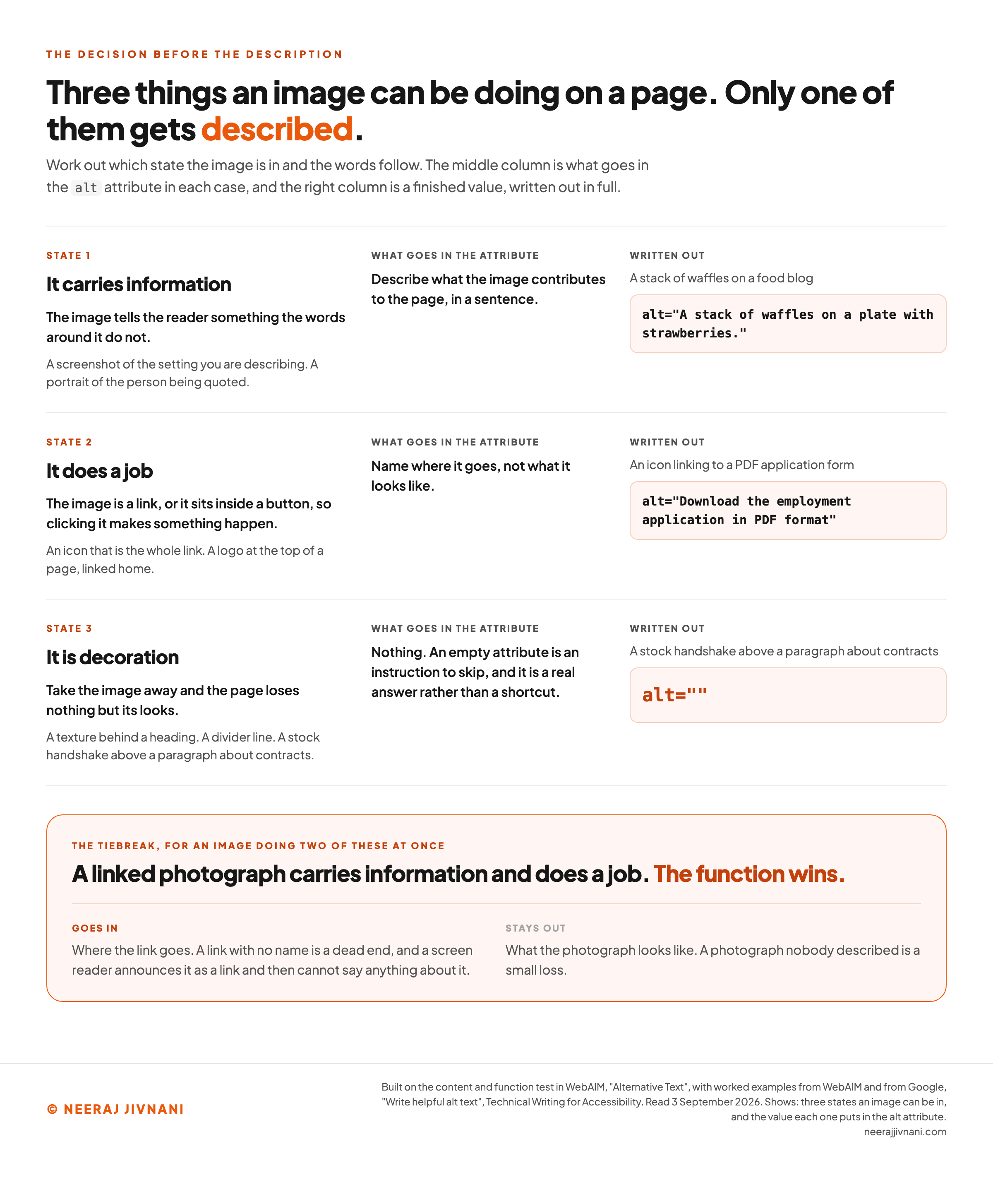
There are only three things an image can be doing on a page, and each takes a different response.
It carries information. The image tells the reader something the words around it do not. A photograph of the damaged component in a repair guide, a screenshot of the setting you are describing, a portrait of the person being quoted. Describe it.
It does a job. The image is a link, or it sits inside a button, and that is the only way an image has a function. Describe where it goes, not what it looks like.
It is decoration. Take the image away and the page loses nothing but its looks. A texture behind a heading, a stock handshake above a paragraph about contracts, a divider line. Leave the attribute empty.
The three are not always exclusive, and that is where people stall. A linked photograph carries information and does a job at once.
The tiebreak: the function wins. A link with no name is a dead end, while a photograph nobody described is a small loss.
What is this image doing on your page?
Answer for the image in front of you. Tick everything that is true, because an image can be doing two of these at once, and that is the case worth watching.
Nothing is decided yet, so there is nothing to write. This is the step people skip, and it is why they end up defending a sentence instead of choosing one.
Run the three questions before you type, and most of the awkwardness disappears. Run them after you have written a sentence and you will spend the time defending the sentence instead.
Use this chart — embed code and citation
<a href="https://neerajjivnani.com/blog/alt-text/"><img src="https://neerajjivnani.com/infographics/alt-text/three-answers.png" alt="A decision table pairing each of the three things an image can be doing on a page with the value it puts in the alt attribute and a finished example, plus the tiebreak for an image doing two of them at once. Every row is set out in the text of this section." width="1200"></a>
<p>Chart: <a href="https://neerajjivnani.com/blog/alt-text/">Neeraj Jivnani</a></p>Neeraj Jivnani, "How to Write Alt Text, and When to Leave It Empty", neerajjivnani.com, https://neerajjivnani.com/blog/alt-text/Free to republish with a link back to this page.
Writing the Description
Describe what the image contributes to the page, in a sentence, as though saying it to someone on the phone.
That last part does more work than any other rule here, because a phone call forces you to say what matters and skip what does not.
What Goes In
Two things decide the content of that sentence, and neither is a rule about words.
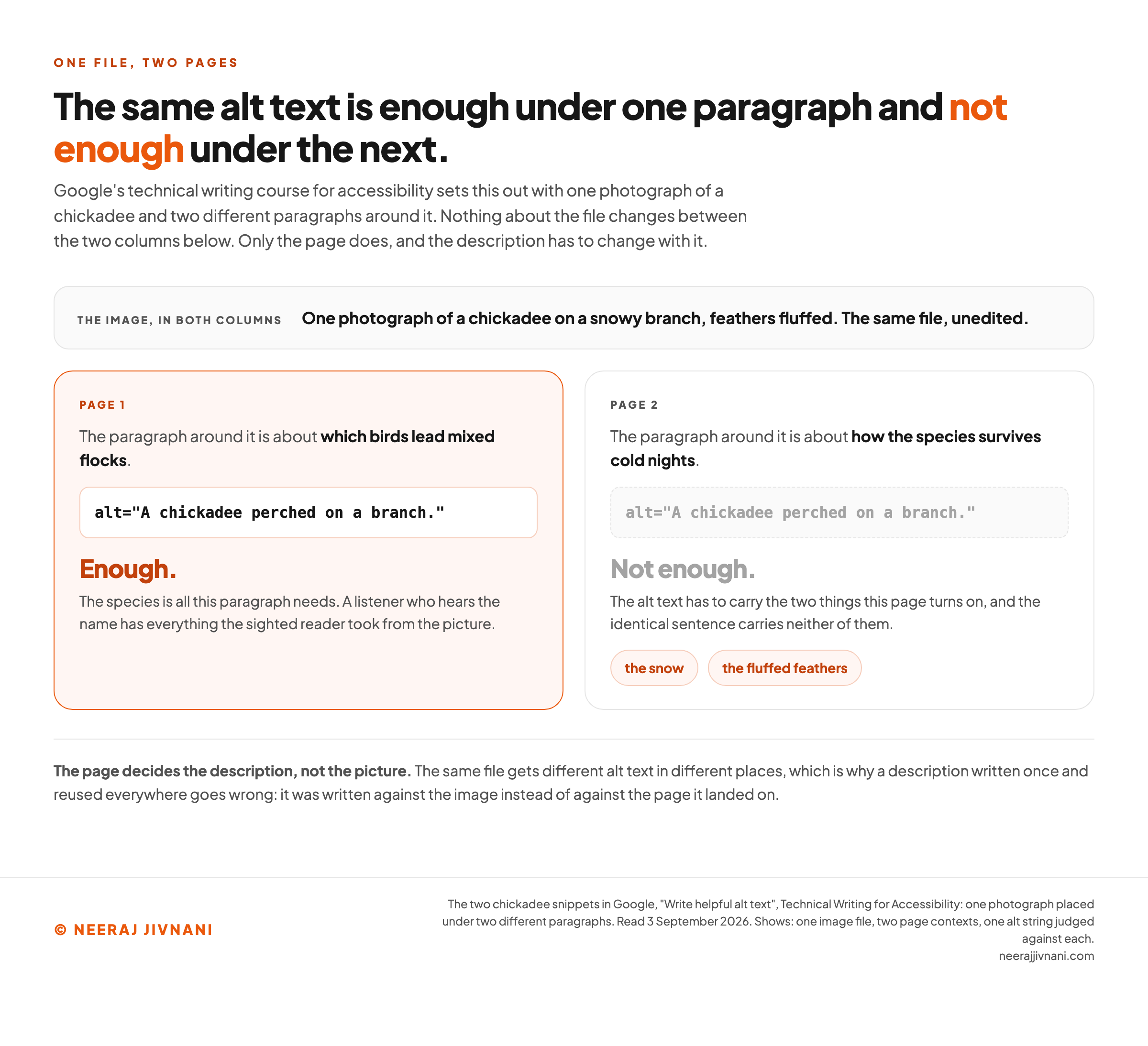
The first is the subject at the level the page needs it. One photograph earns a different description on a different page, because the page decides what about it matters.
Under a paragraph about which birds lead mixed flocks, alt="A chickadee perched on a branch." is enough. Under a paragraph about how the species survives cold nights, the alt text has to carry the snow and the fluffed feathers.
That pair is Google's own, from its technical writing course for accessibility.
The second is any words printed inside the image. Include that text word for word. A reader who cannot see the graphic cannot see the words on it either.
Names, places and numbers belong in the alt text if the page turns on them.
The most useful prompt is not a checklist but a question: why did you choose this particular image? It points at intent rather than inventory.
What Stays Out
Four things do not belong in alt text, and leaving them out is most of the improvement.
- "Image of" and "photo of." A screen reader already announces that there is an image. Saying it again spends the listener's first three words on nothing.
- Anything the adjacent text already says. A caption, a heading or the paragraph beneath the image has already delivered it, and hearing it twice is worse than hearing it once.
- Detail that does not change the point. The color of a jacket, the number of strawberries, the shade of the sky, unless the page is about jackets or strawberries or the sky.
- Capital letters, used for emphasis. A screen reader may read a word in all caps as an acronym, and all-caps words lose the distinct shapes some readers rely on.
The first of those has one exception worth knowing.
If the medium is itself the point, say so: a painting, a cartoon, an illustration, a screenshot.
"Cartoon of a job interview" tells a listener something real. "Image of a job interview" tells them nothing.
Two small mechanical habits are worth adopting. End the alt text with a period, because a screen reader pauses at one and the description separates cleanly from the text that follows.
And write it in the language of the page. Translate a document and the alt text has to be translated with it, which Section508.gov requires explicitly.
How Long
A sentence, occasionally two.
That is the honest answer, and it leaves the real question unanswered: how long is too long when you are staring at the box?
The one place anybody enforces a number is a publisher's submission rule.
Brill's 2025 guide for authors preparing accessible manuscripts asks for 100 to 150 characters including spaces. The reason is the listener's: someone using a screen reader often has to hear the whole description before carrying on.
That is a useful budget even where nobody is enforcing it.
Around 150 characters is roughly a full sentence, which is enough for a subject, a setting and one detail that matters.
If you cannot fit the meaning into that, the image is not the problem and neither is the budget. The description belongs in the body text, and the alt text says what the image is and points at it.
Use this chart — embed code and citation
<a href="https://neerajjivnani.com/blog/alt-text/"><img src="https://neerajjivnani.com/infographics/alt-text/one-photo-two-descriptions.png" alt="Two panels judging one alt string against two different pages, accepted under the first and refused under the second, with the two things it fails to carry named. Both pages and the reason are given in the paragraphs above." width="1200"></a>
<p>Chart: <a href="https://neerajjivnani.com/blog/alt-text/">Neeraj Jivnani</a></p>Neeraj Jivnani, "How to Write Alt Text, and When to Leave It Empty", neerajjivnani.com, https://neerajjivnani.com/blog/alt-text/Free to republish with a link back to this page.
Good Alt Text and Bad, Side by Side
The gap between weak alt text and useful alt text is almost never effort.
It is whether the writer decided what the image was for before describing it.
Five pairs, each one a case you will meet this week.
| the image | weak | better, and why |
|---|---|---|
| A portrait of a named person, in an article about them | Black and white photo of Dr. Martin Luther King Jr. wearing a suit and tie | Dr. Martin Luther King Jr. The page is about the person, so the person is the content and the suit and tie are not. Section508.gov gives this exact pair. |
| A stack of waffles on a food blog | Waffles | A stack of waffles on a plate with strawberries. Enough to picture it, and nothing past that. Google's course calls the first too concise and a much longer version too wordy, and lands here. |
| A company logo at the top of a page, linked home | Company logo | The company's name, on its own. The word "logo" is not part of the content. |
| A card graphic announcing an event, with the date on it | Event details with registration button | The words on the card, in full: Card with text: Acquisition training for the real world - Jan 29th-Feb 9th. 1:00 PM - 2:00 PM EST - Register today. Section508.gov's own example, quoted as they write it. |
| A bar chart in a report | Event sales graph | Bar chart of event sales for Monday through Friday, then the trend, then a pointer to the table below it. Name the chart type first, because a listener needs to know what kind of picture they are being told about. |
Read the weak column again. Not one of those five was written by somebody who had decided what the image was doing on the page first, which is why four of them describe the file and the fifth describes almost nothing.
When to Leave It Empty
Leave it empty when the image is decoration. An empty alt="" is a real answer rather than a shortcut, and choosing it is a decision you should be willing to defend.
If you could not use this image, what would you put in its place? If the honest answer is nothing, empty is right.
That question is faster than the categories, because it needs no judgment about which one you are in.
The same test runs the other way round. If the meaning of the page would be unchanged without the image, the attribute is empty.
Four kinds of image usually qualify.
- Textures, borders and dividers. Visual structure the headings already carry.
- Stock photography chosen for mood. The handshake above a paragraph about contracts, the laptop above a paragraph about remote work.
- Spacers. Anything present to push other things apart.
- An image whose content the caption or the paragraph already states in full. The description exists, and it is not in the attribute.
One limit is the reason decoration is a decision rather than a default.
Logos are never decorative. And a watermark carrying real information has to be repeated in the body text, because screen readers do not read watermarks. Section508.gov requires both.
The Cases That Are Genuinely Hard
Four kinds of image resist the sentence-long description, and there is a fifth group where the attribute is the wrong tool altogether. Each has an established answer.
An Image That Is Also a Link
Describe the destination, not the picture. This is the case the three questions were built for, and it is where the missing descriptions concentrate.
WebAIM's 2026 report on the top one million home pages found that 16.2% of images were missing alternative text, down from 18.5% in 2025.
The number underneath it is the one worth acting on. In the same WebAIM report, 45% of those missing descriptions were on linked images, and one out of every four linked images had none at all.
A linked image with no alt text loses more than a description. It produces a link with no name, because an image link's anchor text is its alt attribute, and a screen reader announces it as a link and then cannot say anything about it.
So if you are working through a backlog and cannot do all of it, do the images that are links first. That single filter reaches nearly half the missing descriptions.
The words themselves are straightforward.
An icon linking to a PDF application form takes PDF when the link text beside it already says what the document is, and Download the employment application in PDF format when the icon is the whole link. WebAIM works through both.
A Chart or a Diagram
Name the chart type, give the trend, then point at the data. Start with a phrase like "Pie chart" or "Bar graph", describe the relationships the image is highlighting, and skip whatever the paragraph underneath already says.
For anything genuinely complex, the alt text stops being the place for it. Put a data table or a full description on the page and let the alt text identify the image and say where the detail is.
Do not reach for longdesc to do this. The attribute is obsolete in the HTML standard and poorly supported by screen readers.
For a flow chart or an organization chart, describe the order and the relationships rather than the shapes. A bulleted list on the page often serves a listener better than any description of boxes and arrows.
A Logo
Use the organization's name and stop.
The word "logo" is rarely part of the content or the function. A listener who hears "link, graphic" and then the company's name at the top of a page already knows what it is.
If the logo has words in it beyond the name, the rule about text inside images applies here too: include the tagline word for word.
An Image With Words In It
Repeat the words, in full. Then ask why they are in a picture at all, and avoid it where you have the choice.
That second half is the better advice. Text set as text can be selected, searched, translated and resized; text baked into a picture can be none of those things, whatever its alt text says.
The Cases Where the Attribute Is the Wrong Tool
Sometimes the fix is not the words but the markup. Three cases come up often enough to name.
- A background image set in CSS. There is no attribute to fill. If a background image carries content, that content has to move into the page markup where a screen reader can reach it.
- An image map with clickable regions. Each region needs its own description, and the main image describes only what the regions do not.
- An image used as a form button. The alt text says what pressing it does, so
Submit searchrather than a description of the magnifying glass.
Alt Text, Captions and Long Descriptions
Captions and long descriptions are not alt text, and they are not each other. Making one do another's job is where the confusion between the three starts.
Alt text replaces the image for someone who cannot see it. Only assistive software and the browser read it.
A caption sits under the image and everybody reads it. It adds context, credit or a source, and it is the right home for anything a sighted reader also benefits from knowing.
A long description is for an image whose meaning will not compress, such as a dense chart. It lives in the body text or on its own page, and the alt text points at it.
The interaction matters. If a caption already carries the content, the alt text should not repeat it.
Pair them deliberately, so each one adds something the other does not.
Adding It: HTML, a CMS, and a Document
Every tool puts the same attribute behind a differently named field.
In hand-written HTML you type the alt attribute yourself. In a content management system there is a field beside the image in the media library or the editor, usually labeled alt text or alternative text.
In an office document the panel sits under a right-click on the image, or under the Review tab. It carries a separate control to mark an image as decorative rather than typing an empty description.
The same Review tab holds an Accessibility Checker that reviews the visual content for missing alt text.
Marking decorative and typing nothing are not the same action.
An image marked decorative exports to PDF as an artifact that screen readers skip, which is what you wanted. An empty field with no such marking may not do that.
Social platforms each have their own version, usually behind an edit or accessibility control on the image before you post. The field is often shorter than a web page allows, which makes a tight character budget a practical constraint there rather than a stylistic one.
What an Automatic Generator Cannot Decide
A generator can describe a picture. It cannot know what the picture is for on your page, and that is the part the three questions settle.
The distinction is not academic.
Automatic alt text looks at pixels, so it produces a description of contents.
Whether those contents are the point, whether the paragraph beneath already says it, whether the image is a link, and whether it should be skipped are all facts about the page rather than the picture.
Microsoft Office gives you an Alt Text pane where you edit or approve an automatically generated description, and a checkbox under File, Options, Accessibility that turns the generator off entirely. Both put a person between the machine and the reader.
That is the right shape for any tool. Use a generator to draft, then run the three questions and edit, and mark the decorative ones decorative rather than accepting a description of a texture.
The place a generator genuinely earns its keep is volume. A library of ten thousand product photographs is not going to be described by hand, and a drafted description a person corrects is better than an empty attribute.
Whether the Law Actually Requires It
Yes, in the standard every accessibility rule points at, and in the United States it is written into federal regulation for some websites and not others.
The Standard Itself
The standard is the Web Content Accessibility Guidelines, or WCAG, published by the World Wide Web Consortium.
Its Success Criterion 1.1.1, Non-text Content, requires that "all non-text content that is presented to the user has a text alternative that serves the equivalent purpose". It sits at Level A, the most basic of the three conformance levels.
WCAG 2.2 then names the situations that get a lighter answer than a full description. The list is short and specific.
- Controls and input, which need a name describing their purpose rather than a description.
- Time-based media, meaning audio and video, which need at least descriptive identification.
- A test that would be invalid if presented in text.
- Something intended to create a specific sensory experience.
- A CAPTCHA, which needs its purpose described plus an alternative form.
- Pure decoration, formatting, or anything not presented to users, which must be implemented so assistive technology can ignore it.
That last exception is the empty attribute, written into the standard.
What American Law Does With It
Two federal instruments turn that guideline into an obligation, and they cover different sites.
Section 508 of the Rehabilitation Act covers federal agencies and what they buy. Its guidance at Section508.gov, revised in May 2025, states that alt text is a requirement of the Section 508 guidelines.
The Americans with Disabilities Act reaches further. The Department of Justice's Title II rule sets WCAG 2.1 Level AA as the technical standard for state and local government web content and mobile apps.
Those compliance dates moved recently. The Federal Register published an interim final rule on April 20, 2026 extending them:
- April 26, 2027 for governments with a total population of 50,000 or more.
- April 26, 2028 for governments under that figure, and for any special district.
For a private business the position is less settled. As of 2026 there is no equivalent federal technical standard for a commercial website, and WCAG conformance is what accessibility claims tend to be measured against rather than a rule a private site can point to.
The practical answer is the same either way.
Alt text is among the cheapest items on the standard, it is one of the few an automated tool detects reliably, and it sits at the lowest of the three levels.
What It Actually Does for Search
Alt text helps a search engine understand an image, so it is one small piece of search engine optimization, and the effect is smaller than the accessibility one.
Two things are real. Alt text is one part of image SEO, so it helps an image get found in Google Images, and it contributes to what a page is understood to be about.
Software has become good at working out what is in a picture, and it still cannot tell what that picture is doing on your page. That distinction is the one that matters here.
That is the whole opportunity, and it is the same work accessibility asks for. Describe the image in the context of the page and both jobs are done at once.
What does not work is stuffing keywords into the attribute.
alt="running shoes best running shoes buy running shoes online" reads as spam to a search engine, and to a listener it is a string of search terms where a sentence should be.
If a keyword genuinely describes the image, it will appear because the description is accurate. If it does not, putting it there makes the alt text false.
Where This Goes Wrong Most
More than one in four images on a popular home page has something wrong with its description, WebAIM found in 2026. The failures fall into a small number of shapes.
WebAIM's 2026 count came from more than 66.6 million images across the top one million home pages, an average of 66.6 per page. And absence is not the worst of it.
Beyond the 16.2% missing a description entirely, WebAIM found that 10.8% of the images that did have alt text carried questionable or repetitive text: alt="image", alt="graphic", a file name, or the same words as the image next to it.
Writing something is not the same as writing something useful, and the second number is the one that proves it.
Four failures account for most of it, and every one is a decision made badly rather than a sentence written badly.
- Nothing at all, which hands the listener a filename.
- A placeholder such as
alt="image", which says the one thing a screen reader has already said. - A repeat of the words beside it, which spends the listener's time twice on one idea.
- A description of the file rather than the page, which is accurate and useless.
Checking a page takes less time than arguing about it.
Right-click an image, choose inspect, and read the alt attribute in the markup.
For a whole site an automated accessibility checker does the same sweep at scale. Inside a document, the Accessibility Checker flags the objects it thinks need one.
Then work through what you find in the order the numbers suggest: the images that are links, then the ones carrying information the page depends on, then everything else. The decorative ones need an empty attribute, which costs a click.
And in front of the next image, with the box open, nothing about the job has changed. Decide what it is doing there, and the sentence writes itself.