Mobile SEO, and How Much of It Your Site Has Already Done
One build decision made years ago settles most of a mobile SEO checklist. Find out which of three setups you run, and what is genuinely left to fix.

/ On this page7 sections
How much mobile SEO your site owes comes down to one thing: the way it answers a phone. Which of three setups you are running decides it, and you can find out in about ten seconds.
The short version is that mobile SEO is not a second discipline. It is your ordinary site, judged on the version a phone gets.
Mobile SEO Is One Site, Judged on the Phone Version
Mobile search engine optimization, usually shortened to mobile SEO, is the work of making sure the version of your site a phone gets is the version you want ranked.
There is no more to the definition than that.
The reason it has its own name is an indexing decision rather than a ranking one.
Google crawls and indexes the web with a smartphone crawler, and announced on 31 October 2023 that the transition to doing so was complete.
There is no separate mobile index to get into. There is one index, and what went into it came off a phone.
That is the stake, and it is a sharper one than a share-of-traffic figure. What your desktop template contains has no bearing on it: if the phone version leaves something out, the index leaves it out.
That holds however your site is built, and it catches one thing people do deliberately. Google will not tap, swipe or type, so content that arrives only after an interaction does not arrive for the index at all.
The Three Ways a Site Fails on a Phone
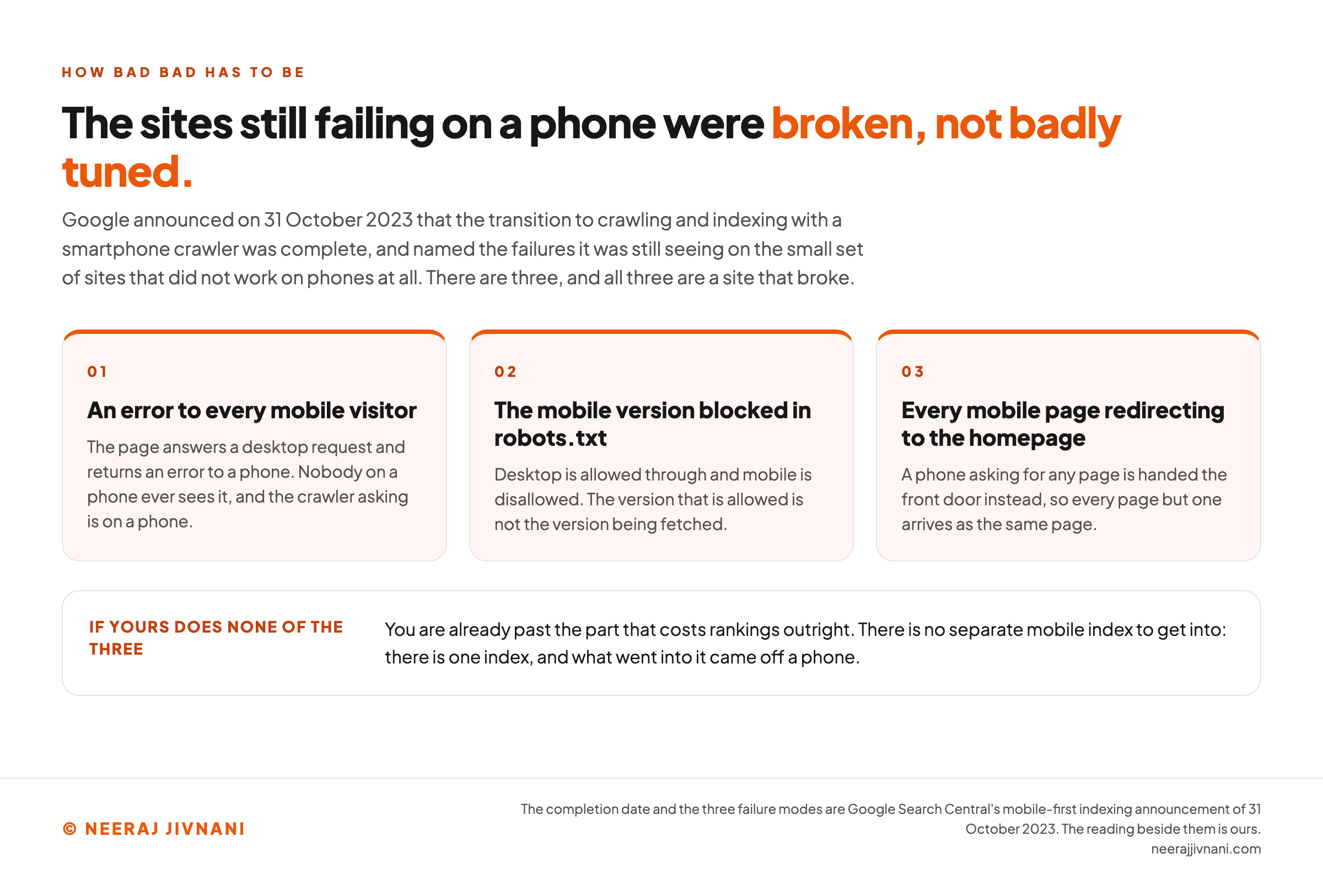
How bad "bad" has to be before this costs you anything is worth being precise about. In the same announcement Google named the failures it was still seeing on the small set of sites that did not work on phones at all.
Three shapes, all of them severe.
Pages that showed an error to every mobile visitor. A mobile version blocked in robots.txt while the desktop version was allowed through. Every mobile page redirecting to the homepage.
Every one of those is a site that broke rather than a site that was tuned badly. If yours does none of the three, you are already past the part that costs rankings outright.
Use this chart — embed code and citation
<a href="https://neerajjivnani.com/blog/mobile-seo/"><img src="https://neerajjivnani.com/infographics/mobile-seo/three-ways-it-actually-breaks.png" alt="Three numbered cards under a title stating that the sites still failing on a phone were broken rather than badly tuned, listing the failures Google named when it announced on 31 October 2023 that the transition to a smartphone crawler was complete. The first card is an error returned to every mobile visitor, noting that the crawler asking is itself on a phone. The second is the mobile version blocked in robots.txt while the desktop version is allowed through, so the version that is allowed is not the version being fetched. The third is every mobile page redirecting to the homepage, so every page but one arrives as the same page. A band underneath reads that a site doing none of the three is already past the part that costs rankings outright, because there is no separate mobile index to get into: there is one index, and what went into it came off a phone." width="1200"></a>
<p>Chart: <a href="https://neerajjivnani.com/blog/mobile-seo/">Neeraj Jivnani</a></p>Neeraj Jivnani, "Mobile SEO, and How Much of It Your Site Has Already Done", neerajjivnani.com, https://neerajjivnani.com/blog/mobile-seo/Free to republish with a link back to this page.
Which of the Three Setups You Are Running
Every site answers a phone in one of three ways.
Establish which one yours uses before anything else. The answer decides how long the rest of this takes.
Responsive design serves the same HTML at the same URL to every device, and lets CSS change how it looks. Google's own description is that it serves the same code regardless of device "but can display the content differently based on the screen size", and it recommends this pattern because it is the easiest to implement and maintain.
Dynamic serving keeps one URL and sends different HTML depending on which device asked for it.
Separate URLs, the pattern usually called m-dot, sends a phone to a different address altogether, typically something like m.example.com.
Telling Them Apart in Ten Seconds
You do not need a tool or an account for this. You need a phone and a laptop.
- Open one of your pages on your phone and read the address bar. If the address begins
m.or contains/mobile/, you are running separate URLs, and you can stop here. - Open the same page on a desktop and compare the two addresses. If they are identical, you are on responsive design or dynamic serving.
- View the page source on both and compare the markup. Responsive design sends the same HTML to both. Dynamic serving does not, and the two views will differ substantially.
Most sites built in the past decade on a maintained theme or a hosted platform are responsive.
If that is your answer, the rest of this job is small.
What the Other Two Owe That Responsive Does Not
Google's guide to mobile-first indexing carries a line worth reading twice.
It says the contents of that guide "only apply to dynamic serving and separate URL configurations", because "in case of responsive design, the content and the metadata are the same on the mobile and desktop version of the pages".
That single sentence is why the long version of this checklist exists at all.
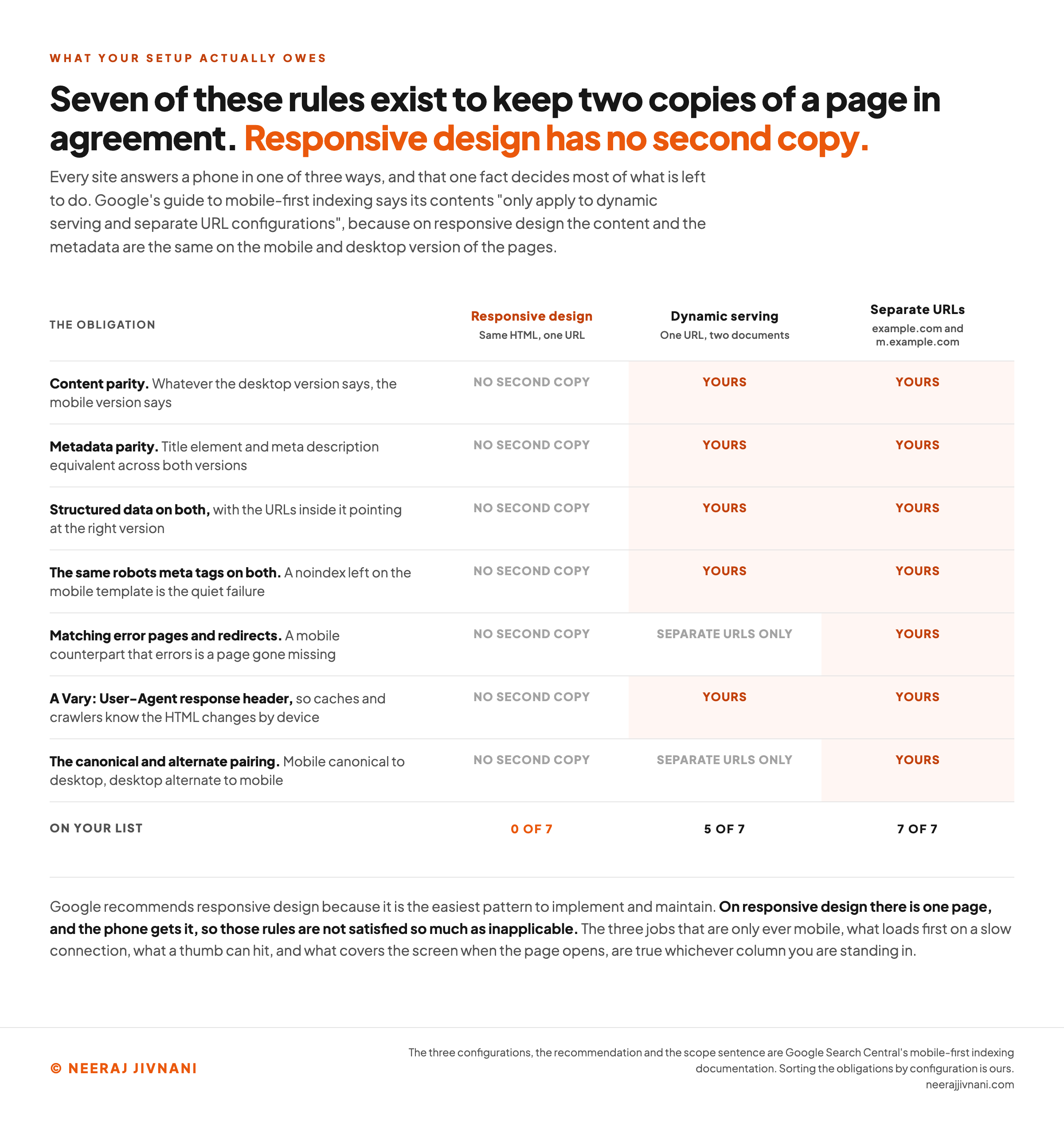
The long version of that list is mostly a set of rules for keeping two copies of a page in agreement.
Same content on both. Same title and description on both. Same structured data, same headings, same robots directives, same alt text on both.
On responsive design there is no second copy. There is one page, and the phone gets it. Those rules are not satisfied so much as inapplicable.
Two configurations do owe them, and if you landed on either in the check above, this is your list:
- Content parity. Whatever the desktop version says, the mobile version says. You can move material into accordions or tabs to save room, and Google is explicit that this is fine, because the words are still in the page. Cutting it is not, because indexing comes from the mobile version.
- Metadata parity. The title element and the meta description have to be equivalent across both versions.
- Structured data on both, with the URLs inside it pointing at the right version.
- The same robots meta tags on both. A
noindexleft on the mobile template while desktop is open is the quiet version of the robots.txt failure above. - A `Vary: User-Agent` response header, so that caches and crawlers know the HTML changes by device. Google says both of these configurations rely on it.
- The canonical and alternate pairing, for separate URLs. The mobile page carries
rel="canonical"pointing at desktop; the desktop page carriesrel="alternate"pointing at mobile. Get this wrong and the two versions read as duplicates of each other. - Matching error pages and redirects, for separate URLs. If a desktop URL returns a page and its mobile counterpart returns an error, that page goes missing.
Dynamic serving owes the first five. Separate URLs owes all seven, because the last two only exist where there is a second address.
If you are responsive, the list above is not yours. That is not a shortcut but the reason Google recommends the configuration in the first place.
Use this chart — embed code and citation
<a href="https://neerajjivnani.com/blog/mobile-seo/"><img src="https://neerajjivnani.com/infographics/mobile-seo/three-setups-one-list.png" alt="A four column matrix headed the obligation, responsive design, dynamic serving and separate URLs, setting out the seven parity rules a mobile configuration can owe. Content parity, metadata parity, structured data on both, the same robots meta tags on both, and the Vary User-Agent response header each read no second copy under responsive design and yours under both of the other two. The matching error pages and redirects row reads separate URLs only under dynamic serving and yours under separate URLs, and the canonical and alternate pairing row reads the same way. A totals row beneath reads zero of seven for responsive design, five of seven for dynamic serving and seven of seven for separate URLs. A band at the foot states that Google recommends responsive design because it is the easiest pattern to implement and maintain, that on responsive design there is one page and the phone gets it so those rules are not satisfied so much as inapplicable, and that the three jobs which are only ever mobile hold true whichever column you are standing in." width="1200"></a>
<p>Chart: <a href="https://neerajjivnani.com/blog/mobile-seo/">Neeraj Jivnani</a></p>Neeraj Jivnani, "Mobile SEO, and How Much of It Your Site Has Already Done", neerajjivnani.com, https://neerajjivnani.com/blog/mobile-seo/Free to republish with a link back to this page.
Where a Phone Result Differs From a Desktop One
Your page is one half of what a searcher sees. The result page it sits inside is the rest, and that page is not the same on a phone.
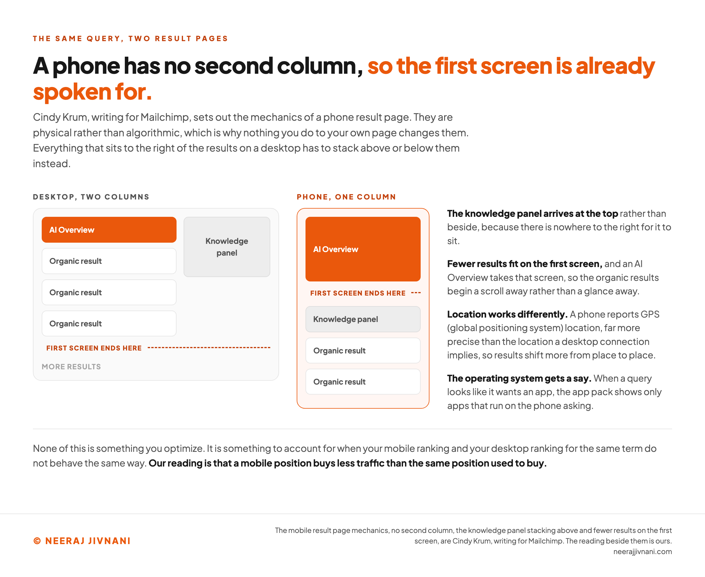
The mechanics are worth knowing because they are physical rather than algorithmic. Cindy Krum, writing for Mailchimp, sets out the main ones.
A phone screen has no room for two columns, so everything that sits to the right of the results on a desktop stacks above or below them instead.
The knowledge panel arrives at the top rather than beside. Fewer results fit on the first screen.
Location works differently too.
A phone reports GPS (global positioning system) location, which is far more precise than the location a desktop connection implies. Results shift more from place to place as a result.
And the operating system gets a say. When a query looks like it wants an app, Google can show an app pack, and it only shows apps that run on the phone asking.
None of that is something you optimize. It is something to account for when your mobile ranking and your desktop ranking for the same term do not behave the same way.
What an AI Overview Does to a Screen With One Column
An AI Overview occupies the top of the results, and on a desktop the rest of the page is still visible beside and below it.
On a phone there is nowhere for the rest to go. The overview takes the first screen, and the organic results begin underneath it, which is a scroll away rather than a glance away.
The practical consequence is narrow. Our reading is that a mobile position buys less traffic than the same position used to buy.
Whether you appear in the overview itself is a different question with its own answer, and it is not a mobile question.
One Description, Two Lengths
The result snippet is truncated by width rather than by a fixed character count, and a phone is narrower than a laptop.
The seoClarity guide puts the usable mobile length at around 120 characters against roughly 158 on desktop. The number matters less than the consequence.
Your description has to make its point twice: once in full, and once in the first hundred-odd characters. Put the reason to click at the front and the qualification after it.
Use this chart — embed code and citation
<a href="https://neerajjivnani.com/blog/mobile-seo/"><img src="https://neerajjivnani.com/infographics/mobile-seo/one-column-first-screen.png" alt="Two result page diagrams side by side under a title stating that a phone has no second column, so the first screen is already spoken for. The desktop frame shows a main column holding an AI Overview above three organic results, with a knowledge panel in a rail to its right and a dashed line marking where the first screen ends below the third result. The phone frame is a single narrow column in which the AI Overview fills everything above the dashed first screen line, with the knowledge panel and two organic results below it. Four notes beside the frames record that the knowledge panel arrives at the top because there is nowhere to the right for it to sit, that fewer results fit on the first screen so the organic results begin a scroll away rather than a glance away, that a phone reports GPS location which is far more precise than the location a desktop connection implies, and that the app pack shows only apps which run on the phone asking. A band at the foot states that none of this is something you optimize, and that our reading is that a mobile position buys less traffic than the same position used to buy." width="1200"></a>
<p>Chart: <a href="https://neerajjivnani.com/blog/mobile-seo/">Neeraj Jivnani</a></p>Neeraj Jivnani, "Mobile SEO, and How Much of It Your Site Has Already Done", neerajjivnani.com, https://neerajjivnani.com/blog/mobile-seo/Free to republish with a link back to this page.
The Work That Is Only Ever Mobile
Strip out everything that is ordinary SEO wearing a mobile label, and what remains is short.
Three things. All three are about the physical object in somebody's hand rather than about search, which is why a desktop check will never find any of them.
They also have the useful property of being true whichever configuration you landed on above.
What Loads First on a Slow Connection
A phone often has less bandwidth, less cache and a slower processor than the machine you built the site on. The same page is a heavier request.
Google measures this with three metrics, and it is worth knowing they exist: Largest Contentful Paint for loading, Interaction to Next Paint for responsiveness, and Cumulative Layout Shift for things moving around while the page settles.
The detail to carry away is that the measurement is taken separately for mobile and desktop. A score you are happy with on your laptop is not a mobile pass, and it never was.
The usual culprit is the largest image in the opening screen, because that is the file the visitor is waiting for. Site speed optimization on a phone usually starts there.
What a Thumb Can Actually Hit
Touch is the input, and a thumb is a blunter instrument than a mouse pointer. Links that sit comfortably apart on a desktop become a coin toss under a fingertip.
This one has a published number, which makes it checkable rather than a matter of taste. Lighthouse flags a tap target when it is smaller than 48 pixels square and it crowds another one, and it suggests 8 pixels between targets as a starting point.
Type has the same cause behind it. Text has to be readable at arm's length without pinching, and contrast has to survive daylight, because people use phones outdoors and laptops mostly indoors.
Be careful about what else gets filed here.
Short paragraphs and generous white space make a page pleasanter to read, and they have no published ranking mechanism behind them. Do them for the reader, not for the index.
One piece of markup does belong on this list. A responsive page needs a viewport meta tag in its head, or the browser lays it out at desktop width and shrinks it, which is the pinch-and-zoom experience responsive design exists to remove.
What Covers the Screen When the Page Opens
Google's page experience guidance asks whether your pages "avoid using intrusive interstitials". On a phone that question has teeth, because an overlay sized to leave a desktop window readable can leave a phone screen with nothing else on it.
The line is about obstruction at arrival, not about pop-ups in general. An overlay that hides the main content as soon as somebody lands from search is the problem.
Consent notices and age verification are treated differently, because a site may be legally obliged to show them. A banner that uses a reasonable slice of the screen is also fine.
If you run one promotional overlay and it fires immediately on entry, that is the one to reconsider.
Answer two questions, and see which of the seven were ever yours
Both answers are things you read off a screen rather than things you have to know. The left column is the part of a mobile checklist your setup decides. The right column is the part it does not touch, which is why it is lit before you answer anything.
Nothing on the left is decided yet. One fact about how your site answers a phone settles all seven rows, and it takes about ten seconds to find.
Decided by your setup
Seven rules for keeping two copies of a page in agreement. Waiting on your answer.
Content parity
Whatever the desktop version says, the mobile version says. Moving material into accordions or tabs to save room is fine. Cutting it is not, because indexing comes from the mobile version.
Metadata parity
The title element and the meta description have to be equivalent across both versions.
Structured data on both
With the URLs inside it pointing at the right version.
The same robots meta tags on both
A noindex left on the mobile template while desktop is open is the quiet version of a robots.txt failure.
Matching error pages and redirects
If a desktop URL returns a page and its mobile counterpart returns an error, that page goes missing.
A Vary: User-Agent response header
So that caches and crawlers know the HTML changes by device. Google says both of these configurations rely on it.
The canonical and alternate pairing
The mobile page carries rel=canonical pointing at desktop; the desktop page carries rel=alternate pointing at mobile. Get this wrong and the two versions read as duplicates of each other.
Yours whichever setup you run
All three are about the physical object in somebody's hand rather than about search. Nothing you answer above moves them.
What loads first on a slow connection
A phone often has less bandwidth, less cache and a slower processor than the machine you built the site on. The measurement is taken separately for mobile and desktop.
What a thumb can actually hit
Touch is the input, and a thumb is a blunter instrument than a mouse pointer. Type size and contrast have the same cause behind them.
What covers the screen when the page opens
An overlay that hides the main content as soon as somebody lands from search is the problem. Consent notices and age verification are treated differently.
Checking Your Own Site
Checking your own site takes two passes: once the way a visitor meets it, and once with something that measures. Both are free and neither takes long.
The tool this used to have a single answer for no longer exists. Google retired the Mobile-Friendly Test and the Search Console Mobile Usability report on 1 December 2023, and the old test address now redirects to Lighthouse.
Lighthouse is the replacement, and it is better than what it replaced.
Here is what to use, in order of how much trouble each one is:
- Your own phone. Open three pages. Read them, tap things, fill in a form. Nothing else finds a broken sticky header or a button that sits under the address bar.
- The device toolbar in Chrome DevTools. Right-click a page, choose Inspect, toggle the device toolbar, and pick a phone size. Free, instant, and it runs against your live page.
- Lighthouse. It audits performance, accessibility and SEO for a mobile viewport, including tap targets and the viewport tag, and gives you the Core Web Vitals numbers for that page.
- Search Console. The Page Experience report splits Core Web Vitals by device, so you can see mobile URLs separately. The performance report takes a Device filter, which is how you compare your mobile and desktop positions for the same query without paying for anything.
The Six Questions Google Publishes
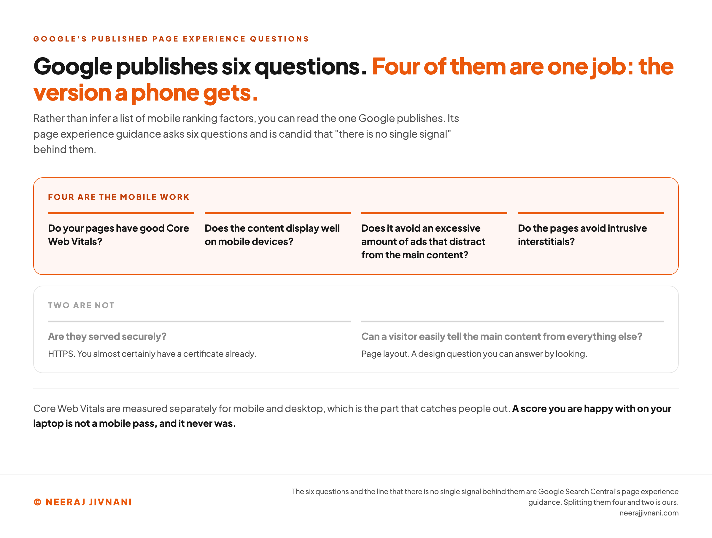
You do not have to infer a list of mobile ranking factors, because Google publishes one. Its page experience guidance asks six questions, and it is candid that "there is no single signal" behind them.
Do your pages have good Core Web Vitals? Are they served securely? Does the content display well on mobile devices?
Does it avoid an excessive amount of ads that distract from the main content? Do the pages avoid intrusive interstitials? Can a visitor easily tell the main content from everything else?
Four of those six are the version a phone gets. The other two are HTTPS and page layout.
You almost certainly have a certificate already, and layout is a design question you can answer by looking.
Use this chart — embed code and citation
<a href="https://neerajjivnani.com/blog/mobile-seo/"><img src="https://neerajjivnani.com/infographics/mobile-seo/four-of-the-six.png" alt="Google's six page experience questions split into two bands, under a title stating that four of the six are one job: the version a phone gets. The upper band, outlined in orange and headed four are the mobile work, carries whether your pages have good Core Web Vitals, whether the content displays well on mobile devices, whether it avoids an excessive amount of ads that distract from the main content, and whether the pages avoid intrusive interstitials. The lower band, dimmed and headed two are not, carries whether they are served securely, glossed as HTTPS that you almost certainly hold a certificate for already, and whether a visitor can easily tell the main content from everything else, glossed as page layout, a design question you can answer by looking. A band at the foot notes that Core Web Vitals are measured separately for mobile and desktop, so a score you are happy with on your laptop is not a mobile pass and never was." width="1200"></a>
<p>Chart: <a href="https://neerajjivnani.com/blog/mobile-seo/">Neeraj Jivnani</a></p>Neeraj Jivnani, "Mobile SEO, and How Much of It Your Site Has Already Done", neerajjivnani.com, https://neerajjivnani.com/blog/mobile-seo/Free to republish with a link back to this page.
Questions People Ask About Mobile SEO
Four of these are worth a straight answer here, because the answer changes on a phone.
A fifth, how to get cited in an AI answer, does not: it is the same work whichever device asked, so it is left where it belongs.
Can I Do SEO With My Phone?
Much of it, yes.
Your own phone does the first check, and Search Console works fine in a mobile browser. Lighthouse and the device toolbar both want a desktop.
What a phone is bad at is the repair work: editing a theme, writing a long page, or reading a table of query data. Diagnose on the phone, fix on a keyboard.
Does an AI Overview Make a Mobile Ranking Pointless?
No, and the mobile version of that worry is more specific than the general one. An AI Overview takes the top of a phone screen that has no second column, so a given ranking position earns fewer visits than it used to.
The pages cited in those answers are the same pages that ranked, which is why the underlying work has not changed.
Can ChatGPT Run These Checks for You?
ChatGPT can draft, summarize and explain, and it is useful for that.
It cannot open your site on a phone, run Lighthouse against your page, or see what your rendered mobile markup contains. None of the checks above are things it can run for you.
What Is the 80/20 Rule in SEO?
The rule is the old observation that a small share of the work produces most of the result, and for mobile that share is unusually easy to name.
Establish your configuration, make sure the phone version contains everything, and fix what loads first.
Most of what remains is either ordinary SEO or does not apply to you.
One Site, Seen Through a Phone
The useful shift is to stop thinking of a mobile site as a version of the real one. Google stopped years ago.
There is one site, and the phone is how it gets read.
On responsive design that is true of the markup itself, so the part of the job that is about keeping two things in step was never there.
On the other two it is a discipline, and the obligations above are what maintaining it costs. Five of them if you serve two documents from one address, all seven if you serve two addresses.
Either way the finishing condition is the same, and it is worth naming because it means the job ends. Your phone version contains everything your desktop version does, it loads without a fight on a poor connection, and nothing covers it when it opens.